How to Design for Accessibility Without Losing Aesthetic Appeal

Designing a beautiful website is no longer just about visual impact. Today, truly effective digital experiences are built at the intersection of design and accessibility. When done right, accessibility doesn’t limit creativity. It enhances it. If you’ve ever worried that prioritising usability might compromise your brand’s visual identity, you’re not alone. The good news is that you can absolutely design for accessibility andcreate something visually striking, engaging, and on-brand.
Let’s explore how to strike that balance.
Why Design for Accessibility Matters More Than Ever
When you design for accessibility, you’re creating digital experiences that work for everyone. This includes people with visual, auditory, cognitive, or motor impairments, as well as users navigating your site in less-than-ideal conditions.
But accessibility isn’t just a compliance checkbox. It directly impacts how your audience experiences your brand.
A well-structured, accessible website helps you:
Reach a wider audience
Improve user experience across all devices
Strengthen your brand’s credibility
Support better SEO performance
In fact, strong design and accessibility principles often overlap with what search engines already favour, like clear structure, readable content, and fast-loading pages.
The Myth: Accessibility Limits Creativity
There’s a common misconception that accessible design feels plain or restrictive. In reality, constraints often spark better creativity.
Designing with intention pushes you to think more strategically about colour, typography, layout, and interaction. Instead of relying on trends alone, you create a system that looks good and works beautifully.
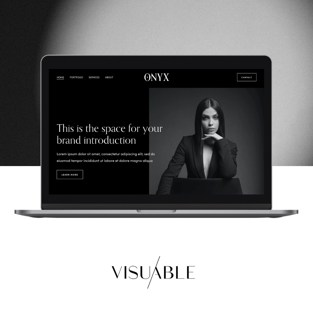
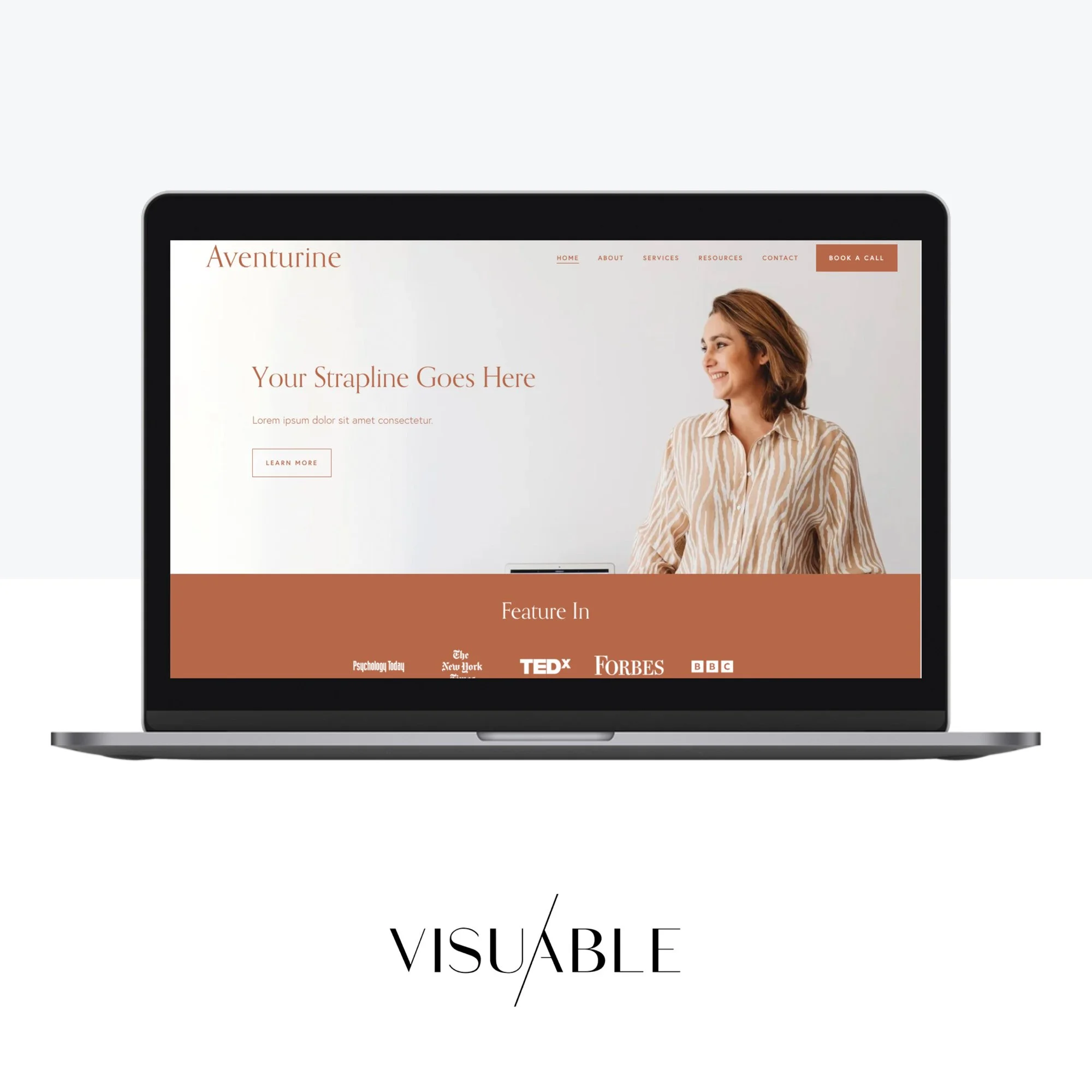
At Visuable, we approach every project with this mindset, combining strategy and creativity to ensure each design decision has a purpose.
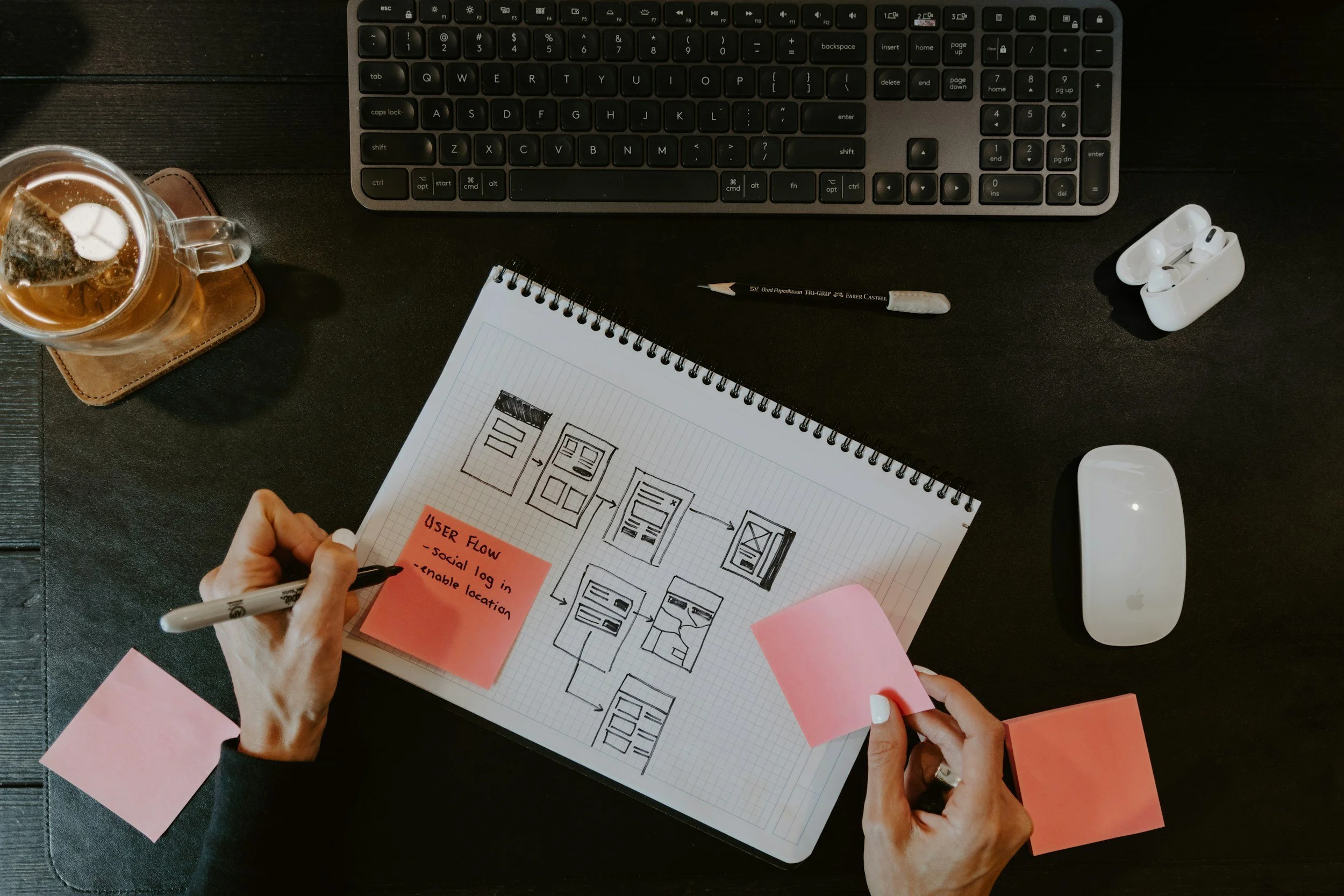
Start with Strong Foundations
Before diving into visuals, focus on structure. Accessibility begins beneath the surface.
A well-organised layout makes your website easier to navigate for all users, including those using screen readers.
Key foundations include:
Clear heading hierarchy (H1, H2, H3)
Logical content flow
Descriptive link text
Consistent navigation patterns
These elements not only support accessibility but also improve readability and engagement. When users can quickly understand your content, they’re more likely to stay and take action.
Colour and Contrast Can Be Both Beautiful and Functional
Colour is one of the biggest concerns when learning how to design for accessibility. Many assume high contrast means sacrificing style.
That’s not the case.
The goal is to ensure text and important elements stand out clearly from their background. This doesn’t mean sticking to black and white. It means being intentional with your palette.
You can maintain a strong visual identity while ensuring accessibility by:
Using brand colours with sufficient contrast ratios
Avoiding colour as the only way to convey meaning
Pairing bold colours with neutral backgrounds
Testing combinations for readability across devices
Done right, colour becomes a powerful tool that enhances both aesthetics and usability.
Typography That Elevates Both Style and Readability
Typography is where design and accessibility truly meet.
A visually stunning font loses its value if users struggle to read it. The key is to balance personality with clarity.
Focus on:
Legible font choices for body text
Adequate font size and line spacing
Clear distinction between headings and paragraphs
Avoiding overly decorative fonts for important information
Good typography doesn’t feel restrictive. It creates rhythm, hierarchy, and flow, guiding your audience through your content effortlessly.
Design with Real User Interaction in Mind
Accessibility goes beyond visuals. It’s about how users interact with your website.
Think about how someone navigates your site without a mouse, or how someone processes information with cognitive differences.
Here’s where thoughtful interaction design makes all the difference:
Ensure buttons and clickable areas are easy to identify
Provide clear feedback for actions like clicks or form submissions
Avoid overly complex animations that may distract or overwhelm
Make forms simple and easy to complete
When you design for accessibility at this level, you create smoother, more intuitive experiences for everyone.
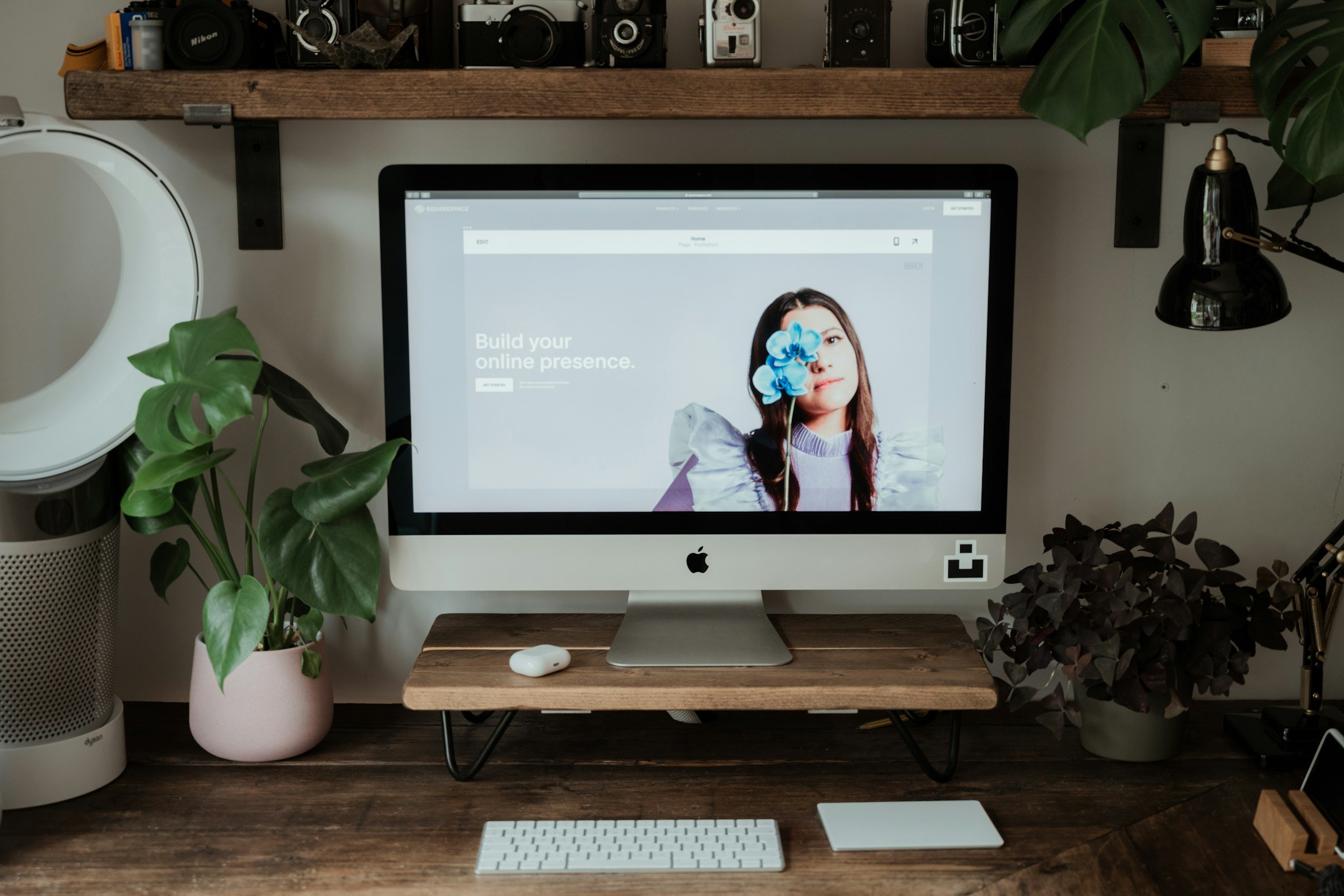
Imagery and Visual Content That Supports Accessibility
Images play a huge role in modern web design, but they should enhance the experience, not create barriers.
To balance aesthetics and accessibility:
Use high-quality, relevant visuals that support your message
Add descriptive alt text for screen readers
Avoid text-heavy images that can’t be read by assistive tools
Ensure visuals don’t overwhelm or distract from key content
Beautiful imagery should feel purposeful. When it aligns with your message and remains accessible, it strengthens your overall brand presence.
Keep Simplicity at the Core of Your Design
Simplicity is often the missing link between great design and accessibility.
When you strip away unnecessary complexity, your design becomes clearer, stronger, and more impactful. This doesn’t mean minimalism for the sake of it. It means designing with clarity and intention.
Ask yourself: Is this element helping the user, or distracting them? The best designs feel effortless because every element has a reason to be there.
Accessibility as a Competitive Advantage
Designing for accessibility isn’t just the right thing to do. It’s a smart business move.
Brands that prioritise inclusive design often see:
Higher engagement rates
Lower bounce rates
Increased trust and credibility
Better long-term growth
When your website works for more people, it naturally performs better.
This is where strategic design becomes a powerful investment. When accessibility is built into your design process from the start, you avoid costly fixes later and create a more future-proof digital presence.
Bringing It All Together
To truly design for accessibility without losing aesthetic appeal, you need to shift your mindset. Accessibility isn’t a limitation. It’s a design advantage.
By combining thoughtful structure, intentional visuals, and user-focused interaction, you create experiences that feel both beautiful and inclusive.
Great Design and Accessibility Go Hand in Hand
At Visuable, we believe the most impactful brands are built on this balance. When strategy and creativity work together, your website doesn’t just look good. It performs, connects, and grows with your audience.
FAQs
-
It means creating digital experiences that can be used by as many people as possible, including those with disabilities. This includes visual, auditory, and cognitive considerations.
-
Not at all. It encourages more intentional design decisions, often leading to stronger and more refined visual outcomes.
-
Accessible websites tend to have better structure, clearer content, and improved usability, all of which contribute to stronger SEO performance.
-
Start with clear structure, readable text, and good contrast. Small changes can make a big difference.
Related Blogs