Rebecca Rockafellar Coaching | California, USA
Rebecca Rockafellar Coaching
Essential Brand Identity Design Case Study
Learn how we helped Rebecca Rockafellar launch a minimalist, elegant brand identity that reflects her calm presence, professional credibility, and deep commitment to personal transformation.

Custom-crafted logo system
Minimalist, earthy visual direction
Clear personal positioning
Versatile brand guidelines for future use
Project Overview
The Client
Rebecca Rockafellar Coaching is an executive coaching practice founded by Rebecca, a former tech executive with over 30 years of leadership experience. Now based in the U.S., she supports senior leaders navigating complex career transitions through increased self-awareness, kindness, and clarity.
The Challenge
Rebecca needed a brand identity that would mirror her coaching style: thoughtful, authentic, and rooted in both kindness and candour. With a strong personal story and clear vision, she wanted a visual identity that could reflect her credibility, calm energy, and deep coaching expertise without feeling corporate or flashy.
Our Approach
Visuable Packages
To bring Rebecca’s vision to life, we delivered the following package:
What We Delivered
60-Min Onboarding Consultation: Uncovered Rebecca’s brand voice, values, and inspirations to ensure alignment throughout.
Typography Selection: Selected clean, humanist typefaces to convey trust, clarity, and a modern approach.
Colour Palette: Developed a sophisticated palette of blacks, taupes, and blues that embody elegance, serenity, and grounded strength.
Design Phases & Progress Calls: Delivered brand development in two collaborative phases with feedback rounds to keep the project aligned.
Logo Suite (Primary, Secondary, Symbol): Designed a calm, confident logo system built around Rebecca’s initials to reflect both personality and professionalism.
Brand Identity Guidelines: Created a simple yet detailed guide to ensure visual consistency across future touchpoints.
The Results
UX & UI Design Outcomes
Elegant and purposeful logo system: A refined wordmark combining clean sans-serif and handwritten script fonts creates a memorable brand presence that feels both professional and personal.
Grounded neutral palette: A blend of charcoal, soft blue, and taupe offers emotional depth and visual calm across platforms.
Personal yet professional tone: The design balances warmth and authority, resonating with Rebecca’s high-achieving audience.
Scalable brand identity: The identity is designed to grow with Rebecca’s business—from website to print, coaching materials, and beyond.
Creative Execution

Impact & Creativity
Rebecca Rockafellar’s brand identity captures the rare balance of calm confidence and executive credibility. The design centres around a sophisticated wordmark—pairing a clean sans-serif typeface with an elegant handwritten script that mirrors Rebecca’s coaching style: structured yet deeply personal. The contrast between the bold, modern first name and the fluid, organic surname reflects her unique duality—strategic leadership combined with mindful support. The result is a brand presence that feels grounded, sincere, and instantly trustworthy.


Functionality & User Experience
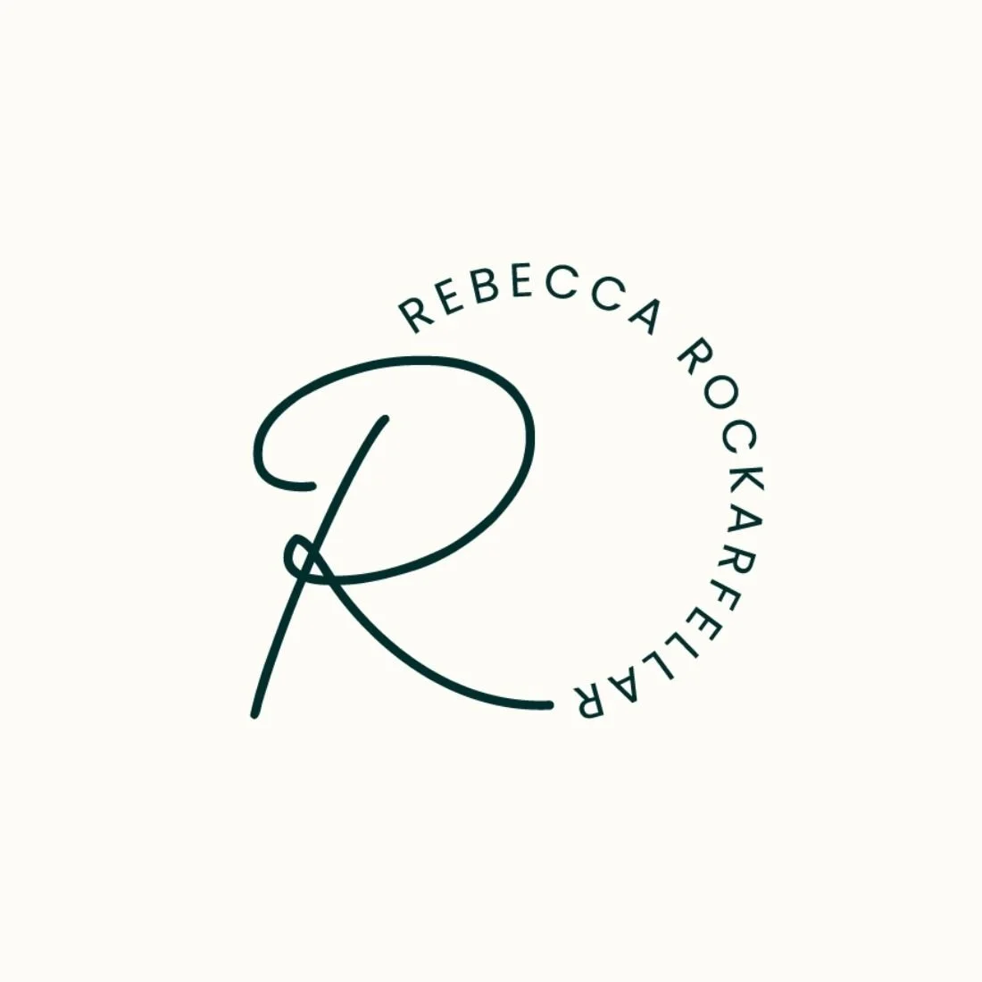
The logo suite is highly versatile, offering consistency across digital and print formats while maintaining visual interest. The primary logo presents a polished, minimalist identity suitable for client-facing materials and web headers. The stacked secondary version increases flexibility for social media and mobile interfaces. The circular symbol—featuring a graceful “R” surrounded by clean uppercase text—adds a distinctive mark that’s ideal for icons, seals, or subtle brand imprints. Each asset was crafted for clarity, balance, and recognition at every scale.
Branding & Storytelling
Every element of Rebecca’s identity is informed by her brand story. The use of deep green evokes trust, wisdom, and emotional depth—key qualities in her coaching practice. Soft neutrals bring warmth and composure, while the warm brown accent hints at approachability and groundedness. The handwritten script font chosen for “Rockafellar” introduces a personal, handcrafted feel—connecting her audience to her values of kindness, candour, and mindfulness. Together, the visual identity tells a story of transformation led by insight and intention.
Execution & Design Excellence
From colour harmony to typographic refinement, the execution reflects high design standards and a deep respect for brand clarity. Letterspacing is precisely measured, ensuring the identity reads beautifully in both large and small applications. The minimal palette and balanced type hierarchy enhance readability and adaptability, while the custom circular monogram provides a visual anchor that ties everything together. With this elegant and intentional brand identity, Rebecca is equipped to grow her coaching practice with confidence and consistency.
Summary
Through a strategic Essential Brand Identity package and close collaboration, Rebecca Rockafellar now has a brand identity that communicates who she is at every level: a calm, experienced coach who empowers her clients with clarity and confidence. With an elegant logo suite, soothing palette, and thoughtful design system, her new visual identity supports her mission—and sets the foundation for meaningful growth.
Consult with our Experts
Amazing brands start with an understanding of your goals and vision.
Our team understands the challenges of launching a brand online, and we’re here to answer all your questions and simplify the process for you. Let’s go!
Our Success Stories
Get inspired by real stories of how our designs have made a difference for brands like yours.