Thriving Practice Community | New York, USA
Thriving Practice Community
Essential brand Identity, Scroll Website, Scroll Copywriting and E-Learning Platform Case Study
Learn how we helped Thriving Practice Community launch a calm, cohesive brand and elegant website with integrated e-learning to empower wellness practitioners.
Elegant new brand identity
Warm, user-friendly web design
Clear, confident messaging
E-learning platform integration
Project Overview
The Client
Thriving Practice Community is a values-led initiative that empowers wellness professionals—coaches, therapists, bodyworkers, and holistic practitioners—to build sustainable practices rooted in purpose and personal growth. Based in the United States, the community blends professional development with human connection, offering a supportive space where like-minded practitioners can grow, learn, and thrive together. Through resources, workshops, and peer learning, the brand exists to nurture fulfilment as much as business success.
The Challenge
The team came to Visuable with a bold mission but no cohesive visual identity or online presence. They needed to launch a brand that would speak to conscious, values-driven healthcare providers—and present an offer that combines strategic business growth with emotional wellbeing.
The challenge was creating an identity that felt calm but confident, professional but soulful, minimal but not cold. The site needed to provide a clear overview of the offer while inviting practitioners into an exclusive membership experience. Additionally, the UX had to provide clear paths to resources, team introductions, calls to action, and external platform access without clutter or confusion.
Our Approach
Visuable Packages
We delivered a beautifully balanced combination of branding, web design, copywriting, and course platform setup tailored to their needs:
What We Delivered
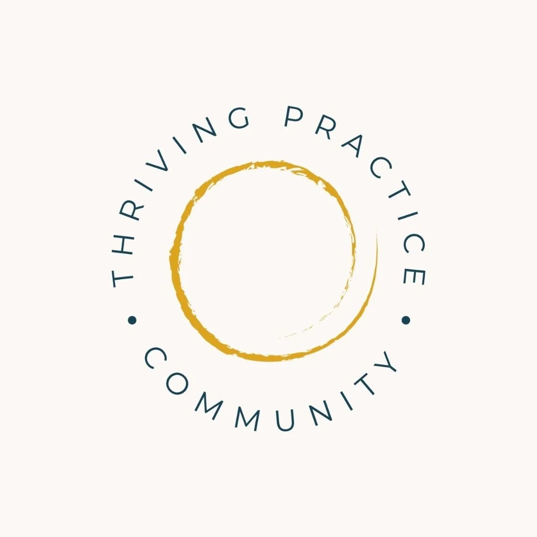
Visual Identity Design: Created a serene yet sophisticated brand look using a gold brushstroke circle and modern teal type.
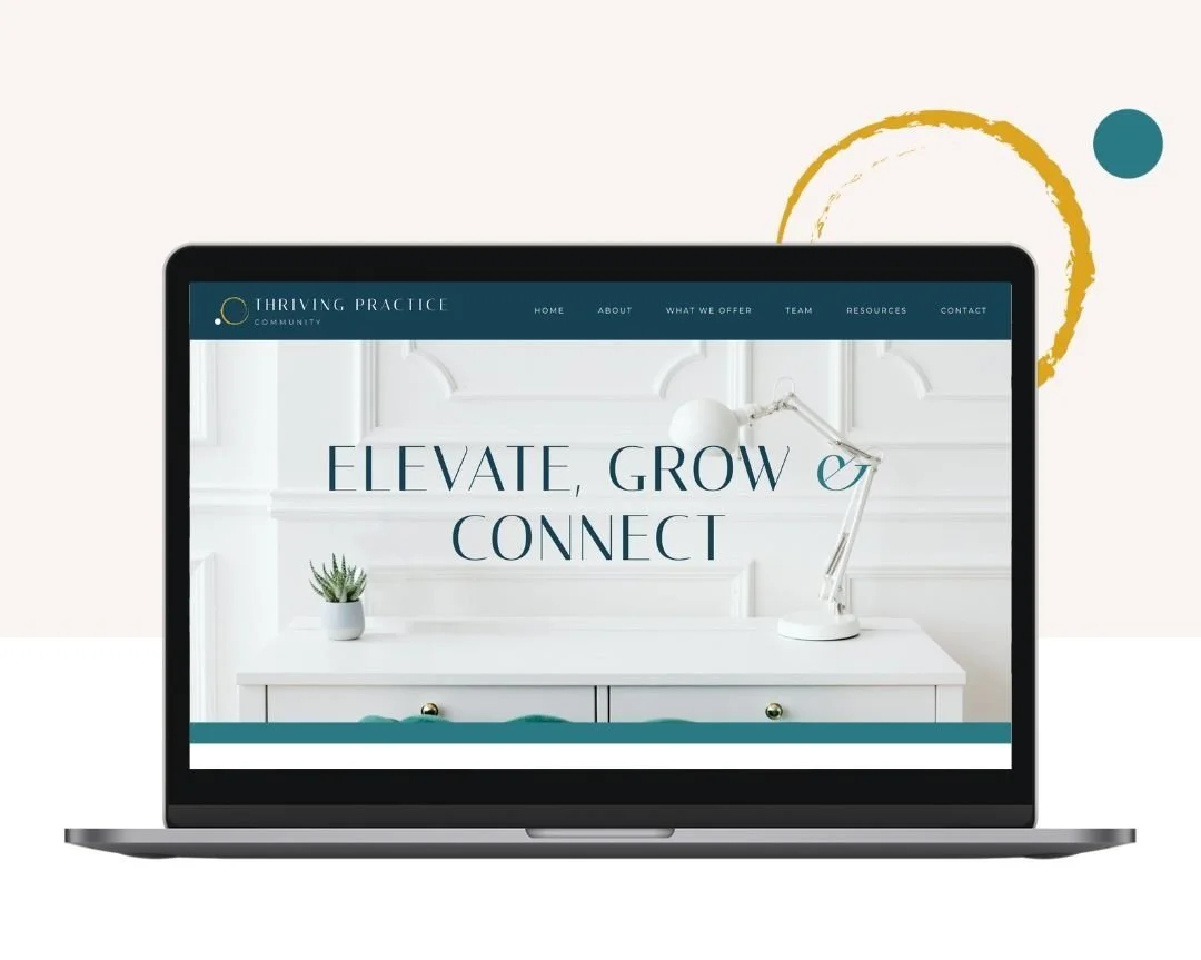
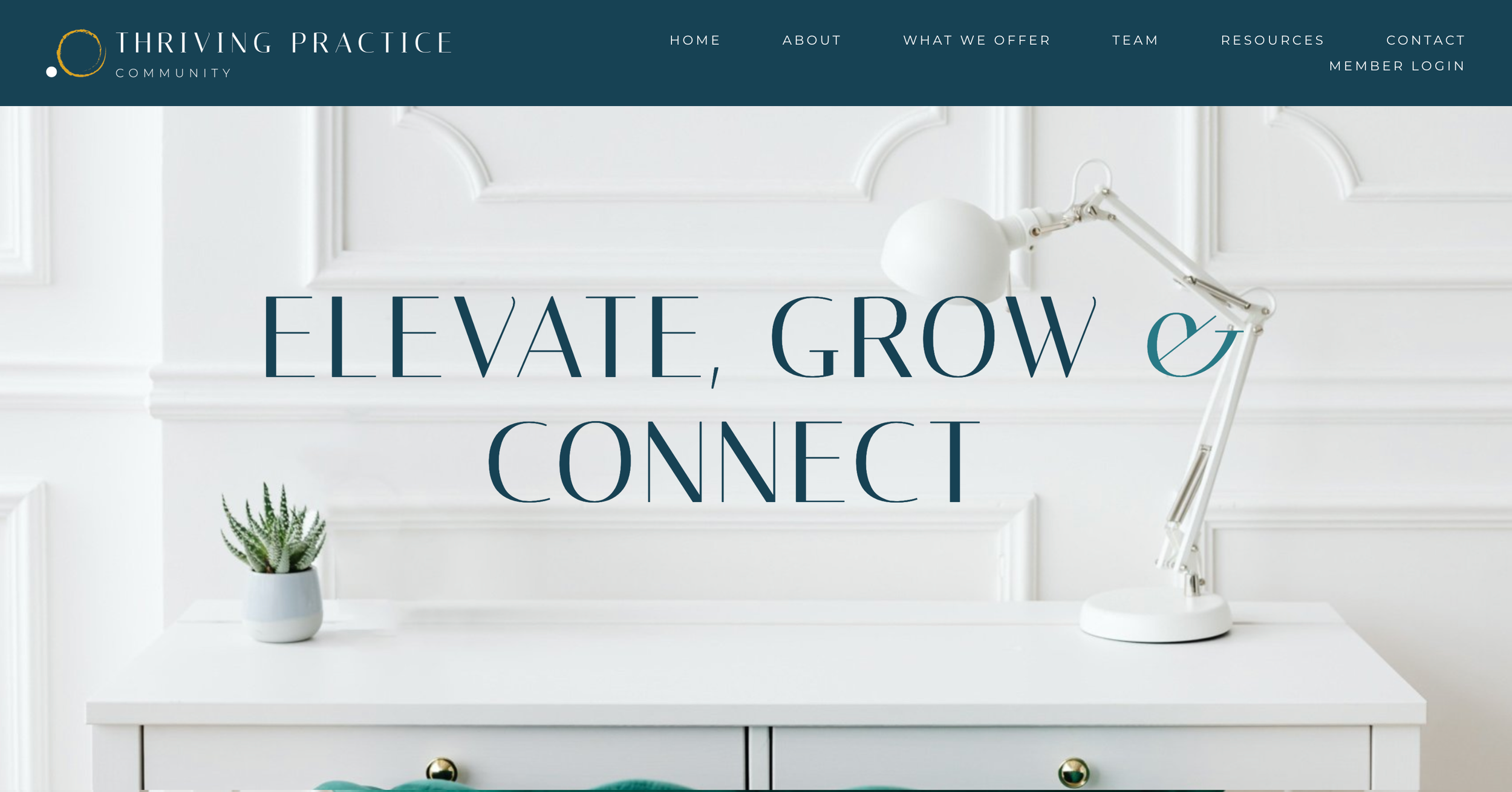
Scroll Website Design: Built a clean, minimalistic one-page site that is easy to navigate and visually uplifting.
Purpose-Led Messaging: Crafted warm, inclusive copy that reflects the community’s values and mission.
User Experience Strategy: Integrated calls-to-action that guide visitors to the MemberSpace login and signup flows without disrupting the site’s simplicity.
Responsive Web Layout: Ensured smooth performance across devices with intuitive, mobile-first functionality.
Conversion-Ready Structure: Designed clear CTAs and navigation paths to drive sign-ups and engagement.
The Results
UX & UI Design Outcomes
Cohesive and inviting digital experience: The site mirrors the community’s tone—warm, clear, and values-aligned—from first glance to final CTA.
Effortless content journey: Scroll-based storytelling helps visitors intuitively explore the brand and take action without overwhelm.
Visually balanced across all devices: Whether on desktop or mobile, the layout adapts beautifully for clarity, simplicity, and ease of use.
Seamless course access for members: While hosted externally, the Member Login CTA offers smooth entry into the learning platform without disrupting the site experience.
Creative Execution

Impact and Creativity
Thriving Practice Community’s visual identity was designed to create a sense of calm, professionalism, and personal growth. At the heart of the brand is a hand-drawn golden circle—symbolising continuity, intention, and transformation. This organic mark, paired with soft teal typography, strikes a balance between the spiritual and the structured. The design leans into simplicity, with soft backgrounds and generous white space creating a sense of ease and spaciousness. The overall aesthetic feels both elevated and approachable—ideal for a wellness audience that values clarity, connection, and inner alignment.
Functionality and User Experience
The website is designed as a focused scroll experience, allowing visitors to flow naturally from brand purpose to offer, team insights, and calls-to-action. Navigation is simple and intuitive, with anchored menu links guiding users smoothly across sections.
Calls-to-action such as “Claim Your Free Month”, “Take the Readiness Assessment”, and “Join Our Community” are placed with intention throughout the journey, leading users toward the MemberSpace platform where the full community experience and content delivery take place.
Rather than integrating the e-learning environment directly into the site, we provided seamless access points via strategically placed buttons and menu links. This maintains design clarity while ensuring users can transition effortlessly into the member experience without distraction. The flow between informational site and membership platform is clear, user-friendly, and built for trust.
Responsive design ensures all content and CTAs are visually balanced and fully functional on mobile, tablet, and desktop devices—making it easy for wellness professionals to engage, learn, and join from wherever they are.
Branding and Storytelling
From its opening statement—“Elevate, Grow & Connect”—the site carries a consistent tone of support, empowerment, and gentle leadership. Copy was crafted to reflect the mindset and language of the brand’s audience, using soft encouragement and inclusive phrasing over persuasion or sales talk. Every section of the page serves a story-driven purpose: to welcome, to explain, to guide, and to inspire. The visuals, language, and layout all work in unison to communicate trust, grounded energy, and a deeper sense of shared mission. The result is a brand that feels like a mentor—steady, clear, and nurturing.


Execution and Design Excellence
Design excellence came from knowing where to pause. The use of space, soft colour transitions, and typographic contrast allow the site to feel both premium and personal. Every interaction—from hovering over a CTA to scrolling past the mission statement—feels intuitive and fluid.
The site design and copy work in harmony to support both information and invitation. The Member Login and Free Month CTAs are present but never aggressive. Visual consistency across typography, colours, and iconography supports brand cohesion and builds credibility. This is a digital presence designed for trust, simplicity, and scalable impact.
Summary
Thriving Practice Community now has a complete visual and digital ecosystem that communicates who they are, what they do, and why it matters. With an emotionally intelligent brand identity, a purpose-led scroll website, and strategic platform access for members, they are equipped to grow a powerful community—one grounded in values, built for change, and ready to help healthcare providers thrive.


Consult with our Experts
Amazing brands start with an understanding of your goals and vision.
Our team understands the challenges of launching a brand online, and we’re here to answer all your questions and simplify the process for you. Let’s go!
Our Success Stories
Get inspired by real stories of how our designs have made a difference for brands like yours.