Shimizu-Jones | California, USA
Shimizu-Jones
Full Squarespace Website Design Case Study
Learn how we helped Shimizu-Jones build a cinematic, multi-disciplinary portfolio website that showcases the full scope of Sam Shimizu-Jones’ storytelling—across film, photography, and education.
Cinematic digital experience
cross-disciplinary navigation
Compelling course showcase
Platform ready for future growth
Project Overview
The Client
Shimizu-Jones is the personal brand of Sam Shimizu-Jones, a Japanese-American filmmaker, photographer, and educator. With a career rooted in connection, Sam blends visual storytelling with cultural and environmental narratives. His work has reached millions—through film festivals, online education, and large-scale impact campaigns.
The Challenge
Sam needed a personal website that could serve as a central hub for his multi-faceted creative work. It had to feel cinematic and intentional—yet be simple to navigate across filmmaking, photography, and course offerings. Equally important was the ability to tell his story clearly while laying the groundwork to link with his ventures Will Call and Video School.
Our Approach
Visuable Packages
To bring Sam’s vision to life, we delivered:
What We Delivered
Custom Squarespace Website: A streamlined 5-page website that brings together film, photography, and education under one cohesive brand.
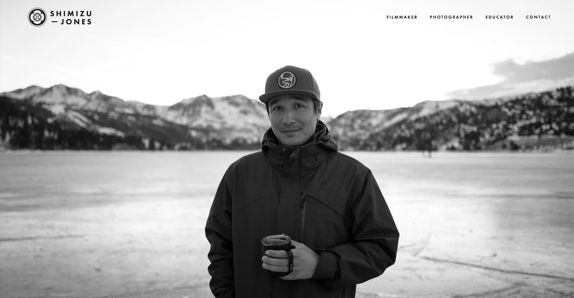
Visual-first homepage: A powerful monochrome opening anchored by Sam’s portrait and mission, setting the tone for a site driven by purpose.
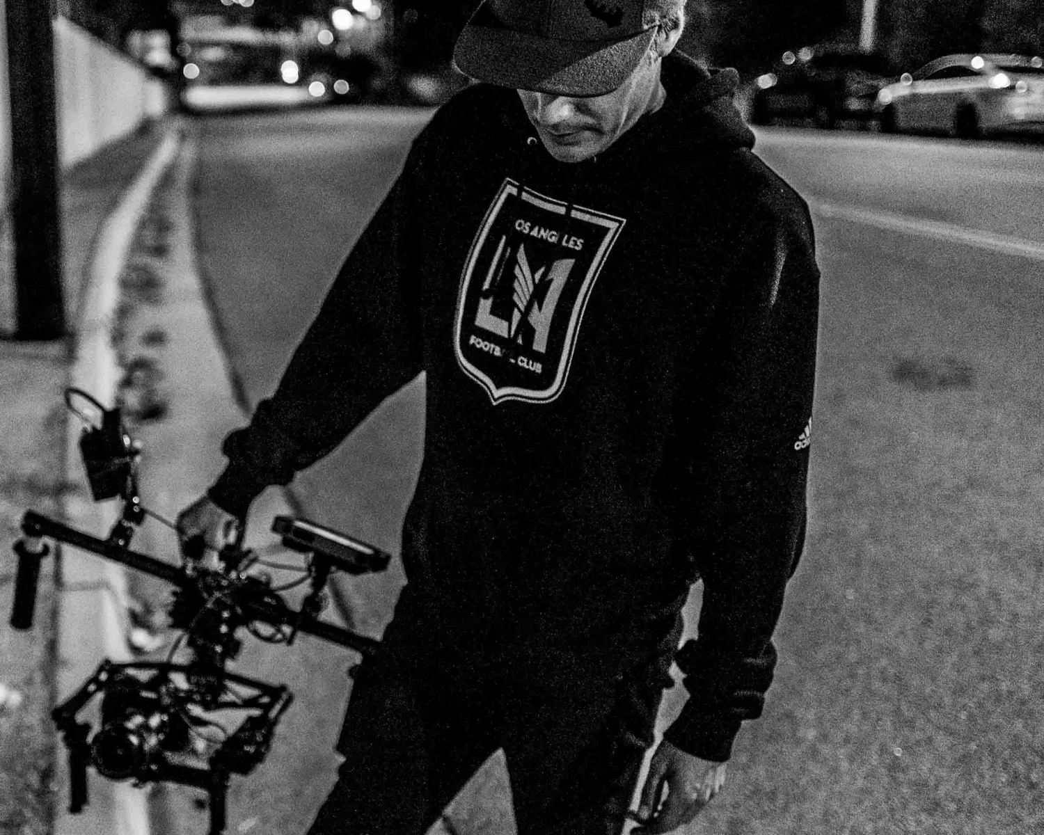
Dynamic portfolio pages: Grid layouts on Filmmaker and Photographer pages allow visitors to explore work visually, quickly, and clearly.
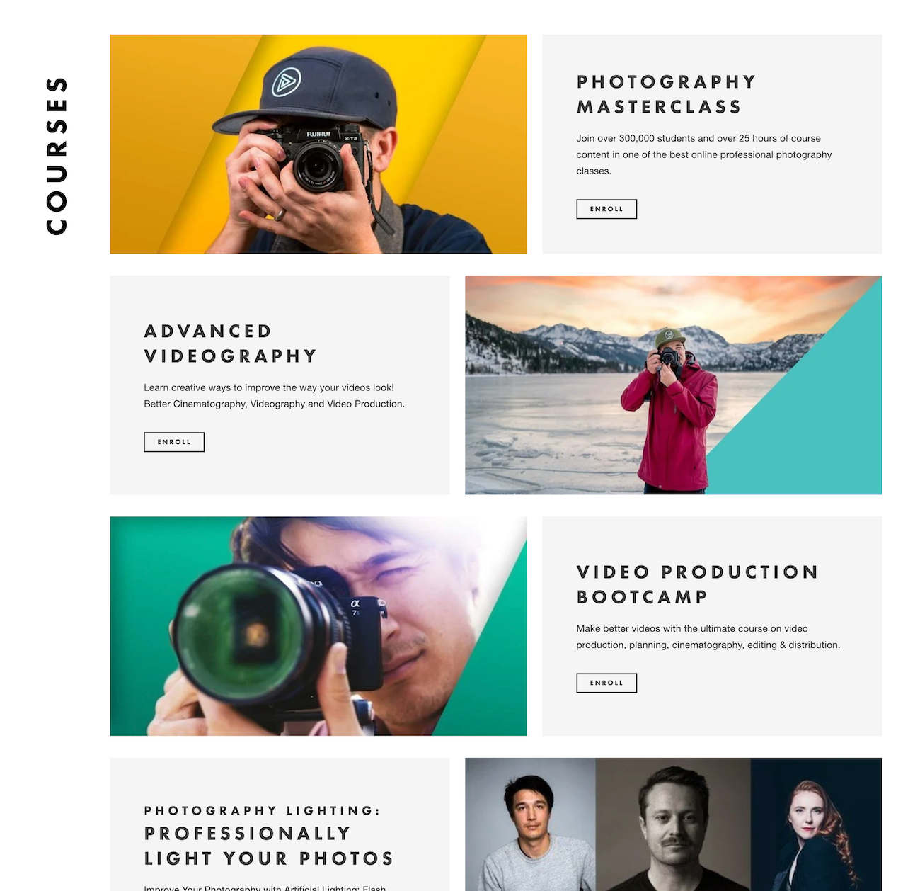
Educator & Courses section: A structured yet inviting breakdown of Sam’s course catalogue, with direct pathways to enrol and learn.
Consistent call-to-action strategy: “Let’s work together” and “Get in touch” prompts across pages guide engagement without pressure.
Brand-aligned structure: The site’s structure respects both the narrative flow of Sam’s career and the practical needs of varied audiences.
The Results
UX & UI Design Outcomes
Cinematic, cohesive experience: A minimal black-and-white visual identity connects every page while highlighting Sam’s content.
Clear segmentation of services: Visitors can explore distinct areas—film, photography, education—without friction or confusion.
Course-focused conversion pathways: Each course is presented with direct, actionable enrolment options optimised for clarity.
Built-in flexibility for growth: The design supports future integration with Sam’s partner ventures and expanding portfolio.
Creative Execution
Impact and Creativity
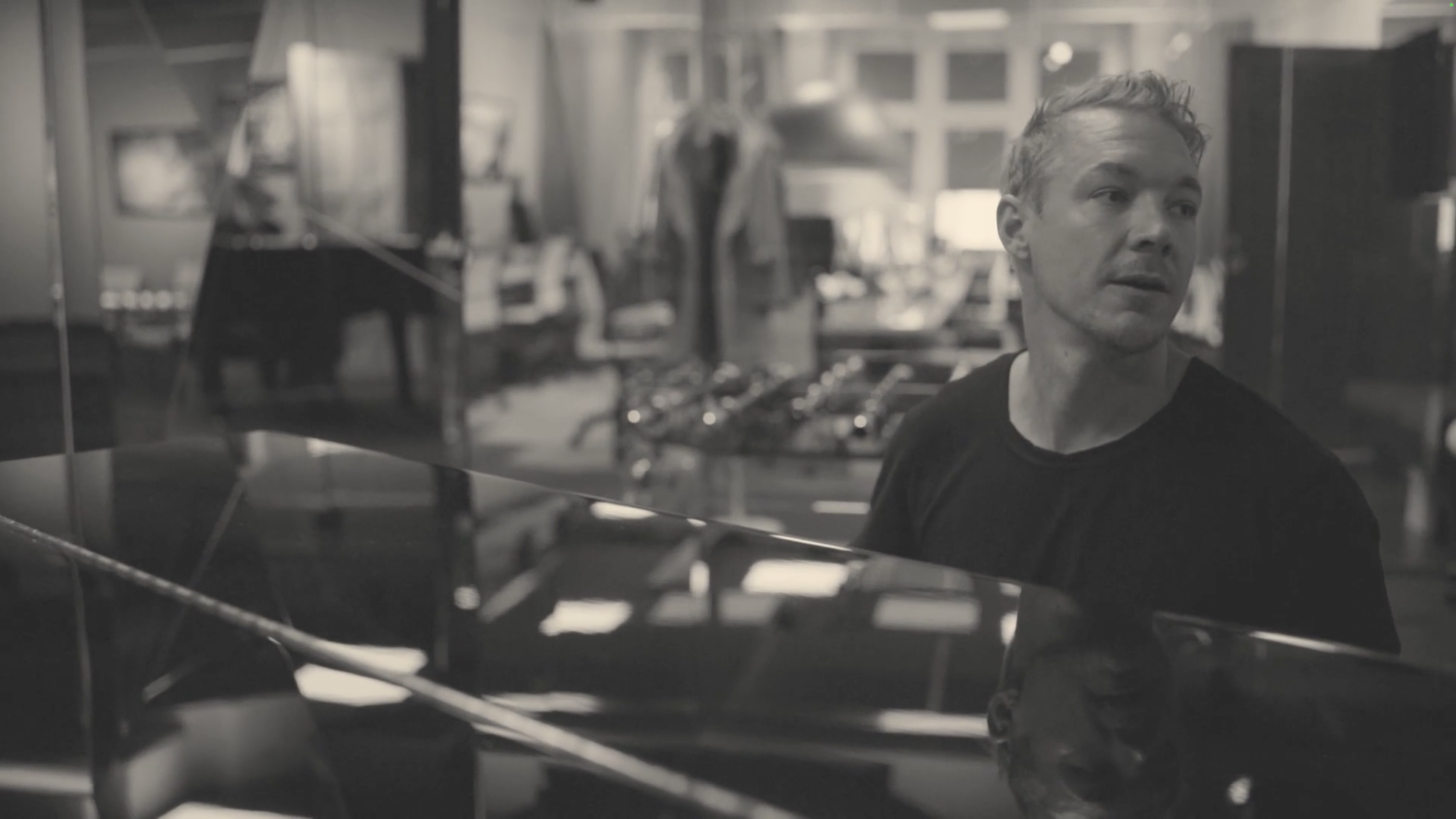
The site opens on a striking black-and-white still of Sam in the wild—instantly grounding the visitor in atmosphere, purpose, and presence. This is a site designed like a visual essay. Rather than overwhelming the user with content or calls to action, it creates space for quiet discovery. Every frame feels intentional. The design leans into contrast—bold black sections, soft neutrals, and bursts of colour in key content zones like the course tiles. Visual rhythm is achieved through editorial pacing: large, cinematic imagery balanced by brief, meaningful text. The entire aesthetic reflects Sam’s craft—clear, powerful, and human.
Functionality and User Experience
Navigation is fluid and intuitive. Clear, minimalist top-level links (Filmmaker, Photographer, Educator, Contact) guide the user through Sam’s multi-disciplinary practice, while large content blocks make the site scrollable and scannable. The Portfolio and Courses pages are particularly strong in usability—grid layouts organise diverse projects and offerings in a way that feels light, never crowded. Each film and photo project is clearly titled and easily explored.

Branding and Storytelling
This is storytelling by design. Sam’s values—connection, creativity, and clarity—are felt on every page. The tone is purposeful but never performative. His bio is short and strong, accompanied by striking photography that adds weight to his words. “Let’s work together” isn’t just a button—it’s a recurring phrase that weaves his personal brand into the user journey. From the documentary-inspired layout to the use of black-and-white portraiture, the site is unmistakably Sam: a thoughtful, intentional storyteller focused on meaningful impact.
Execution and Design Excellence
Everything about this build is refined. Typography is perfectly weighted—uppercase headers for clarity and structure, paired with elegant, highly readable body copy. Section titles like “THE WORK” and “PORTFOLIO” are rotated vertically or placed with bold spacing, creating both editorial flair and strong visual anchors. Responsive functionality is seamless—every page flows beautifully on mobile and desktop. There are no gimmicks here—just strong visual storytelling, precise layout logic, and a brand that speaks clearly without having to shout.

Summary
The new Shimizu-Jones website gives Sam a digital home that is as intentional and inspiring as the stories he tells. It balances the practical—clear structure, course enrolment, and contact pathways—with the emotional, delivering a visual experience that resonates with depth and care. It doesn’t just showcase Sam’s work—it invites collaboration, learning, and meaningful connection. Built to evolve alongside his journey, this site is now a central anchor for a career—and mission—that continues to grow.


Brand photography courtesy of Shimizu-Jones
Consult with our Experts
Amazing brands start with an understanding of your goals and vision.
Our team understands the challenges of launching a brand online, and we’re here to answer all your questions and simplify the process for you. Let’s go!
Our Success Stories
Get inspired by real stories of how our designs have made a difference for brands like yours.


