Coldsurge | London, UK
Coldsurge
Complete Brand Identity Design Case Study
Learn how we helped Coldsurge build a bold, kinetic brand identity from the ground up—designed to reflect their cutting-edge security expertise, scale confidently, and stand out in a saturated market.

Bold dynamic logo set
Cold-inspired brand palette
Scalable brand assets
Sleek business card design
Project Overview
The Client
Coldsurge is a UK-based cybersecurity consultancy founded by two offensive security veterans. Their work simulates real-world attacks using the same tactics as malicious actors—helping clients proactively discover and fix critical vulnerabilities before adversaries exploit them.
The Challenge
As a new entrant to the market, Coldsurge needed a brand identity that reflected their elite technical expertise and differentiated them from outdated, overly corporate competitors. The brand had to feel cold, stealthy, and modern—yet remain practical and scalable for day-to-day business use across digital and print.
Our Approach
Visuable Packages
To bring their vision to life, we delivered these following packages:
Business Card Design
What We Delivered
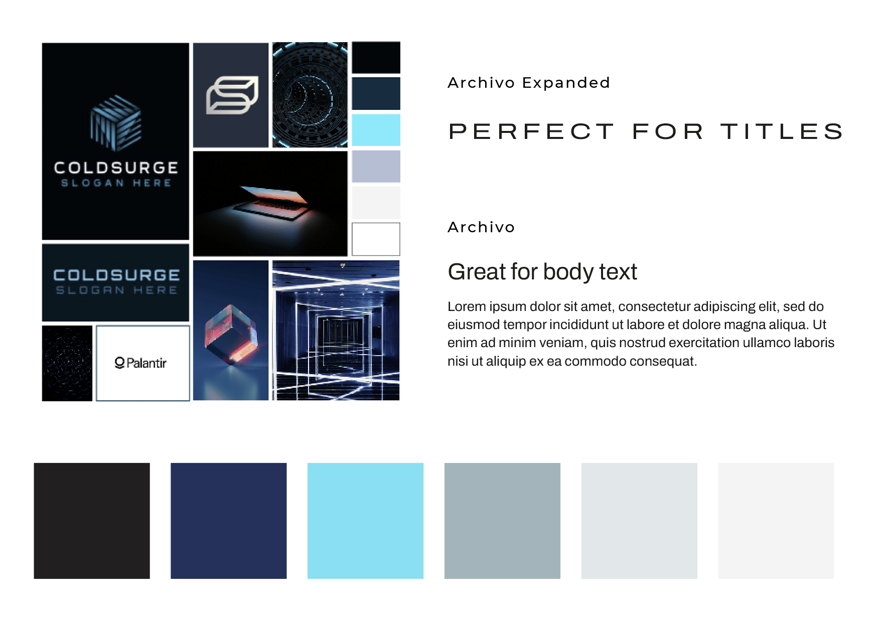
Primary Logo: A bold, all-caps COLDSURGE wordmark using a clean, tech-driven font
Geometric Emblem: A dynamic logomark inspired by movement, duality, and stealth—symbolising both offensive and defensive cyber strategy
Futuristic Colour Palette: Cold, sharp cyan paired with deep blacks and crisp whites—representing precision and clarity
Typography System: Minimalist, monospaced fonts designed for high legibility and a cutting-edge feel
Graphic Toolkit: Scalable, modular assets for use across decks, social, and marketing materials
Business Cards: Dual-theme (light and dark) cards with high-impact layout and a sleek, professional finish
Brand Guidelines: A comprehensive manual covering tone, visual hierarchy, spacing, logo rules, and colour specifications
The Results
UX & UI Design Outcomes
Iconic logo system – Recognisable at any scale, across formats
Unified design aesthetic – Streamlined visuals for web, print, and social use
Future-ready brand kit – Designed for easy implementation across all platforms
Premium print presence – Business cards that communicate instant authority and clarity
Foundational toolkit for launch – Giving Coldsurge a cohesive identity from day one
“We’re both delighted with the final product, thank you for all your creativity and understanding of our ideas and vision! We’re very happy with our logo, brand and business cards and are excited to open our doors for business very shortly.”
Creative Execution
Impact & Creativity
From the outset, the visual identity for Coldsurge was designed to disrupt expectations within the cybersecurity space. The goal was to evoke stealth, power, and intelligence—all without resorting to clichéd security iconography. Instead of shields or padlocks, we created a custom emblem made of intersecting arcs and lines, forming a shape that feels in motion—symbolising precision, velocity, and the dynamic nature of digital threats. This geometric simplicity gives the brand a minimalist edge while remaining rich with meaning.
The primary logotype—COLDSURGE in all caps—features clean, angular letterforms inspired by aerospace and advanced technology brands. The type feels engineered, bold, and grounded in the future. The design also nods subtly to kinetic energy: everything appears poised to move forward, mirroring the company’s R&D-led methodology and commitment to pushing boundaries.


Functionality & User Experience
Every element of the brand system was developed to be highly usable across real-world scenarios. The emblem performs exceptionally across all sizes, maintaining clarity whether it's a tiny favicon, a profile icon, or a large deck cover. Colour selections were carefully tested against accessibility and contrast standards, ensuring digital legibility and print quality.
The business cards—available in both dark and light themes—serve two use cases: formal, high-stakes meetings, and more casual, peer-to-peer introductions. Each version was designed with subtle variations in layout, allowing the mark and contact details to breathe while maintaining brand presence. Spacing, font scaling, and logo placement were meticulously refined for readability and visual balance.
The full brand graphics suite includes square, horizontal, and story formats—making social roll-out frictionless. These templates are ready to deploy across platforms like LinkedIn, X, Instagram, and internal Slack or investor decks, supporting the team with flexibility and professionalism from day one.


Branding & Storytelling
The entire identity system is anchored in the Coldsurge story: a cybersecurity consultancy formed by two experts who have worked on the offensive side of security for years, now using that knowledge to protect clients. The design embraces that narrative of sharp expertise and proactive defence. The cold-toned colour palette isn’t just aesthetic—it symbolises clarity, control, and calculated action. The geometric forms represent structured thinking, precision, and systems engineering.
The brand voice embedded in the visuals communicates trust without bravado—the kind of brand that speaks with quiet authority. It’s built for B2B clients who value intelligence, depth, and innovation over noise. The visual identity was designed to embody Coldsurge’s values of transparency, collaboration, trust, and innovation—without saying a word.


Execution & Design Excellence
Every visual decision was guided by precision. The emblem was constructed on a perfect grid, ensuring exact geometry and visual harmony. Typography was tested for spacing, alignment, and clarity across devices. We refined the logotype to ensure it balanced strength and legibility, avoiding overly stylised trends in favour of timelessness.
The brand guidelines deliver more than just rules—they provide structure, rationale, and flexibility for future growth. Each page is laid out to help Coldsurge scale confidently—whether they’re briefing a designer, onboarding a new team member, or preparing materials for a pitch.
The business cards were print-optimised, with versions designed for embossed finishes, spot colour usage, or digital templates. From alignment to material-ready specs, everything was created with long-term use in mind.
Summary
Coldsurge now has a future-ready identity that captures the intelligence, precision, and confidence at the heart of their brand. From logo to business cards, every detail is designed to scale with the business and reflect its cutting-edge mission. As they prepare to launch, Coldsurge stands apart—equipped with a brand built for the challenges and opportunities ahead.
Consult with our Experts
Amazing brands start with an understanding of your goals and vision.
Our team understands the challenges of launching a brand online, and we’re here to answer all your questions and simplify the process for you. Let’s go!
Our Success Stories
Get inspired by real stories of how our designs have made a difference for brands like yours.