Deflect and Protect | UK
Deflect & Protect
Full Squarespace Website Design Case Study
Learn how we helped Deflect & Protect bring their mission to life online by delivering a Full Squarespace Website.
Supportive Brand Feel
Engaging Visual Flow
Trust-Building Design
Emotionally Resonant Layout
Project Overview
The Client
Deflect & Protect is a UK-based community interest company focused on online safety training and digital harms awareness. Founded with a neurodivergent-centered approach, the organisation provides education that empowers families, young people, and communities to navigate the digital world safely.
The Challenge
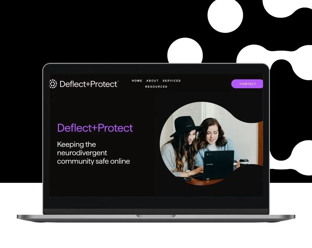
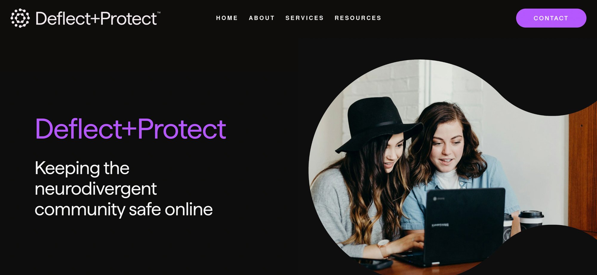
The client wanted a custom Squarespace website with a maroon background, white text, and carefully selected imagery that felt family-oriented and caring. The design needed to flow smoothly as users scroll, with information presented in a way that feels natural and supportive.
Our Approach
Visuable Packages
To address Deflect & Protect needs, we provided:
What We Delivered
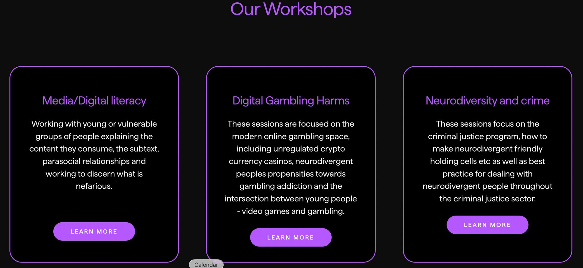
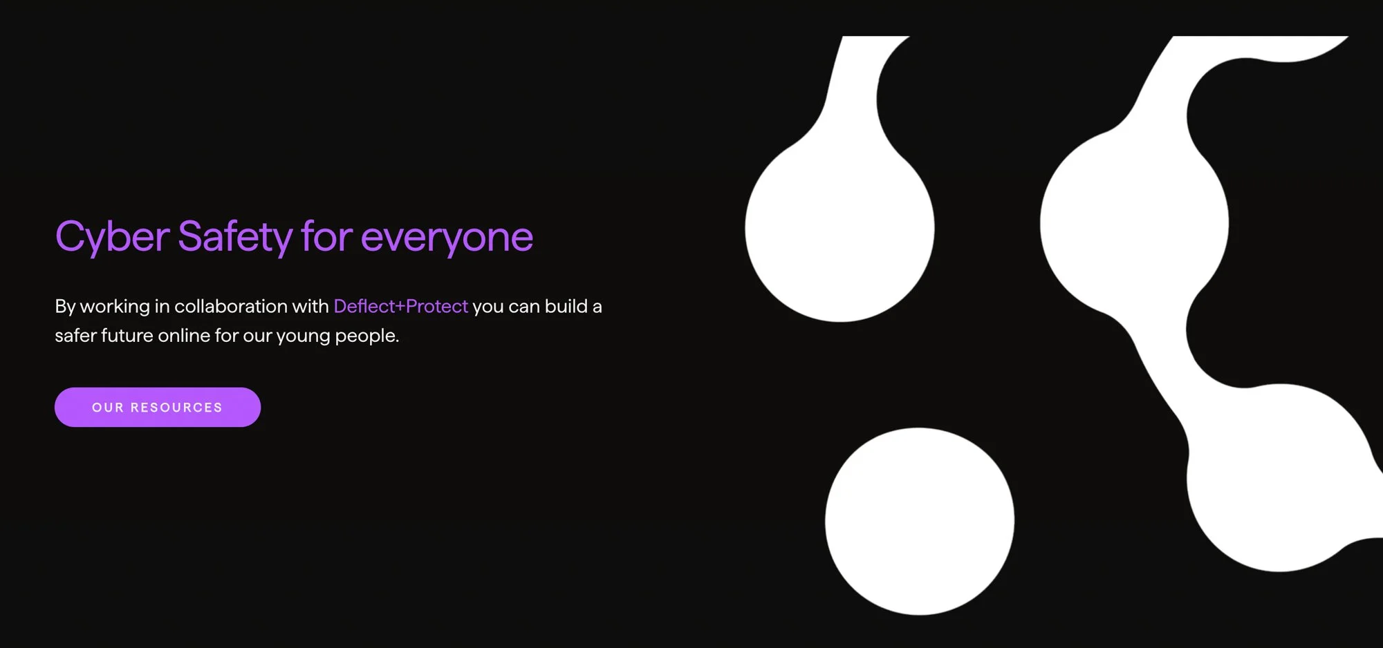
Custom Homepage Layout: We designed a smooth, scroll-based homepage where information flows intuitively, creating a guided user journey.
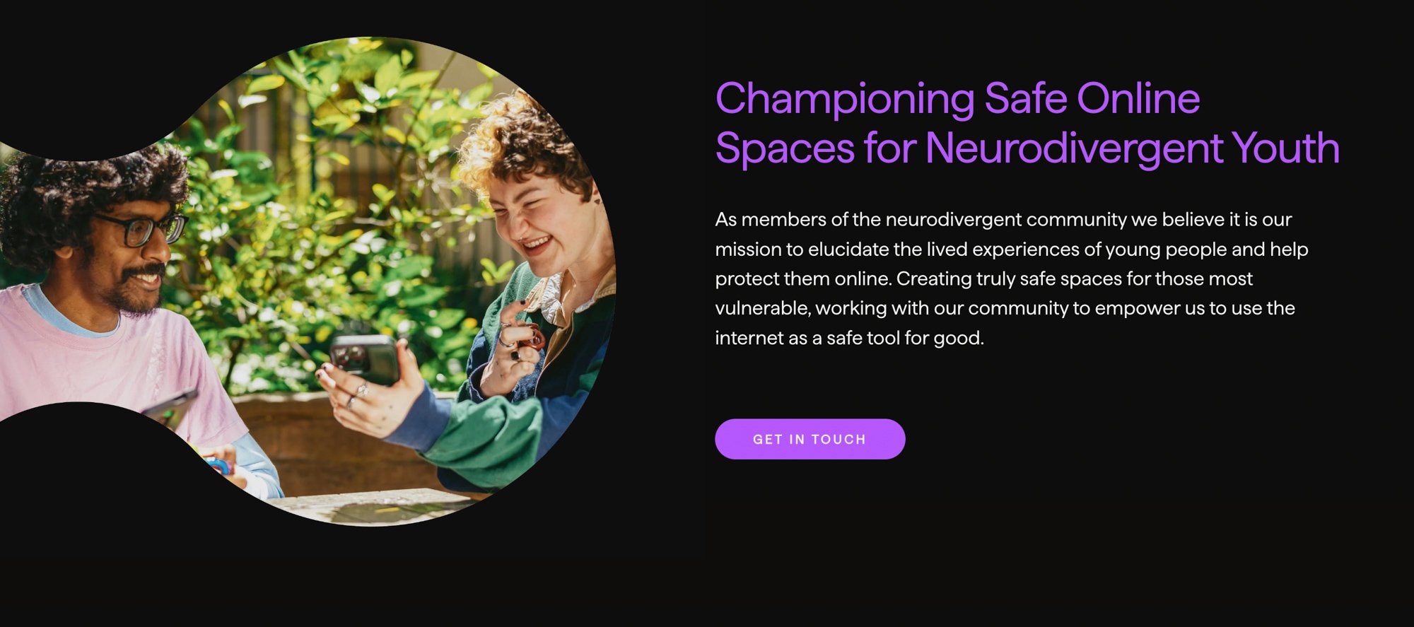
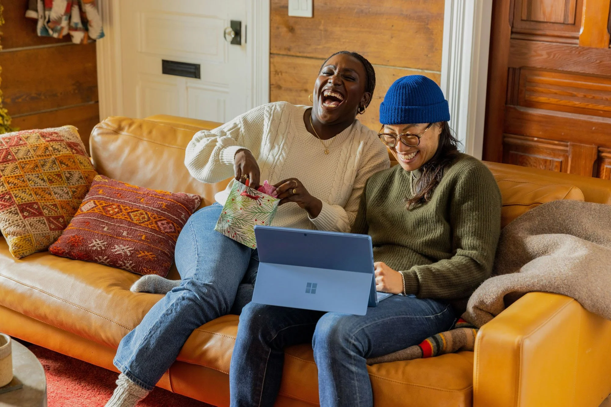
Family-Focused Imagery: We carefully selected caring, relatable images of families to align with the brand’s mission of protection and trust.
Maroon & White Colour Palette: A bold maroon backdrop paired with crisp white text ensures strong readability while reflecting warmth and care.
Mobile-Friendly Design: The site was built to be fully responsive, delivering a seamless experience across phones, tablets, and desktops.
Technical SEO Setup: We implemented SEO-friendly architecture, optimised headings, compressed images, and configured Google Search Console for discoverability.
Squarespace Training & Support: We provided a recorded training session to empower the team to update and manage the site independently post-launch.
The Results
UX & UI Design Outcomes
Improved Readability: The strong colour contrast enhances accessibility and ensures key messages stand out clearly.
Emotional Connection: Family imagery resonates with the audience and reinforces the caring, protective brand message.
Seamless Navigation: The scroll-based design flows naturally, keeping visitors engaged without overwhelming them.
Professional Yet Approachable Presence: The final design balances authority with warmth, making the organisation feel both trustworthy and relatable.
“This company is a pleasure to work with, and they listened to my needs and feedbacks and delivered a quality final product!”
Creative Execution
Impact and Creativity
The creative vision for Deflect & Protect centred around empathy, clarity, and care. The bold maroon background serves as both a grounding and empowering visual choice—symbolising safety, strength, and warmth. Paired with crisp white typography, the design achieves exceptional contrast and readability, ensuring accessibility for all users, including neurodivergent audiences. Soft transitions and smooth scrolling animations guide visitors through the content at a comfortable pace, creating a sense of calm and reassurance. The result is a digital space that feels both emotionally supportive and visually engaging—perfectly reflecting the organisation’s mission to educate and protect families online.
Functionality and User Experience
Every aspect of the user experience was designed with clarity and inclusivity in mind. The layout follows a clear narrative flow, making information easy to digest as visitors scroll through the site. Calls-to-action are woven naturally into the content, encouraging engagement without feeling forced. Each section has been intentionally spaced and balanced to avoid visual overload, ensuring visitors can process information comfortably. The website’s fully responsive design adapts beautifully across screens and devices, maintaining its visual integrity whether viewed on desktop, tablet, or mobile. The end result is an intuitive, accessible experience that puts users at ease while guiding them toward meaningful interaction.

Branding and Storytelling
Deflect & Protect’s new digital identity tells a story of trust, community, and compassion. The colour palette and imagery were selected to evoke feelings of warmth and belonging, positioning the brand as both professional and approachable. Family-focused visuals anchor the storytelling, helping visitors immediately understand the human impact of the organisation’s mission. Thoughtful typography choices add a sense of structure and stability, reinforcing credibility while maintaining friendliness. Throughout the site, the messaging and visuals work in harmony to communicate one clear narrative: this is a brand that cares deeply about people and empowers them to navigate the digital world with confidence.
Execution and Design Excellence
Visuable’s team executed the project with precision and sensitivity, ensuring every design decision aligned with Deflect & Protect’s values and audience needs. CSS enhancements and technical SEO were seamlessly integrated to elevate both form and function. Consistent spacing, structured page hierarchy, and attention to accessibility standards ensured a professional, high-quality finish. The smooth scrolling journey reflects not only design finesse but also an understanding of how users absorb and connect with educational content. The final website embodies design excellence—polished, purposeful, and deeply human—positioning Deflect & Protect as a trusted voice in online safety education.
Summary
With Visuable’s support, Deflect & Protect now has a bespoke Squarespace website that reflects their mission and values. The design blends warmth and professionalism, guiding visitors through an engaging scrolling experience. With its maroon backdrop, family-focused visuals, and intuitive navigation, the website strengthens the brand’s online presence and empowers the organisation to reach and support more families.


Brand photography courtesy of Deflect & Protect
Consult with our Experts
Amazing brands start with an understanding of your goals and vision.
Our team understands the challenges of launching a brand online, and we’re here to answer all your questions and simplify the process for you. Let’s go!
Our Success Stories
Get inspired by real stories of how our designs have made a difference for brands like yours.