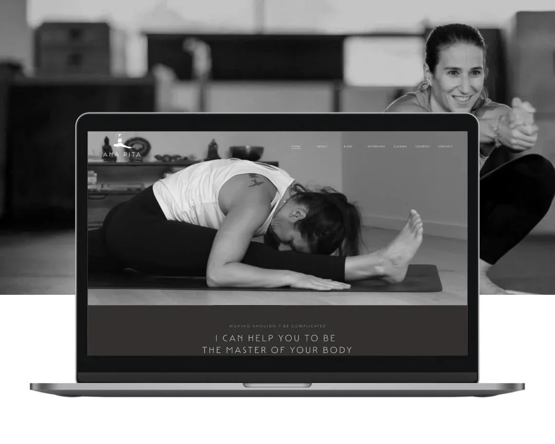
Ana Rita Yoga & Mobility | Australia
Ana Rita Yoga & Mobility
Complete Brand Identity, Full Squarespace Website and E-Learning Platform Case Study
Learn how we helped Ana Rita build a confident and minimal digital presence through complete branding, a Squarespace website, and e-learning platform—later refined through a strategic restyle as her business evolved.
Movement-led brand identity
Streamlined e-learning platform
Simplified content for new direction
Calm and flowy user experience
Project Overview
The Client
Ana Rita is a yoga teacher and mobility coach with advanced training in yoga, anatomy, FRC, meditation, and functional movement. Her practice combines the philosophy of yoga with science-backed mobility training to help people move better, feel stronger, and reconnect with their bodies.
The Challenge
Ana needed a brand that captured both her calm presence and her professional edge. As an expat frequently moving countries, her goal was to build an online platform to sell yoga and mobility bundles while eventually expanding into memberships and 1:1 coaching. She wanted a minimalist design, a space to educate her audience, and a scalable system she could manage herself.
Our Approach
Visuable Packages
To bring Ana Rita’s vision to life, we delivered:
What We Delivered
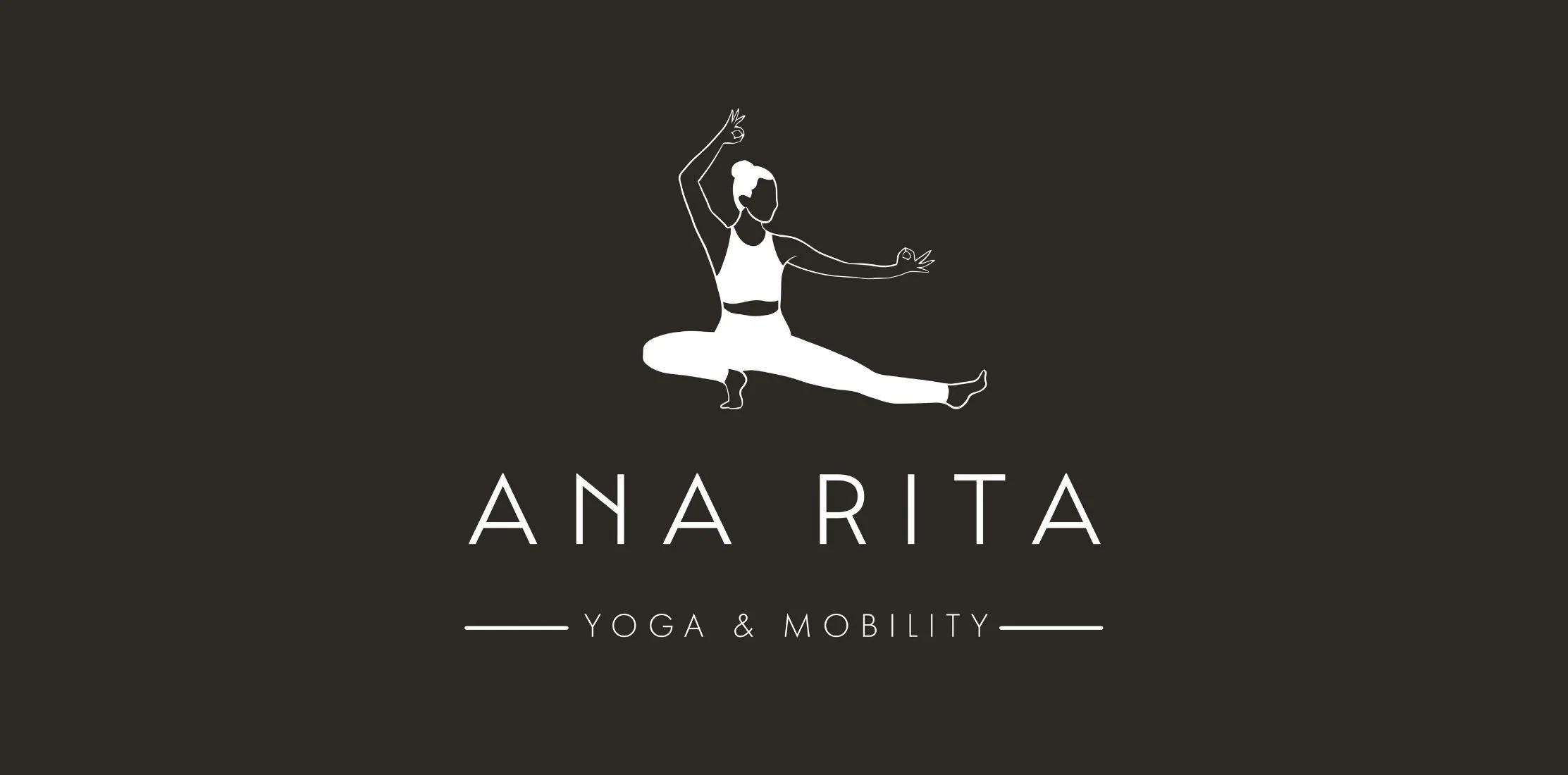
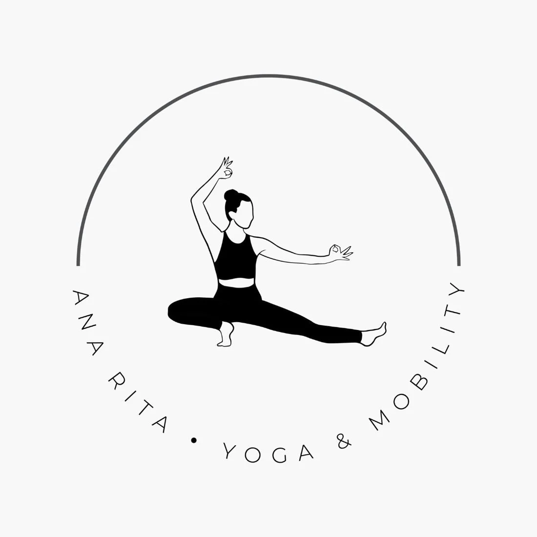
Full Brand Identity System: A modern, flexible suite of logos for “Yoga & Mobility” and “Strength & Mobility,” using minimalist linework and a strong yet calm typeface.
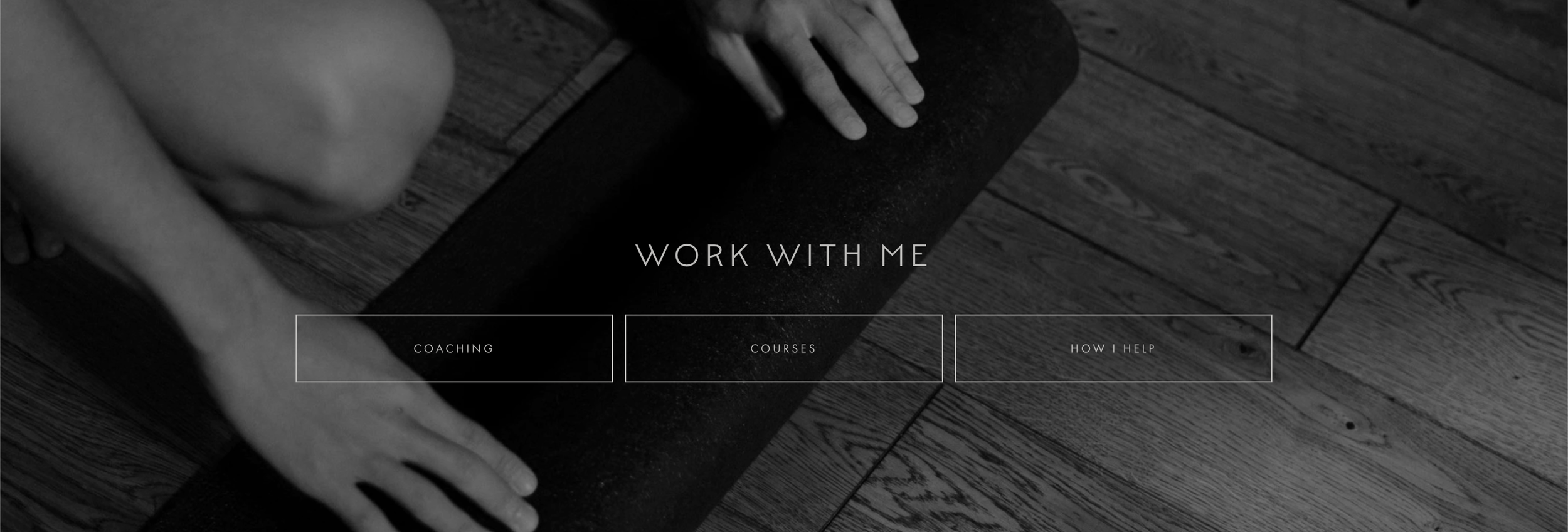
5-Page Squarespace Website: Designed for mobile-first interaction, with dedicated pages for About, Courses, Coaching, Method, and Contact.
E-Learning Integration: Setup of a digital product system to support easy bundle browsing, checkout, and lifetime access.
Strategic Restyle: Refined user journeys, removed outdated offerings, and introduced new pages like "My Method" to support her signature framework.
Client Empowerment: Provided Ana with the tools and training to update her homepage video and future content independently.
Visual Storytelling: Featured Ana’s personal photography throughout to ensure consistency, authenticity, and visual trust.
The Results
UX & UI Design Outcomes
Refined, movement-led brand identity: A dual-brand system that flexes across yoga, mobility, and strength services.
Structured e-learning platform: Clear product layouts make it simple to purchase and revisit content.
Simplified content aligned with new strategy: The site reflects Ana’s shift away from memberships toward method-based coaching.
Calm and flowy user experience: Clean layouts, intuitive navigation, and monochrome design elements guide visitors without overwhelm.
Creative Execution


Impact and Creativity
Ana’s brand was designed to convey clarity, intention, and calm strength. At the centre of the visual identity is a line-drawn yoga pose—simple yet expressive—symbolising movement, stillness, and personal growth. A subtle arc element adds a sense of flow and continuity, while a minimalist mandala brings in a light touch of tradition without overpowering the design.
The muted colour palette of greys, off-whites, and soft neutrals sets a quiet, grounded tone. We avoided any high-contrast or overly vibrant shades to maintain a serene, focused experience across all brand touchpoints. Typography was chosen for elegance and readability, combining clean sans-serifs with generous spacing for a breath-like rhythm throughout the site.
Functionality and User Experience
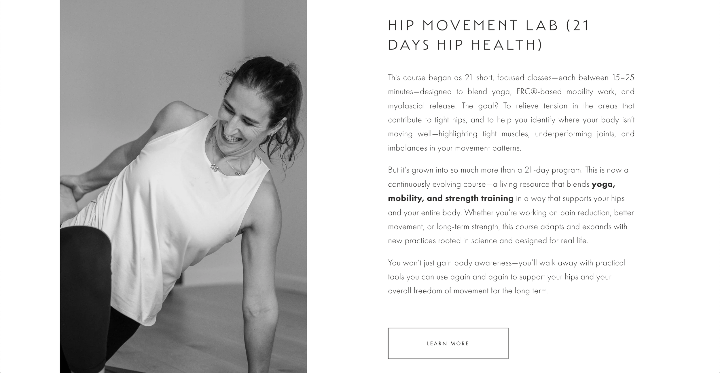
From homepage to course checkout, the user journey was built for simplicity. The layout supports exploration while gently guiding users to take action. The Courses page presents Ana’s digital bundles—like Hip Movement Lab and Spine Movement Lab—in a clean, product-style layout with clear calls-to-action and easy navigation.
The Coaching page provides everything needed to book a 1:1 discovery call, supported by testimonials and benefit-led copy. For those looking to go deeper, the My Method page introduces Ana’s “Strength Her Way” framework. We used expandable accordion sections to break down her method into approachable concepts—covering topics like nervous system regulation, mobility, and strength training—without overwhelming the reader.
All pages are responsive and designed with a mobile experience in mind as well. Whether users are on a laptop, tablet, or phone, the experience remains polished, fast, and functional.

Branding and Storytelling
Ana’s journey is core to her brand, and we built that story into the structure of the site. Her About page tells the story of her shift from working in hospitals to helping people reconnect with their bodies through yoga and mobility. It’s honest, grounded, and speaks directly to her audience’s lived experiences.
The My Method page deepens that story, positioning Ana not just as a teacher, but as an educator with a clear point of view. She communicates complex ideas in a way that’s accessible and empowering, helping users understand the deeper “why” behind her work.
The visual language—especially Ana’s choice of black-and-white photography—adds authenticity and calm. Rather than glossy perfection, her imagery focuses on movement, form, and emotion, reinforcing the human side of the brand.
We also developed two logo systems: one for Yoga & Mobility and another for Strength & Mobility. These visually linked identities give Ana the ability to segment her offers—whether it’s movement education, 1:1 coaching, or digital programs—without losing consistency. This flexibility allows her brand to grow with her business while remaining cohesive.

Execution and Design Excellence
From the initial brand build to the post-launch review and restyle, every step of the project was guided by Ana’s evolving business goals. We created a digital home that’s both strategic and soulful—built to grow, adapt, and support new offerings as her teaching continues to evolve.
The e-learning platform is simple and scalable, the brand is elegant and flexible, and the user experience makes learning and engagement feel effortless. Whether Ana is adding new bundles, launching coaching programmes, or refining her content, she now leads with a digital brand designed for longevity—scalable, manageable, and completely aligned with her values.
Summary
Ana Rita Yoga & Mobility now leads with clarity, elegance, and purpose. Her brand communicates both calm and strength, reflecting the depth of her knowledge and the intention behind her work. With a flexible Squarespace site, e-learning platform, and dual-brand identity system, Ana can confidently grow her offerings—whether it’s launching new courses, expanding 1:1 coaching, or evolving her method. This digital foundation gives her the freedom to move, teach, and inspire—wherever life takes her.

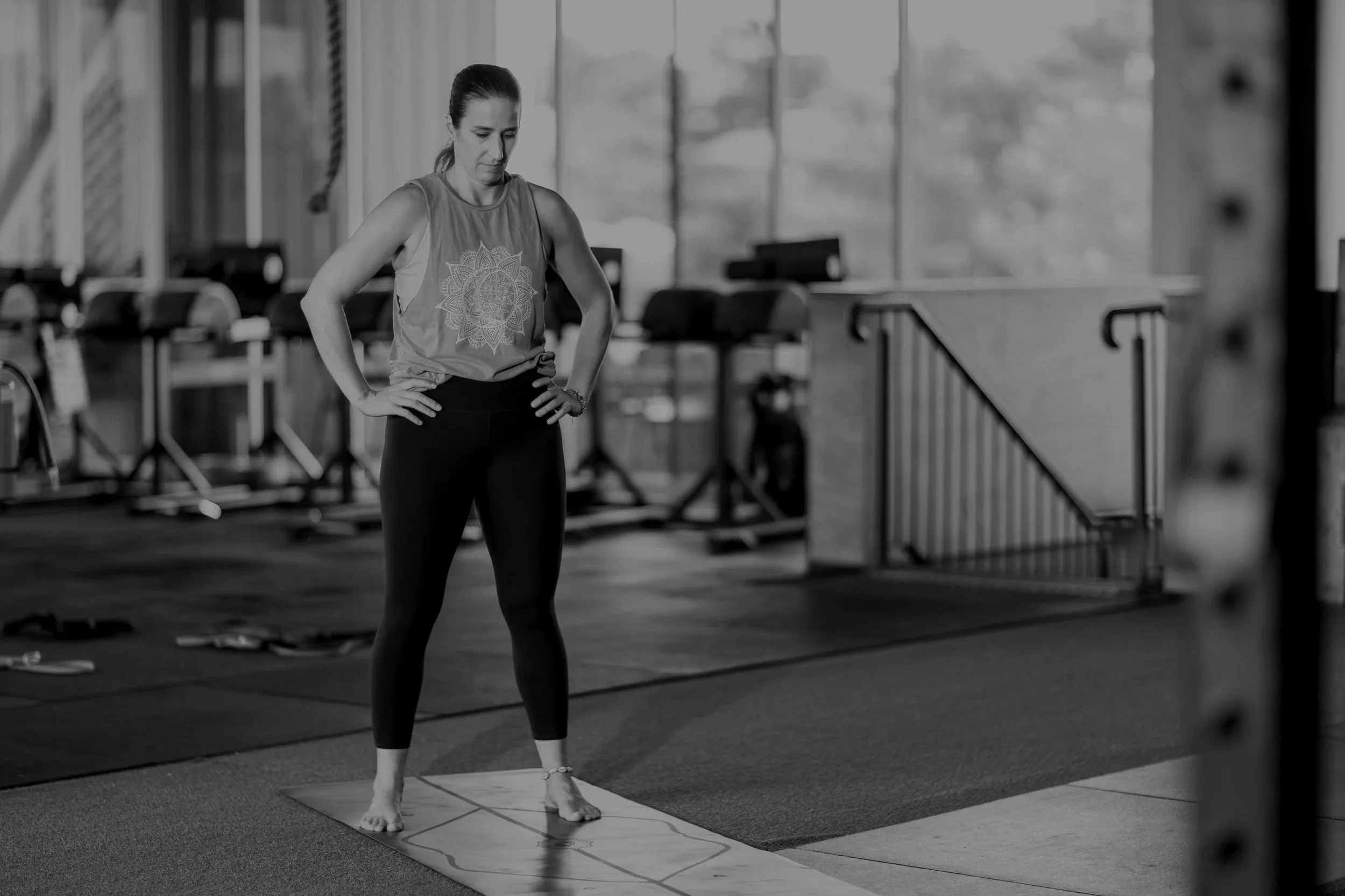


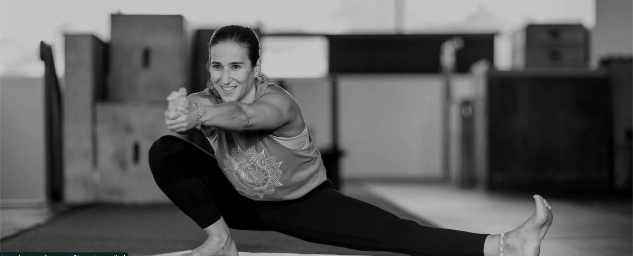
Brand photography courtesy of Ana Rita Yoga & Mobility
Consult with our Experts
Amazing brands start with an understanding of your goals and vision.
Our team understands the challenges of launching a brand online, and we’re here to answer all your questions and simplify the process for you. Let’s go!
Our Success Stories
Get inspired by real stories of how our designs have made a difference for brands like yours.