AlleyFlats | Colorado, USA
AlleyFlats
Complete Brand Identity Design Case Study
Learn how we helped AlleyFlats shape a bold, people-first visual identity to launch their architect-designed ADU brand with clarity and confidence.

Refined logomark
Optimised brand colours
Clear visual hierarchy
Human-first design direction
Project Overview
The Client
AlleyFlats is a Colorado-based business delivering architect-designed, prefabricated Accessory Dwelling Units (ADUs) and Mountain Retreats to homeowners across Denver and beyond. Their mission: to make compact, resilient homes more attainable through turnkey design, permitting, and construction services.
The Challenge
AlleyFlats needed a visual identity that stood out in a crowded real estate and prefab space—something modern, modular, and grounded in architecture, yet warm and emotionally engaging for homeowners. While they had a logomark they liked, they wanted refinement and visual consistency across sub-brands, including AlleyFlats, MountainFlats, and Custom Design.
Our Approach
What We Delivered
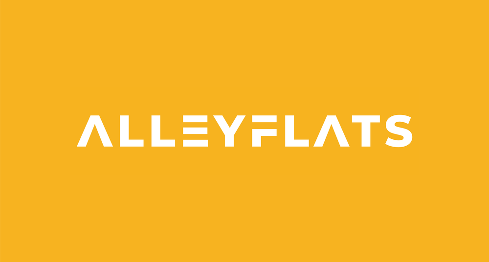
Logo Refinement: We refined the existing logomark to feel less generic and more custom. Subtle tweaks created a more balanced, architectural rhythm while retaining the original concept.
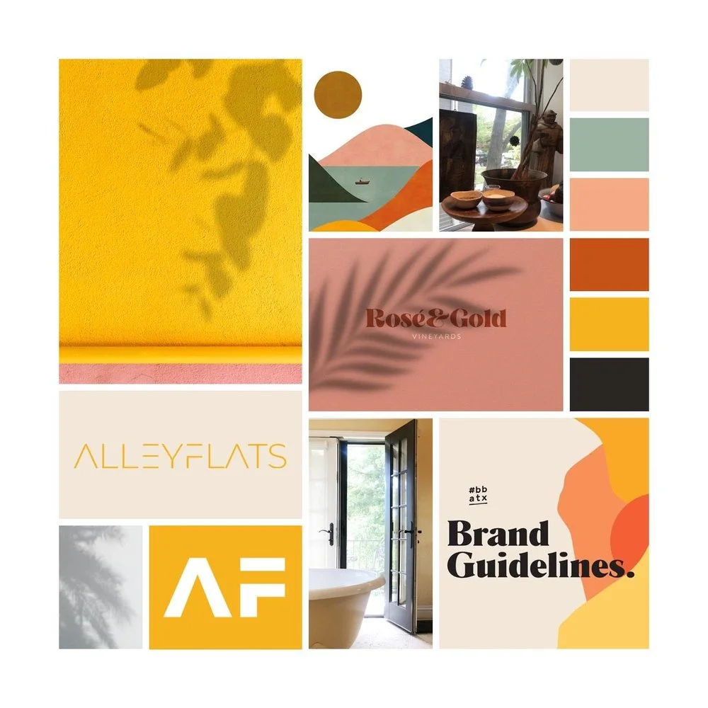
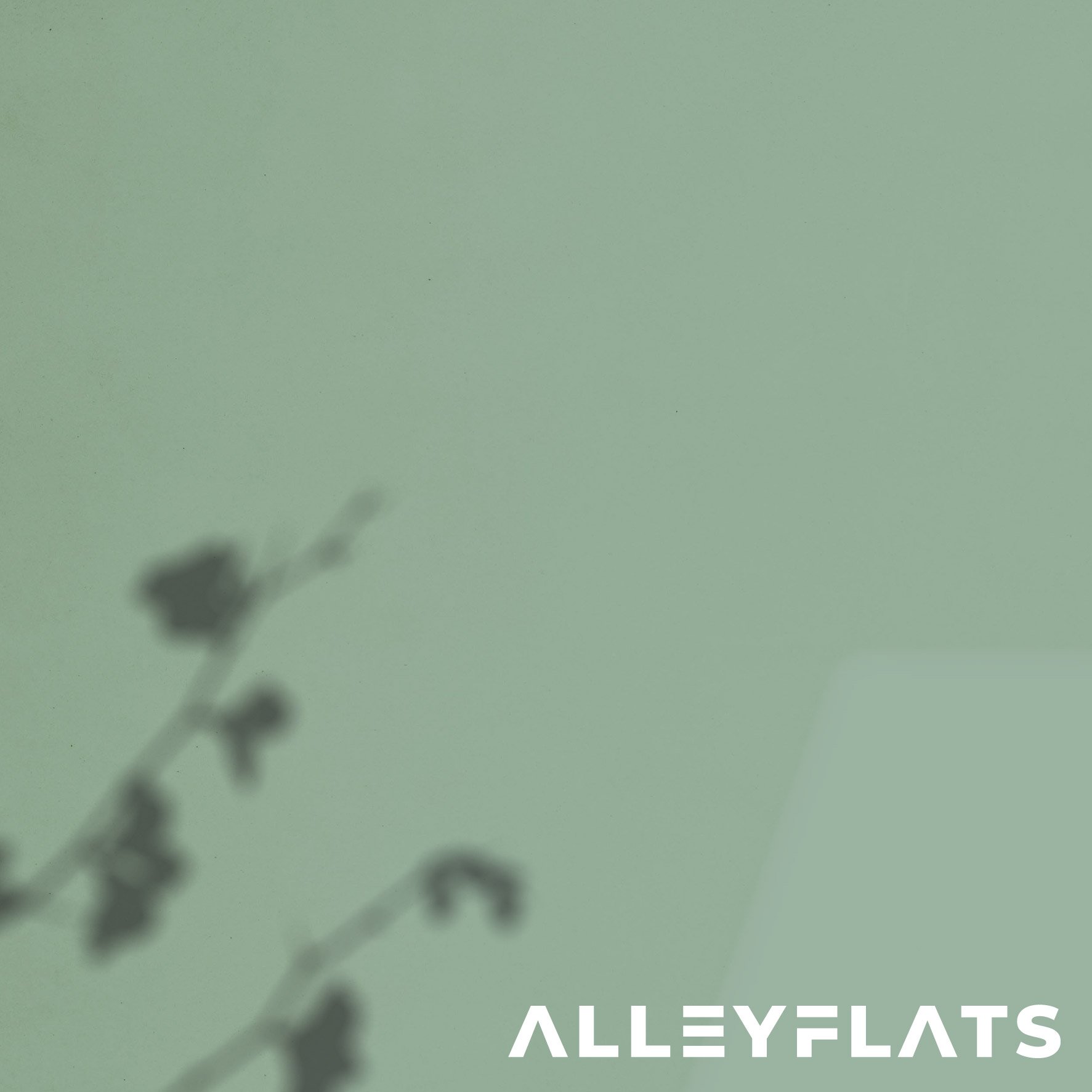
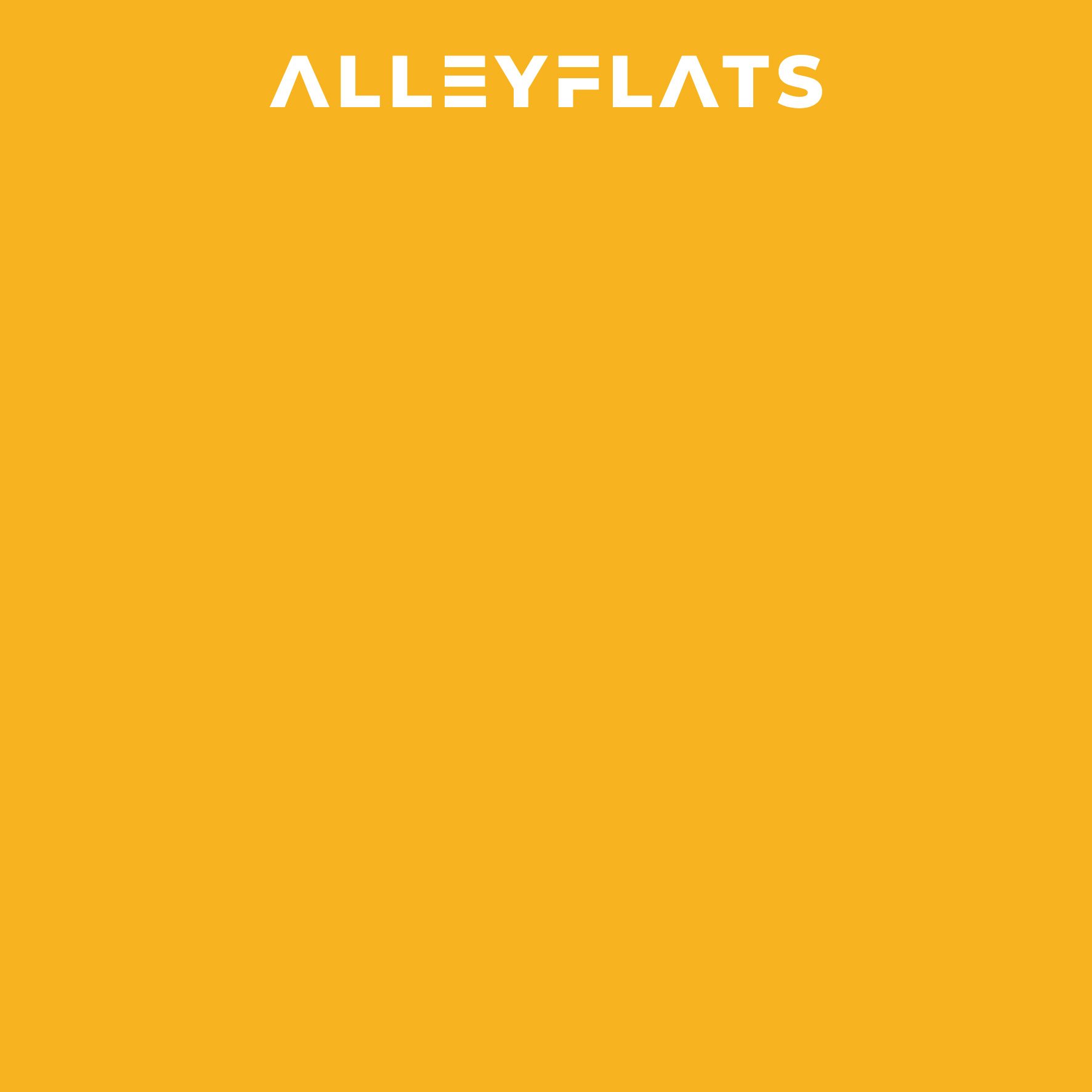
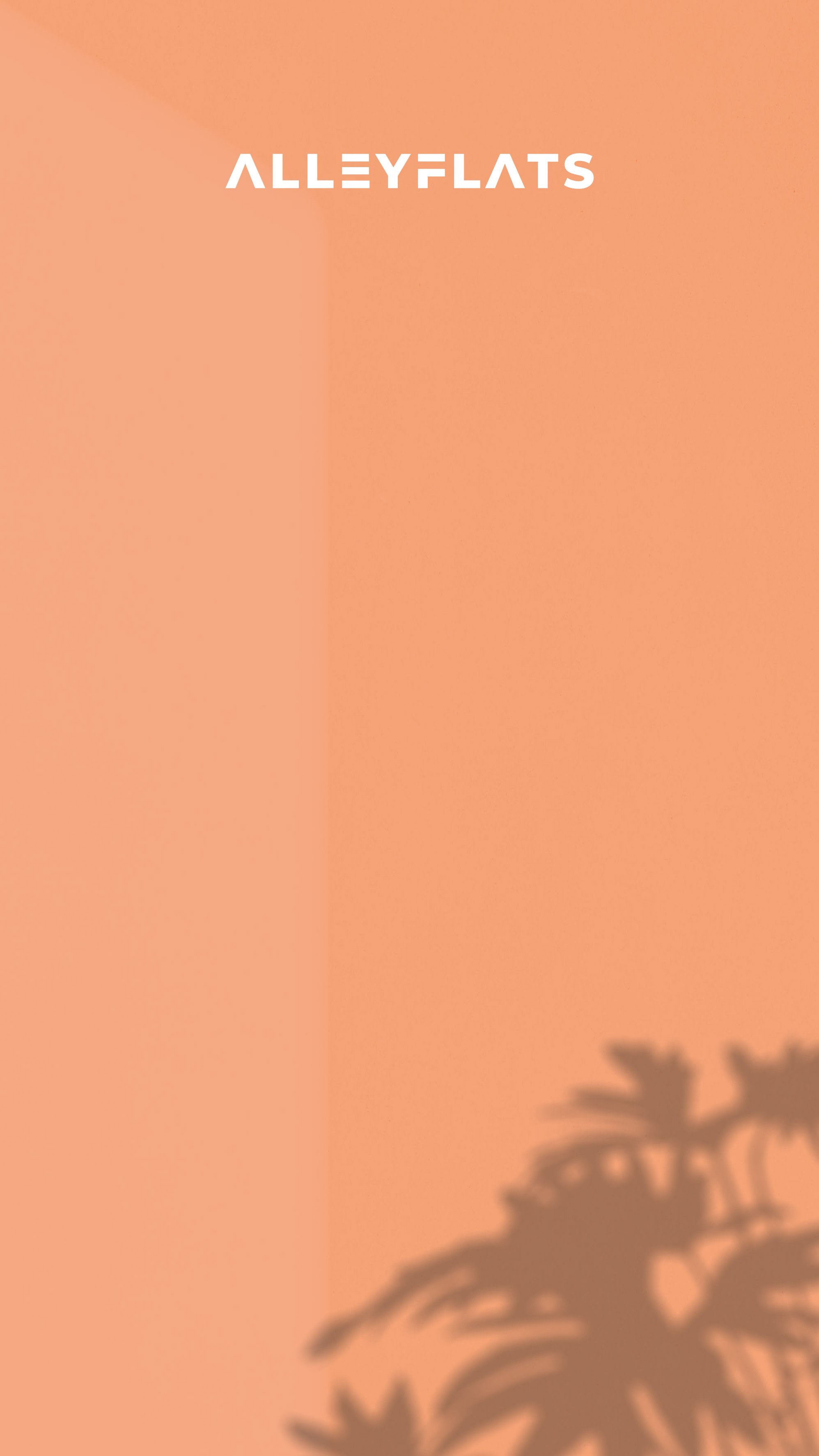
Custom Colour Palette: We created a modern palette inspired by architecture and nature—blending bold raspberry and vibrant orange with earthy chartreuse and warm neutrals for balance and flexibility.
Visual Direction Guide: We provided brand direction inspiration that balanced structure with play—supporting integration of handwritten elements, bold graphics, and modular layouts.
Typography & Layout Styling: We recommended a confident, architectural sans-serif paired with subtle organic touches for headers—striking the right tone between precision and warmth.
The Results
UX & UI Design Outcomes
Architecturally inspired visual language: Refined logotype and layout system reflect modular design thinking—perfectly aligned with AlleyFlats’ prefab offering.
Scalable sub-brand architecture: Developed a cohesive identity system flexible enough to support three distinct product lines while maintaining visual unity.
Warm, future-forward colour palette: Blended natural hues with bright, optimistic tones to convey accessibility, innovation, and human connection.
People-first design principles: Crafted every element with the end user in mind—communicating warmth, adaptability, and long-term value in housing.
Creative Execution
Impact & Creativity
The AlleyFlats identity was crafted to be bold yet approachable—mirroring the brand’s mission to make modern architecture more accessible. The logotype uses architectural forms with softened edges, signalling both precision and warmth. The custom “E” and angled “A” add structure and rhythm, inspired by modular fabrication and compact living. The palette—led by a warm, optimistic yellow—was selected to reflect both sunlight and resilience, setting the tone for a brand built around bright futures and thoughtful design.

Functionality & User Experience
Visual consistency was paired with user adaptability. Each asset—from logo variants to colour applications—was crafted to work across digital platforms, architectural documentation, and printed materials. Whether used on a planning document or a social post, the identity maintains legibility, professionalism, and warmth. The flexible logo formats and clean typographic system make application intuitive for both designers and clients.
The brand also anticipates future use-cases—from on-site signage and branded merchandise to interactive floorplans and homeowner guides. With strong visual hierarchy and accessible design, the identity supports a seamless user experience from first impression to post-construction communication.
Branding & Storytelling
This identity tells a story of practical optimism. Where competitors emphasise square footage and materials, AlleyFlats focuses on adaptability, community, and life within the walls. The visual system amplifies this narrative through colour, shape, and type. Yellow represents hope; the modular layout signals smart solutions; the soft geometric logo mirrors the balance between order and warmth. It’s a system built not just to be seen—but to be understood, remembered, and trusted.
We also embraced a human-centred storytelling approach. By designing a visual style that feels personal and practical—rooted in emotion and functionality—the brand invites connection. It speaks to real people facing real housing challenges with confidence and clarity.


Execution & Design Excellence
From colour calibration to logo scalability, the execution reflects care and precision. The typography hierarchy is clean, contemporary, and architectural—designed to support future rollout across print, web, and even interior signage. Each element was tested for contrast, readability, and cohesion, ensuring the identity performs beautifully across mediums.
The use of modular visual principles—consistent spacing, repetition, alignment—reinforces the brand’s prefab roots without feeling rigid. The result is a system that adapts and grows with the business while staying unmistakably AlleyFlats: modern, meaningful, and made for people.


Summary
With a refined identity, strategic palette, and modular visual system, AlleyFlats is now equipped to confidently present its vision of smarter housing for modern life. This brand identity sets the stage for future storytelling, digital rollout, and the creation of thoughtful, compact homes that feel like more.
Consult with our Experts
Amazing brands start with an understanding of your goals and vision.
Our team understands the challenges of launching a brand online, and we’re here to answer all your questions and simplify the process for you. Let’s go!
Our Success Stories
Get inspired by real stories of how our designs have made a difference for brands like yours.