Scholars & Writers | UK & USA
Scholars & Writers
Essential Identity and Squarespace Website Case Study
Learn how we helped Scholars & Writers craft a sophisticated, text-forward website that speaks to an academic audience by delivering a bespoke brand identity and full Squarespace web design.

Consistent branding
Text-driven design
Audience-specific UX clarity
Streamlined user experience
Project Overview
The Client
Scholars & Writers is a consultancy dedicated to supporting academics through writing coaching, developmental editing, and faculty development services. Their clientele includes Ph.D. students, faculty, researchers, and independent scholars seeking to advance their academic careers.
The Challenge
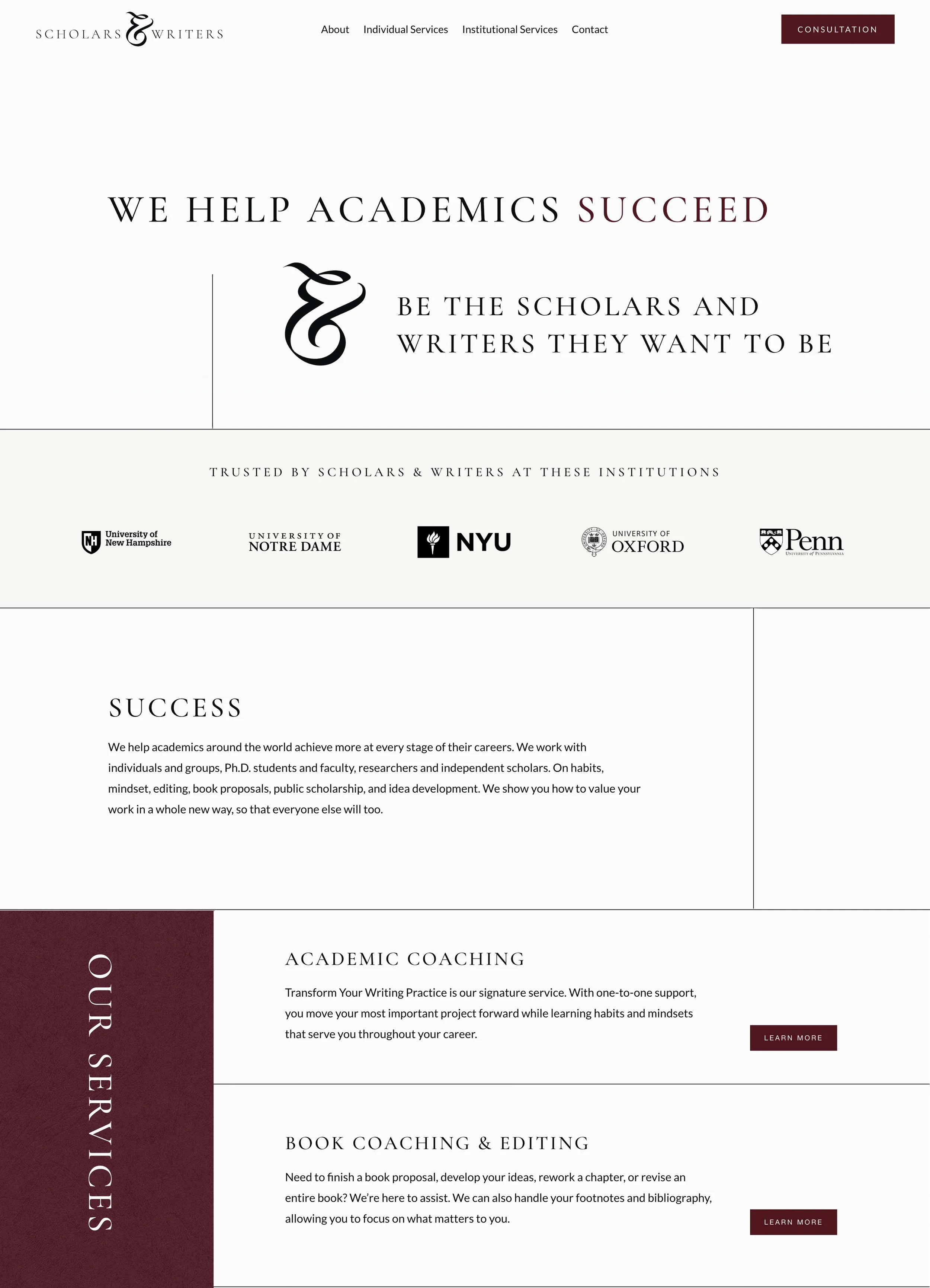
The client required a website that diverged from conventional designs—favoring a text-rich, image-light approach that would appeal to a discerning, scholarly audience. The goal was to create a sophisticated, minimalist digital space that foregrounds content and reflects the intellectual rigor of their services.
Our Approach
Visuable Packages
To deliver on this vision, we curated a focused design experience:
What We Delivered
Brand identity design: Created a minimalist yet distinctive logo, refined font pairings, and a deep-toned colour palette to reflect intellectual depth.
Typography-focused layout: Emphasised font weight, spacing, and typographic rhythm to guide the reader through dense, meaningful content.
5 custom-designed Squarespace pages: Each page was tailored for clarity and flow, structured around how academics process and engage with information.
Texture-rich background styling: Introduced tactile, paper-like visual elements to evoke a sense of timeless editorial quality.
Subtle animation and transitions: Used elegant scroll effects and fade-ins to enrich the user experience without overwhelming it.
SEO-ready foundation: Included basic SEO optimisation to ensure discoverability among niche audiences in academia and writing.
The Results
UX & UI Design Outcomes
Typographic-led visual identity: Reinforced the credibility and sophistication of the brand through expressive, editorial-style text design.
Visually engaging layout with minimal imagery: Proved that strong design can be achieved with text as the hero, rather than relying on photos or graphics.
Clear, confident content flow: Guided users seamlessly through complex service offerings with intuitive page structures.
Tailored to a niche audience: Delivered a digital experience that meets the expectations of academic professionals and deep thinkers.
“We asked Inka for something unusual and difficult: a site driven by text and texture with few images + a sophisticated mood for a highly-educated audience. She went above and beyond every step of the way. We appreciated her artistic strengths (especially her typography training) as well as her willingness to explain design choices in detail. She never stopped until absolutely everything was just as our audience would want it. Highly recommend!”
Creative Execution

Impact and Creativity
This project challenged conventional web design by placing language—rather than visuals—at the center of the experience. From the outset, we committed to designing a site where text and texture did the heavy lifting. Inspired by academic journals and literary magazines, we constructed a layout where typographic finesse became the primary visual tool. The use of elegant serif fonts conveyed depth and formality, while clean sans-serifs brought modernity and clarity to headers and calls to action.
Subtle design details elevated the textual interface: deliberate spacing, tonal blocks, and quiet transitions served to pace the reading experience, allowing each word to carry its weight. Decorative linework and soft overlays added visual rhythm without disrupting the site’s quiet authority. The result is a website that feels less like a typical business site and more like a well-edited manuscript—minimal yet full of presence.
Functionality and User Experience
To match the intellectual tone, the navigation is restrained, clear, and intentional. Every page flows logically into the next, guiding visitors through the brand’s offerings with ease and confidence. We structured the content so that each section builds on the last—mirroring the thoughtfulness of a well-organized argument. No dropdowns, no clutter—just a clear journey through values, services, and outcomes.
The interface was designed to be distraction-free yet rich in nuance. CTAs are embedded with care, appearing only when the reader is naturally ready to take action. Subtle hover states and motion cues add a layer of refinement, while the mobile experience remains just as typographically polished and well-paced. The design respects the user’s attention, creating an experience that feels composed, not hurried.
Branding and Storytelling
Although the visual branding is understated, it’s no less intentional. We leaned into the natural storytelling power of structure, typography, and tone. Rather than using logos or imagery to define the brand, we let the way the site reads and feels carry the message. This subtle form of storytelling is well suited to Scholars & Writers’ audience: intelligent, text-oriented, and sensitive to design that respects their intellect.
The voice and brand presence come through in cadence and clarity—how the copy is structured, how the sections unfold, and how the layout gently guides the eye. Each choice supports the brand’s core proposition: clarity, depth, and thoughtful coaching. The site not only informs, it invites reflection.


Execution and Design Excellence
Delivering a site this refined meant working with extreme attention to detail. Typography was tested and fine-tuned across breakpoints. Line lengths were adjusted for optimal readability. Content modules were designed to create flow without fatigue. The absence of heavy visuals placed even greater emphasis on the mechanics of design—spacing, rhythm, balance—which we executed with precision.
Rather than relying on visuals to create impact, we used design to reveal the weight and intention of every word. The site performs beautifully across devices and browser types, but beyond function, it feels distinctly human. That’s the real mark of success here: a content-rich site that whispers, rather than shouts, and still leaves a lasting impression.
Summary
Scholars & Writers now has a digital home that reflects its values, expertise, and audience. Through a typography-first, image-light approach, we delivered a website that feels as intellectually rigorous and refined as the work they support. The result is a content-led platform built with quiet confidence—tailored for an audience that values depth, clarity, and intellectual integrity.


Consult with our Experts
Amazing brands start with an understanding of your goals and vision.
Our team understands the challenges of launching a brand online, and we’re here to answer all your questions and simplify the process for you. Let’s go!
Our Success Stories
Get inspired by real stories of how our designs have made a difference for brands like yours.