D’Witches | Mexico City, Mexico
D’Witches
Complete Brand Identity Design Case Study
Learn how we helped D’Witches launch a bold, high-energy brand identity to match their global rise in the electronic music scene.
Iconic visual identity
Bold colour strategy
Scalable logo system
Distinctive social media presence
Project Overview
The Client
D’Witches is a globally recognised DJ duo made up of sisters Thania and Thamara. Born in Mexico and now playing shows across iconic locations like Ibiza, Mykonos, and Miami, their performances combine afro house beats with playful remixes and unmistakable sibling energy. From IT Tulum to Sexy Fish Miami, they’ve built a powerful reputation for electrifying sets and matching outfits that double as a performance signature.
The Challenge
With an ambitious vision to build a brand that expands into fashion, mezcal, and beyond, D’Witches needed a strong brand foundation to unify their presence. They sought something expressive, loud, and modern—an identity that reflected their vibrant personalities and positioned them as one of the most iconic acts in the music industry. The brand had to feel wild, stylish, and memorable, with flexibility to grow into sub-brands and product lines.
Our Approach
What We Delivered
Brand Discovery & Strategy: Uncovered the duo’s values, vision, and high-energy mission to inspire global connection through music.
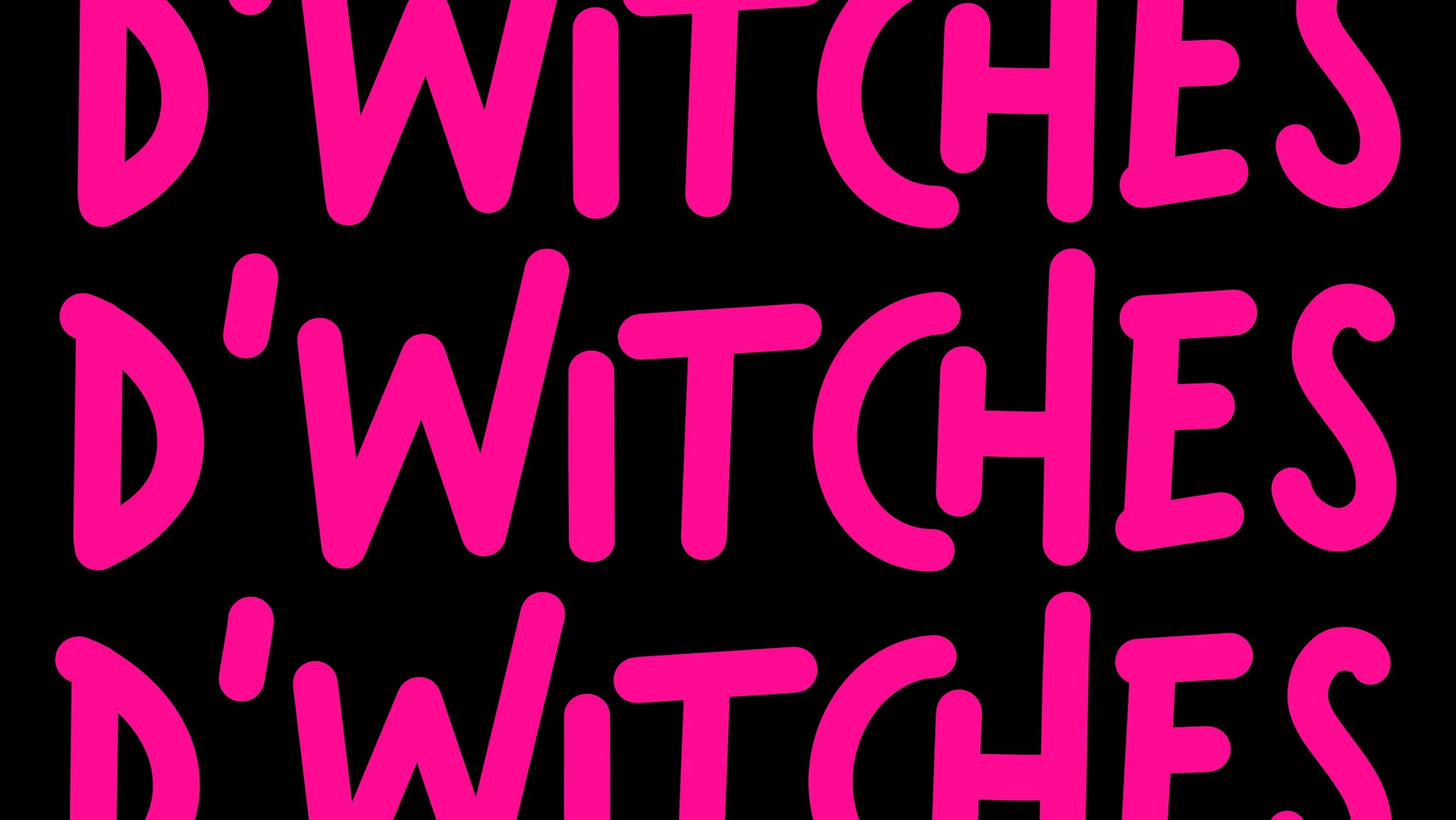
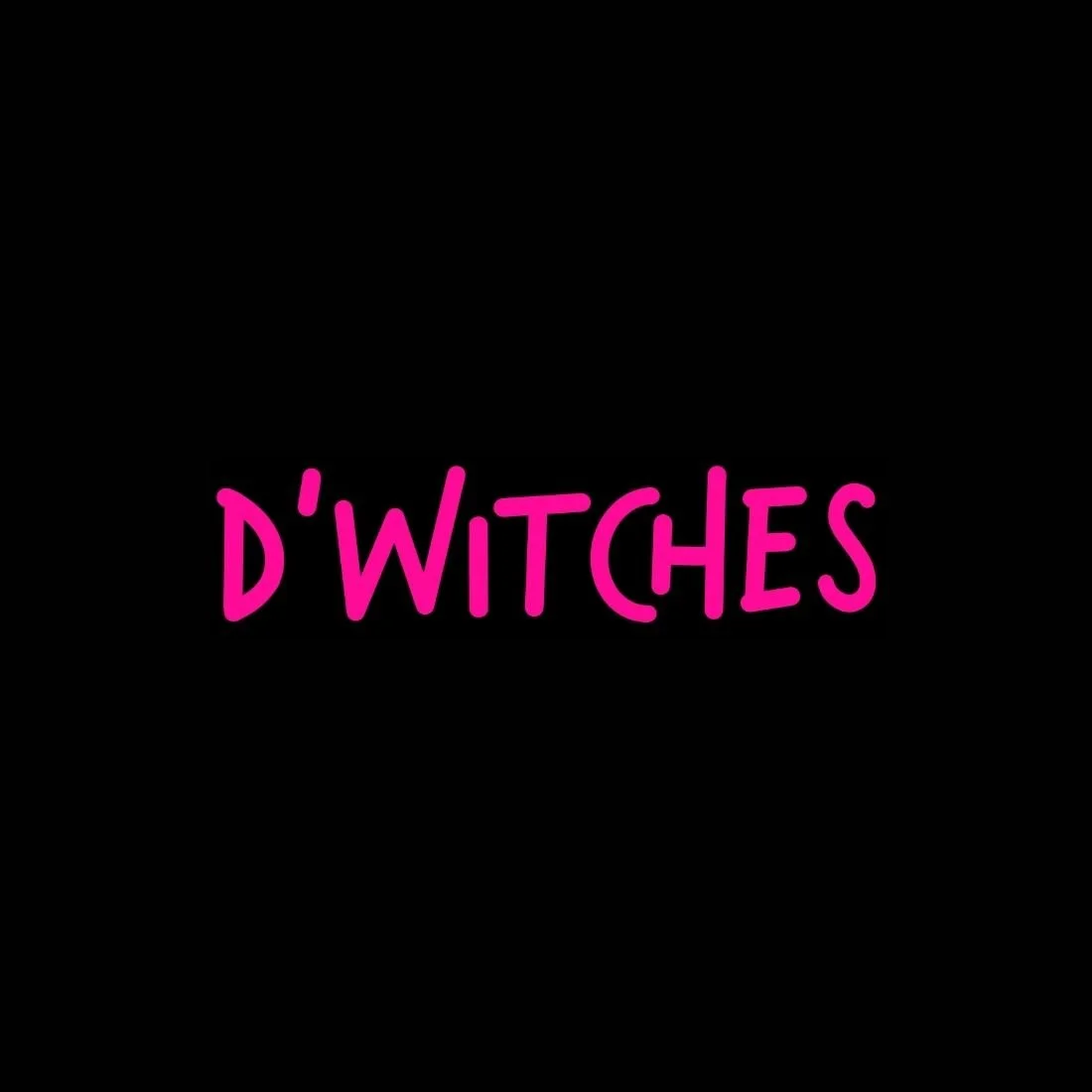
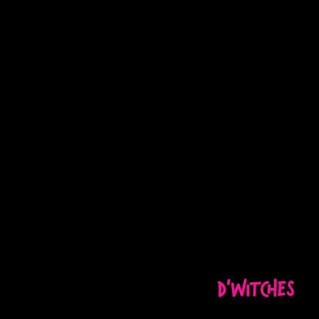
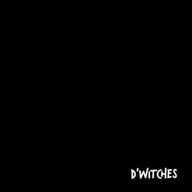
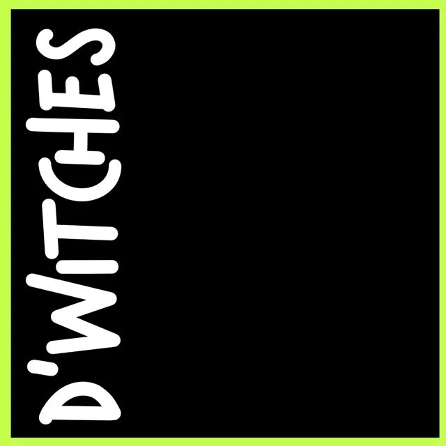
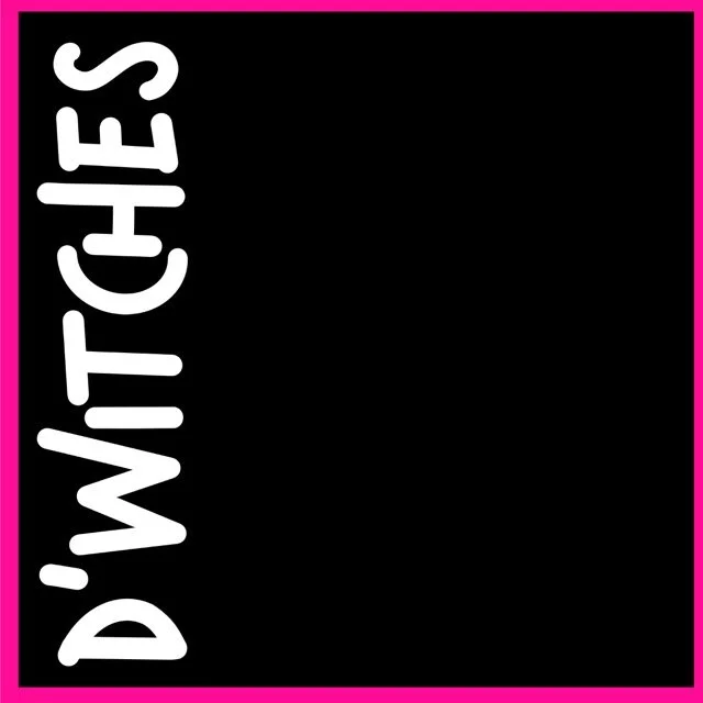
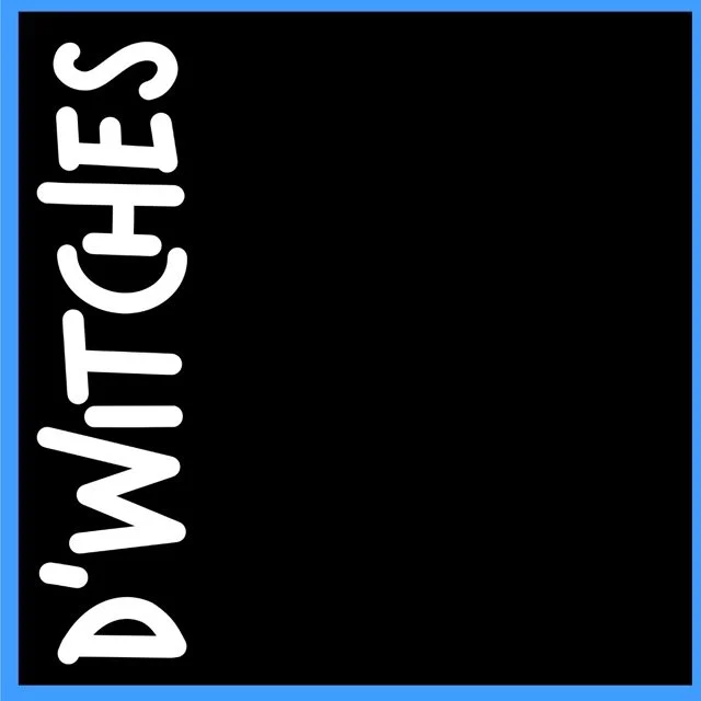
Primary & Secondary Logo: A bold, custom wordmark with an edgy handwritten style—flexible across merchandise, banners, and digital formats.
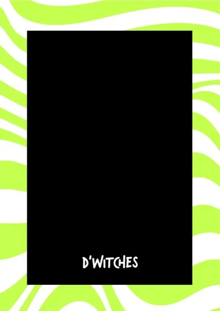
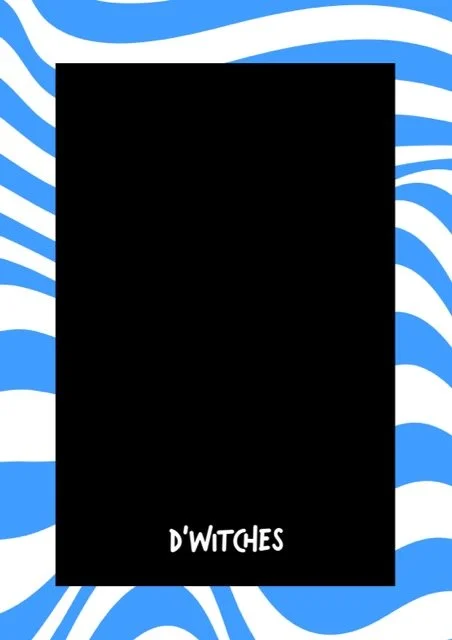
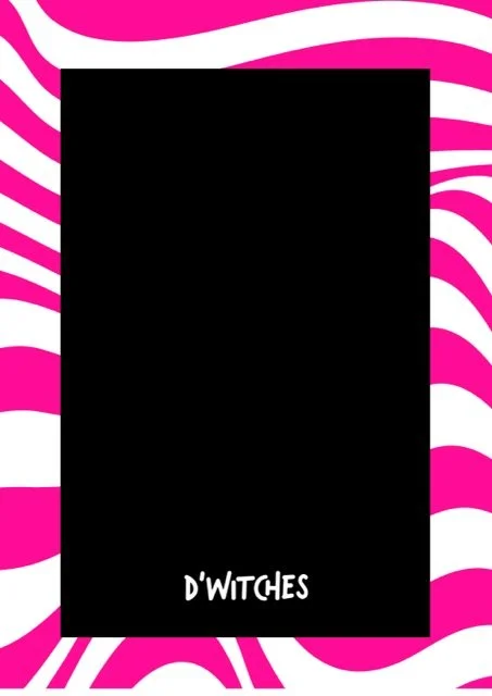
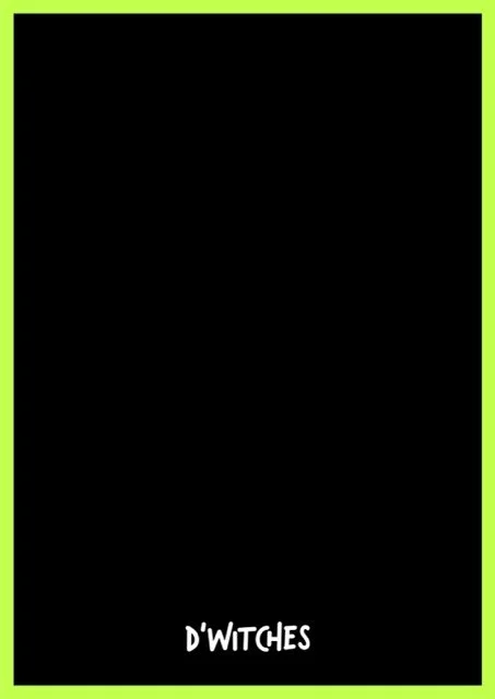
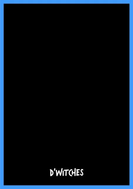
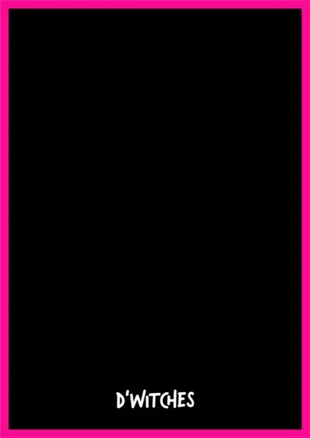
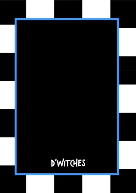
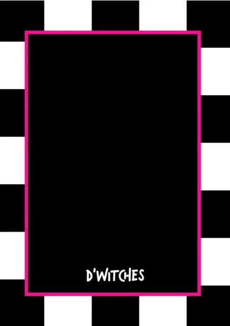
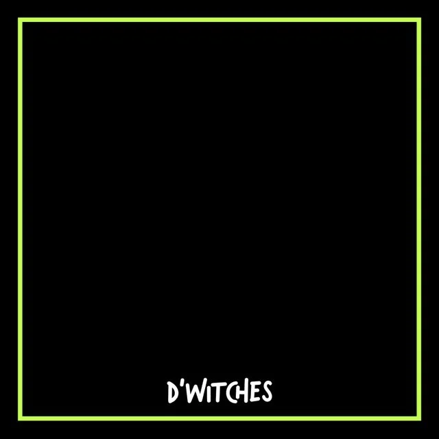
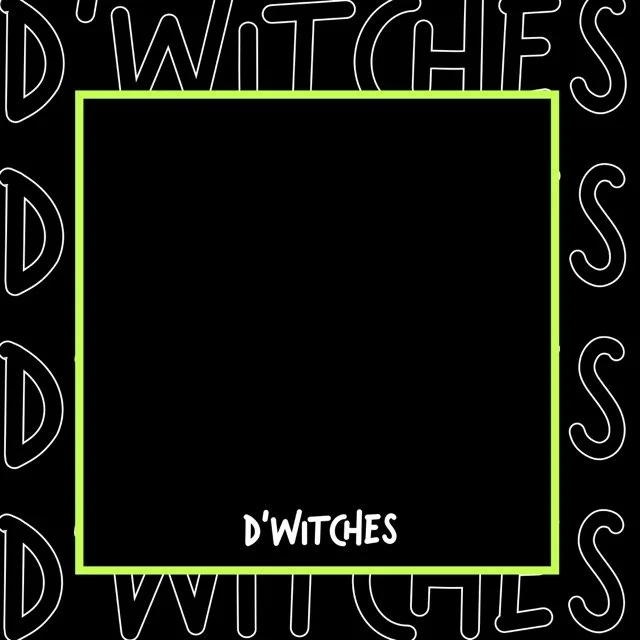
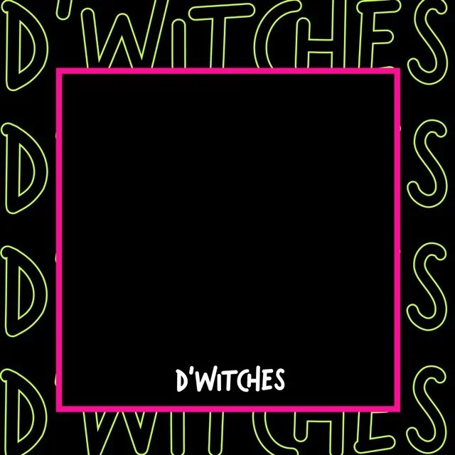
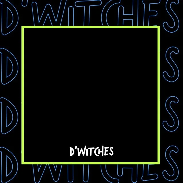
Colour Palette: High-impact neons—electric pink, lime, cyan—balanced with black and white for high contrast and versatility.
Typography System: Combined playful title fonts (Verveine) with minimalist body fonts (Quasimoda) to match their duality of fun and professionalism.
Social Media Templates: Designed a dynamic suite of branded visuals in square, story, and vertical formats to support consistency across platforms and visuals for events and performances.
Style Guide: Delivered detailed brand guidelines covering usage, colour combinations, logo lockups, and scalable assets for future growth.
The Results
UX & UI Design Outcomes
High-impact visual presence: Crafted a distinctive look using bold typography and saturated neons that stand out on stage, screen, and social.
Emotion-led logo design: The custom hand-lettered wordmark evokes the duo’s energy, sisterhood, and rebellious spirit—instantly recognisable across all brand assets.
Performance-ready digital system: Built for speed, scale, and soundcheck—ensuring legibility, visibility, and visual punch in fast-paced music environments.
Brand toolkit with longevity: Equipped the duo with scalable templates, colour systems, and brand rules to confidently grow into new markets—from merch to mezcal.
Creative Execution

Impact & Creativity
D’Witches' refreshed brand identity is a vibrant celebration of sound, sisterhood, and self-expression. Inspired by pop art, club culture, and fashion-forward visuals, the moodboard guided us to create a bold, neon-charged design language that radiates personality. The logo’s hand-lettered energy mirrors the duo’s live performances—unfiltered, confident, and full of motion. Colour becomes a character of its own, with highlighter yellow, hot pink, electric blue and stark black commanding attention and reflecting the high-tempo environments D’Witches perform in.
Every visual choice—from the striking typography to the unpredictable graphic elements—was made to evoke feeling. This isn’t just a logo; it’s a vibe that fans instantly recognise. The brand delivers a sense of movement, fun, and fearless femininity, making it instantly iconic across posters, backdrops, and socials.


Functionality & User Experience
We designed the identity with flexibility in mind. From stage visuals and merchandise to digital assets and social media posts, the brand adapts effortlessly. The high-contrast colours are screen-ready and performance-proof, while the bold fonts remain legible in low-light or fast-scrolling environments. Social templates in all key formats (vertical, square, story) support D’Witches' high-volume content needs with a cohesive look and feel.
Branding & Storytelling
The identity tells the D’Witches story without words—bold, magnetic, sister-led energy breaking norms in a male-dominated space. The hand-rendered logotype reflects their raw passion and live performance style, while the loud colourways and abstract graphics underscore their fearless and fashion-forward stage presence. This is branding that feels alive—dynamic, recognisable, and impossible to ignore.

Execution & Design Excellence
We combined punchy typography like Verveine and Quasimoda with colour-blocking techniques to ensure consistency across touchpoints, while still feeling fresh and playful. Every asset was tested across print and digital contexts, ensuring scalability and strength. From pop-up visuals to festival flyers, this brand is built to perform—just like D’Witches.


Summary
D’Witches now stands out as a powerful, memorable brand in the global music scene. With a vibrant and scalable identity designed to grow with them, they’re equipped to expand across industries—from performance to product—without losing their bold, rebellious soul. Their new brand doesn’t just reflect their energy—it amplifies it.
Consult with our Experts
Amazing brands start with an understanding of your goals and vision.
Our team understands the challenges of launching a brand online, and we’re here to answer all your questions and simplify the process for you. Let’s go!
Our Success Stories
Get inspired by real stories of how our designs have made a difference for brands like yours.