Catalyst Litigation | London, UK
Catalyst Litigation
Full Squarespace Website & Essential Brand Identity Case Study
Learn how we helped Catalyst Litigation build a visually striking, multilingual digital presence by delivering a Full Squarespace Website, 9 Additional Pages, Essential Brand Identity, and a Translation Plugin Integration.

Improved clarity of complex legal information
Enhanced user journey across all service pages
Elegant, trustworthy brand identity
Seamless English–Chinese translation experience
Project Overview
The Client
Catalyst Litigation is a legal and financial consultancy supporting international clients seeking redress for failed UK property investment schemes. Their work combines litigation management, group action coordination, and high-level financial remediation.
The Challenge
The client needed a comprehensive, visually engaging website that communicates complex legal processes clearly and professionally. A key requirement was to make the site accessible in both English and Chinese to support their global client base.
Our Approach
Visuable Packages
To bring Catalyst Litigation’s vision to life, we delivered:
What We Delivered
Custom multi-page website design: Created a polished, high-authority layout that presents legal information with clarity and professionalism.
Essential brand identity: Developed a refined visual system with typography, colours, and logo variations that reflect trust and credibility.
Service-specific page structures: Crafted clear, informative layouts for each litigation service, allowing users to understand complex concepts quickly.
English–Chinese translation integration: Implemented a seamless multilingual experience to support Catalyst Litigation’s international audiences.
User-centred navigation: Designed an intuitive menu system that helps visitors find the right information without overwhelm.
Technical SEO groundwork: Applied foundational SEO to ensure proper indexing, responsive performance, and clean architecture.
The Results
UX & UI Design Outcomes
Clear, structured content presentation: The new layout makes complex legal services easy to understand at first glance.
Improved cross-language accessibility: Dual-language capability supports global clients and increases usability.
Consistent visual identity: The refined branding establishes trust and recognition across all pages.
Enhanced user flow: Visitors can now navigate multi-step legal processes with ease, increasing confidence and engagement.
Creative Execution


Impact and Creativity
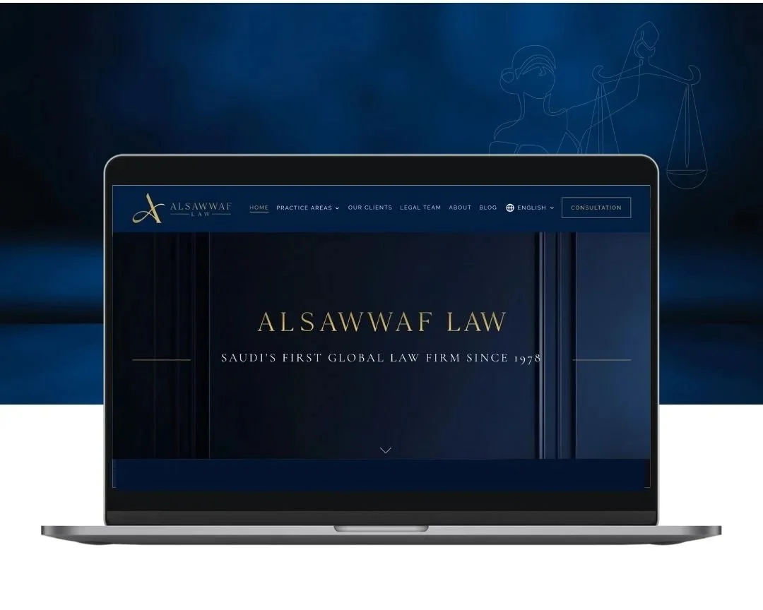
Catalyst Litigation’s website delivers immediate impact through a refined, understated aesthetic that communicates authority without overwhelming the visitor. The homepage hero—featuring a calm, tonal cityscape overlay—sets the tone for a consultancy that operates with precision, clarity, and composure. This visual restraint is intentional: it supports the legal nature of the brand while allowing content to remain the focal point. A considered use of colour accents, such as deep blues and muted greys, reinforces credibility and guides the eye through carefully structured layouts.
The site leverages strategic spacing and modern typography to simplify dense information, helping users engage with the narrative effortlessly. Each page follows a consistent visual rhythm—introductory statements, concise summaries, and structured content blocks—designed to reduce cognitive load. The creative direction expresses quiet confidence, positioning the brand as both professional and approachable. This combination of elegance and clarity encourages visitors to explore further, building trust from the very first interaction
Functionality and User Experience
The site’s functionality is built around accessibility, clarity, and user flow. Each litigation pathway—such as failed property investments or group claims—is divided into structured sections that break down the consultancy’s processes into clear, manageable steps. On the homepage, concise blocks guide users directly to key service areas, ensuring intuitive navigation for individuals unfamiliar with legal terminology.
Service pages are designed with scannability in mind, using progressive disclosure: visitors can read a simple overview at the top before diving into more detailed explanations further down the page. This supports both high-intent users seeking immediate clarity and those gathering broader information.
An integrated translation plugin provides seamless English–Chinese switching, retaining page layout and formatting across languages for a consistent experience. The mobile experience is equally refined, with responsive typography, fluid spacing, and reorganised content blocks that ensure readability on smaller screens. Every functional decision enhances the overall usability of the site, ensuring global visitors can understand complex legal processes with ease and confidence.
Branding and Storytelling
Catalyst Litigation’s Essential Brand Identity forms the backbone of the website’s tone and presence. The logo and typography are refined and minimal, mirroring the consultancy’s analytical, methodical approach while retaining a sense of warmth. The colour palette—anchored in deep blues and sophisticated neutrals—adds stability and reassurance, qualities that are essential when engaging clients facing financial or legal uncertainty.
Throughout the site, the brand voice is consistent: calm, supportive, and knowledgeable. Headings are written in clear, direct statements that acknowledge the seriousness of the client’s challenges while offering practical clarity. Imagery is chosen with intention—urban architectural motifs and subtle textures communicate structure, reliability, and global perspective.
Together, these visual and verbal elements construct a compelling narrative of expertise. The storytelling is not dramatic; instead, it reassures, clarifies, and positions Catalyst Litigation as a trusted partner capable of guiding clients through high-risk legal disputes with professionalism and care.

Execution and Design Excellence
Every aspect of the design demonstrates a meticulous approach to structure, consistency, and polish. Page layouts use generous white space to frame content, making lengthy or complex information easy to read. Key concepts are highlighted through subtle visual cues rather than heavy-handed graphics, maintaining a premium, consultancy-grade aesthetic.
The multi-page site is organised logically, with each page serving a precise purpose—from defining the consultancy’s role to outlining specific services, processes, and outcomes. Technical execution includes responsive page behaviour, crisp page transitions, and seamless plugin integration, ensuring a smooth user experience across devices. The multilingual implementation has been configured to maintain brand integrity in both English and Chinese, preserving spacing, alignment, and hierarchy.
These details culminate in a digital presence that balances beauty with functionality. The design feels timeless, authoritative, and frictionless—built not just to look impressive today, but to remain scalable and dependable as Catalyst Litigation expands its portfolio and global reach.
Summary
Catalyst Litigation’s website now stands as a sophisticated, multi-page digital platform that communicates complex legal services with clarity and confidence. With a refined brand identity, intuitive navigation, and seamless Chinese translation, the site supports both local and international clients with ease. The project demonstrates how thoughtful design, precise messaging structure, and multilingual functionality can elevate a consultancy’s online presence and enhance client trust.


Consult with our Experts
Amazing brands start with an understanding of your goals and vision.
Our team understands the challenges of launching a brand online, and we’re here to answer all your questions and simplify the process for you. Let’s go!
Our Success Stories
Get inspired by real stories of how our designs have made a difference for brands like yours.