aKin | Toronto, Canada
aKin | Toronto
Full Website Design Case Study
Learn how we helped aKin, a fine-dining restaurant in Toronto, elevate their digital presence with a refined, brand-led website design.
Clean, elevated website aesthetic
Cohesive colour palette and typography
Improved clarity and flow across the site
Timeless design foundation
Project Overview
The Client
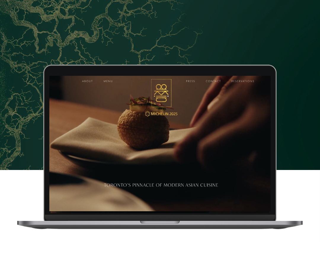
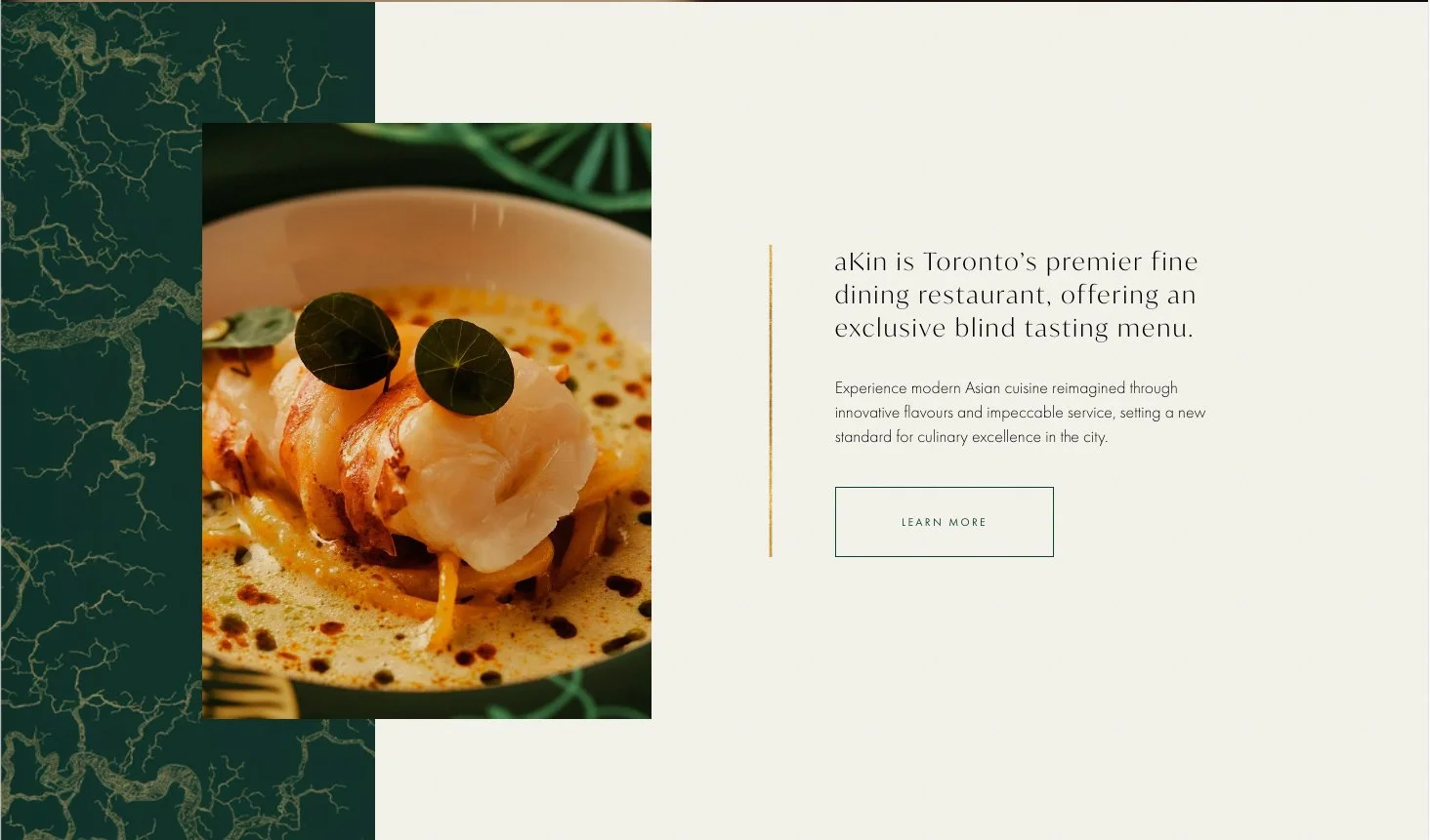
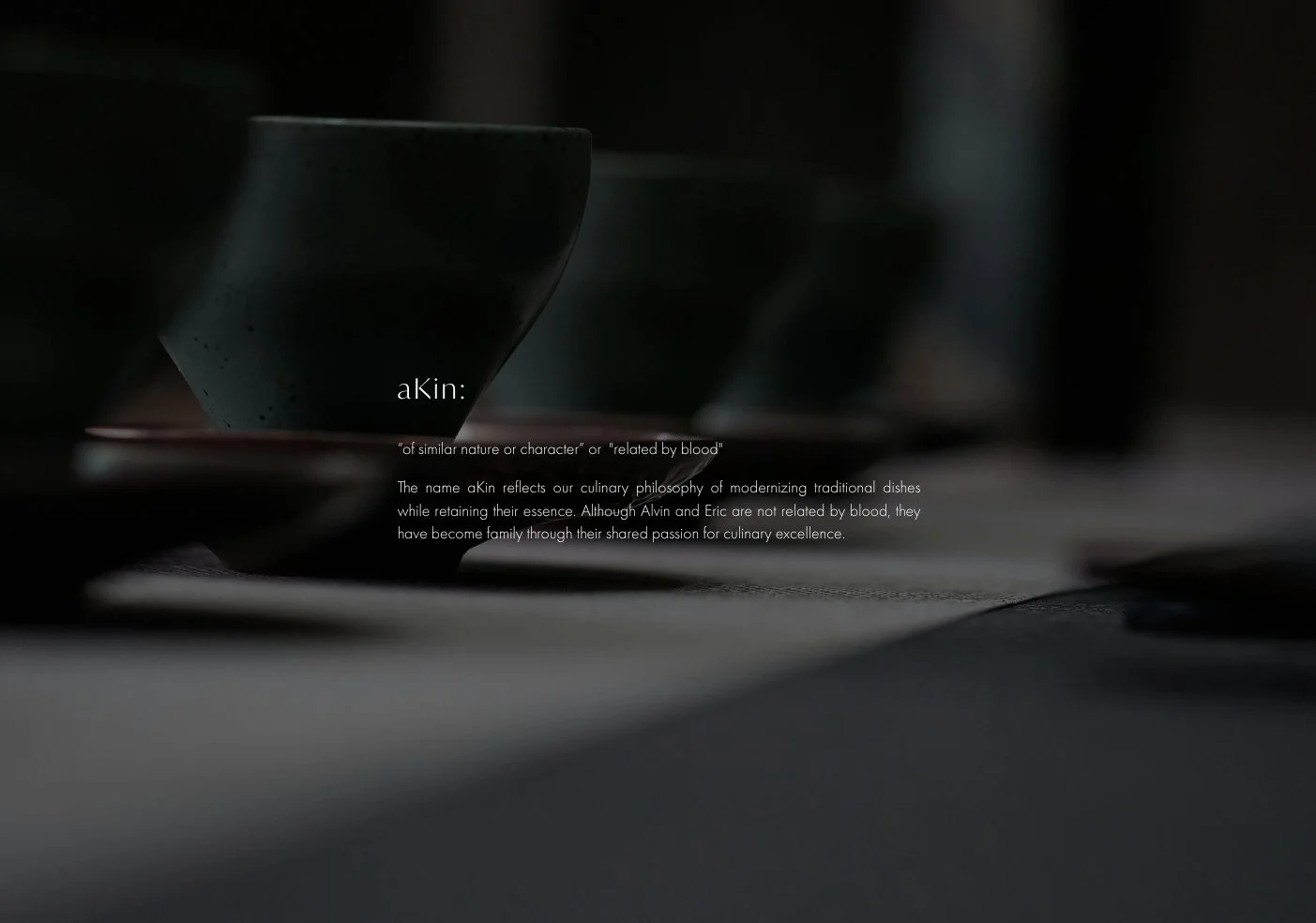
aKin is a Toronto-based restaurant offering a refined dining experience that blends thoughtful cuisine with a curated atmosphere. Their website needed to reflect the same level of care, intention, and sophistication found in their physical space.
The Challenge
The client wanted a white, clean, and minimal look inspired by Odette, while staying true to their existing brand colours of hunter green and gold. The challenge was to expand the colour palette and font selection in a way that felt luxurious, restrained, and cohesive—without overwhelming the simplicity they valued.
Our Approach
Visuable Packages
To address aKin’s needs, we provided:
What We Delivered
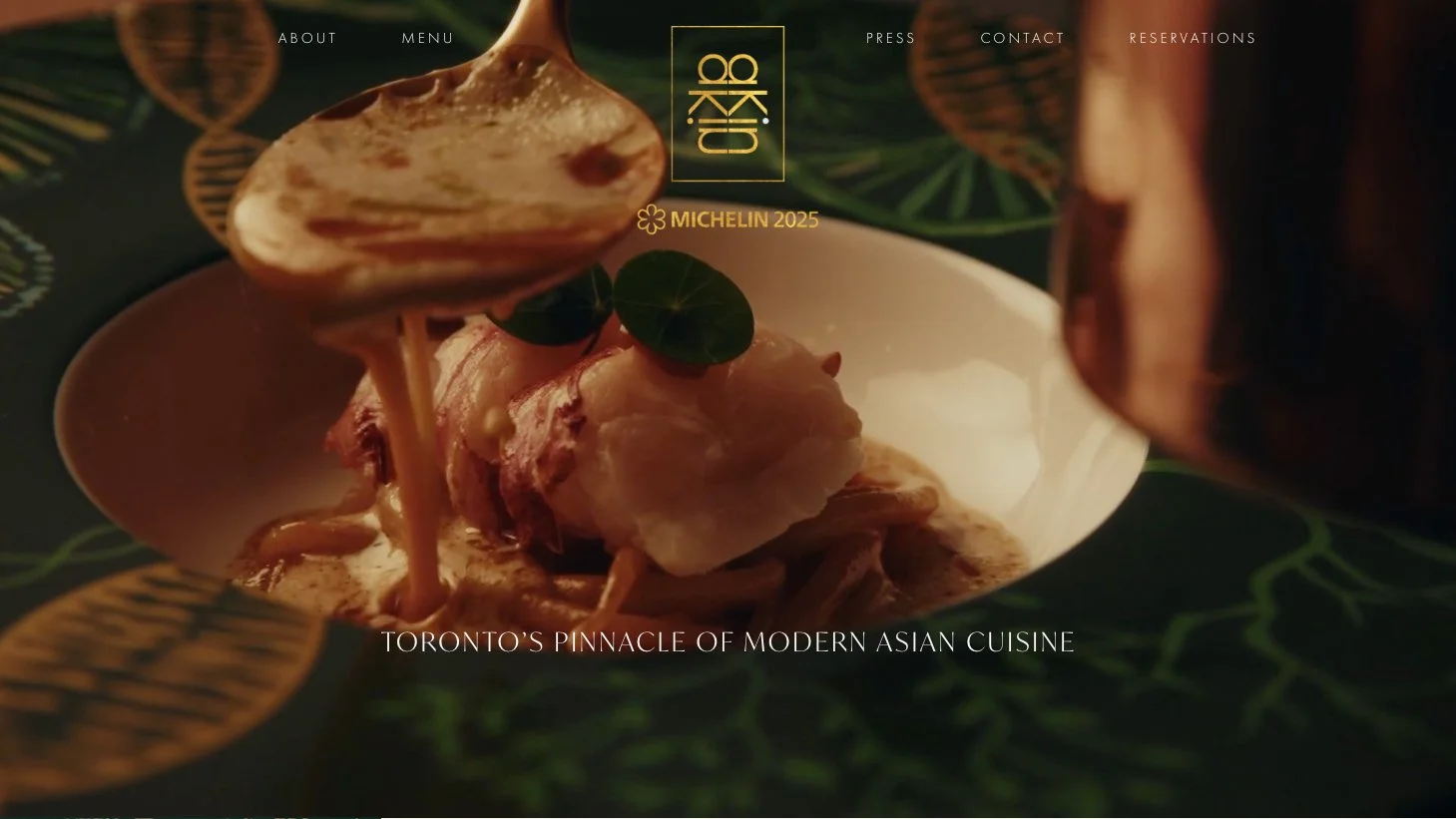
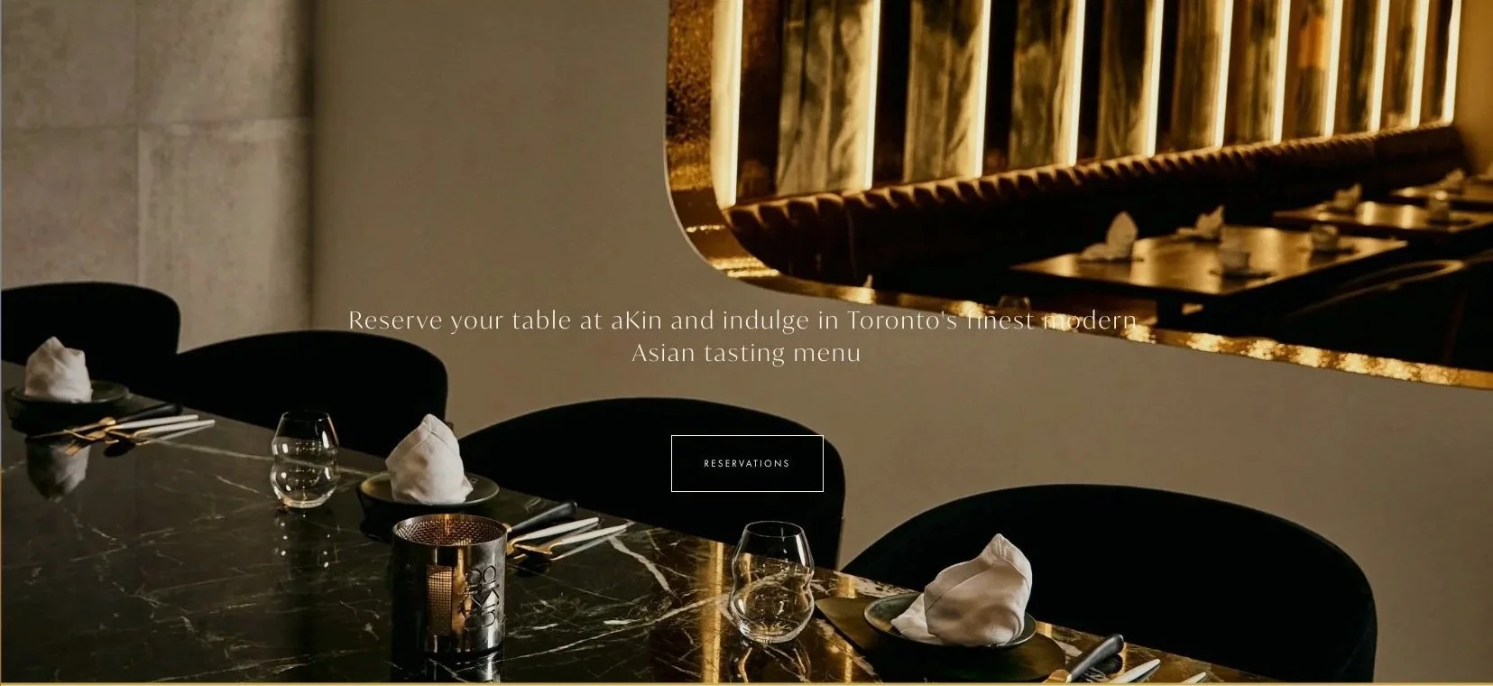
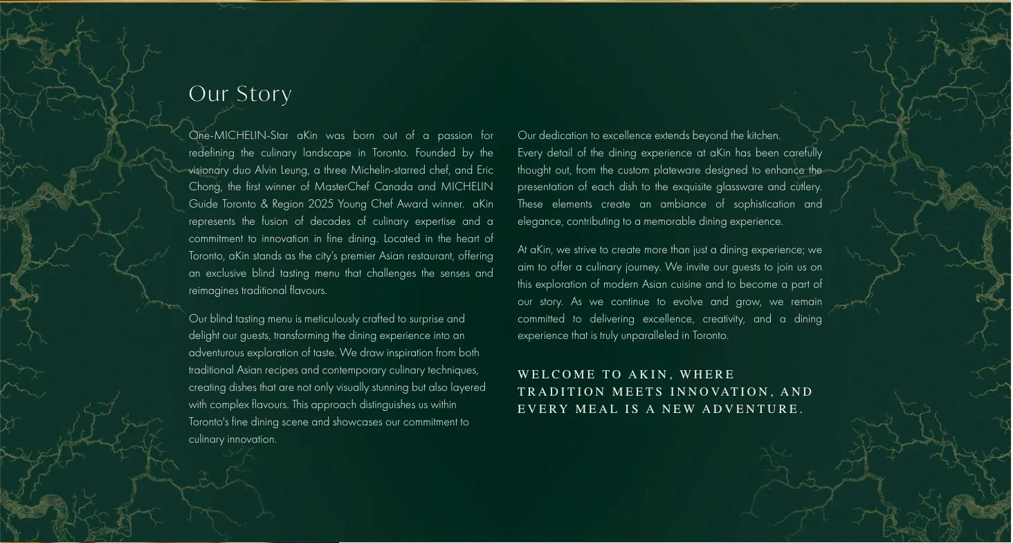
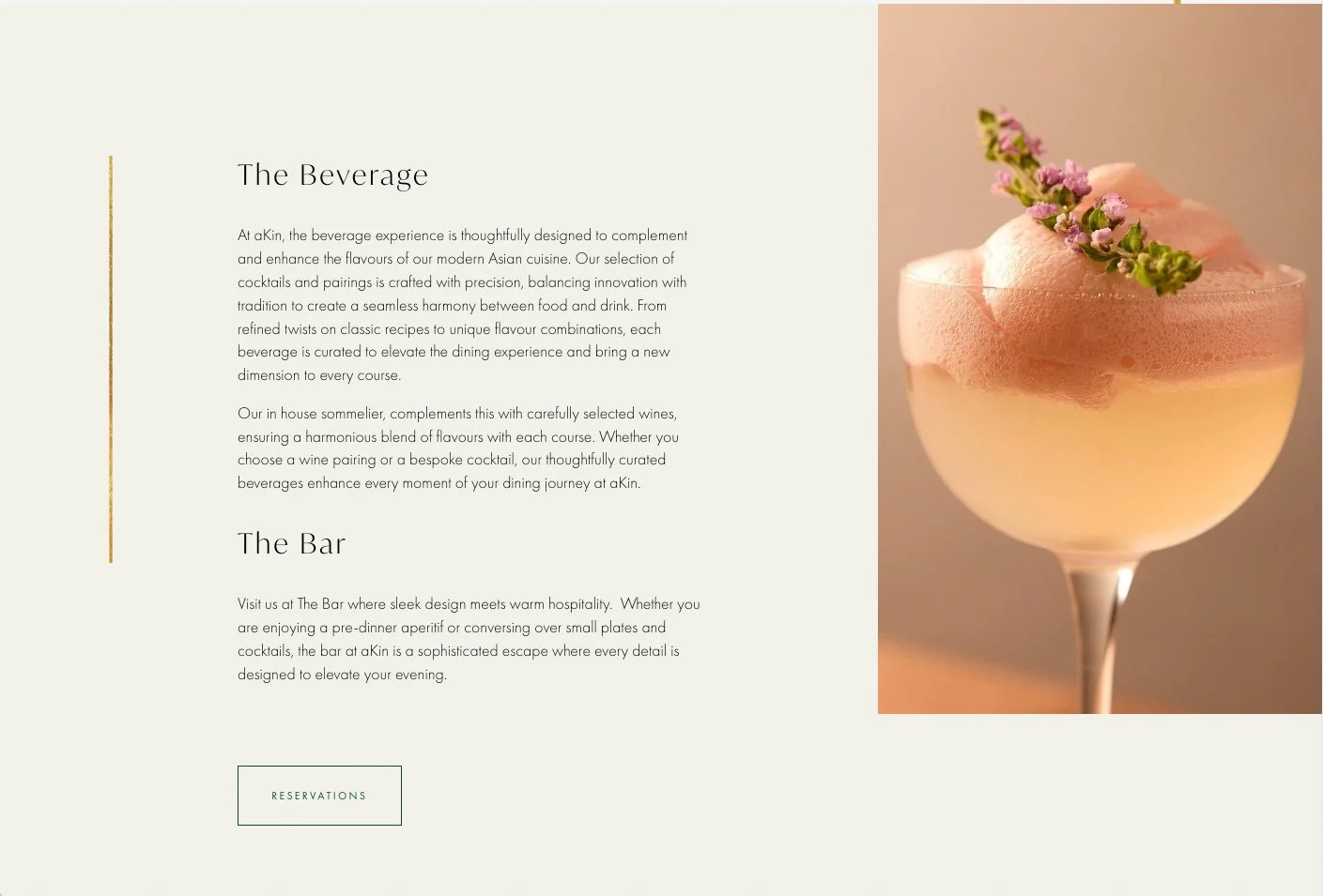
Full Squarespace Website Design: A bespoke multi-page website designed to reflect aKin’s elevated dining experience through clean layouts and considered spacing.
Expanded Colour Palette: A refined extension of the hunter green and gold brand colours, paired with soft neutrals to create balance and breathing room.
Typography Direction: Carefully selected fonts that felt editorial, timeless, and premium, supporting both readability and brand expression.
Visual Hierarchy & Layouts: Clear structure across pages to guide visitors effortlessly through menus, story, and key information.
Mobile-First Styling: Thoughtful mobile layouts ensuring the experience feels just as polished on smaller screens.
Technical Setup & Training: Backend setup and client training so the team can confidently manage updates moving forward.
The Results
UX & UI Design Outcomes
Elevated brand perception: The new design mirrors the in-restaurant experience, creating a seamless brand journey from digital to physical.
Improved clarity: Simplified layouts and considered spacing make content easier to digest and navigate.
Stronger visual cohesion: Colours, typography, and imagery now work together as a unified system.
Future-proof foundation: A flexible design that can grow with the restaurant as offerings evolve.
Creative Execution
Impact and Creativity
The design leans into restraint as a deliberate creative choice, echoing the refined and thoughtful nature of the aKin dining experience. Generous white space creates a sense of calm and sophistication, allowing key elements such as imagery, menus, and editorial-style text to stand on their own. Subtle gold accents are used with intention, adding warmth and quiet luxury without distracting from the overall minimal aesthetic. This balance results in a website that feels confident, elevated, and unhurried—much like the experience aKin offers its guests. Every visual moment feels considered, reinforcing the restaurant’s premium positioning from the first interaction.
Functionality and User Experience
User experience was designed to feel seamless and intuitive, ensuring visitors can quickly access what matters most. Clear navigation pathways guide users to essential content such as the menu, reservation information, and the restaurant’s philosophy without friction. The layout encourages gentle exploration rather than overwhelming the user, with a natural flow that mirrors the pacing of the dining journey itself. Interactions feel smooth and intentional, supported by clean layouts and consistent visual cues. Whether viewed on desktop or mobile, the experience remains polished, accessible, and easy to navigate.
Branding and Storytelling
aKin’s brand story is communicated through subtle visual language rather than overt messaging. The hunter green acts as a strong, grounding colour that reflects depth, heritage, and sophistication, while lighter neutral tones soften the overall experience and keep the design feeling fresh and modern. Typography plays a key role in reinforcing the brand’s attention to detail, with font choices that feel editorial, timeless, and crafted. Together, colour and type work as storytelling tools, translating the atmosphere of the physical restaurant into a cohesive digital identity that feels authentic and intentional.
Execution and Design Excellence
Every design decision—from spacing and alignment to font pairing and colour balance—was made with purpose. The result is a refined, editorial-style website that feels timeless rather than trend-driven, ensuring longevity for the brand. Subtle design details elevate the overall experience while maintaining clarity and simplicity. Built on Squarespace, the site balances high-end design with practical functionality, making it easy for the aKin team to manage and update content as needed. The final execution reflects the same level of care, precision, and craftsmanship that defines the restaurant itself.
Summary
The aKin website design brings clarity, elegance, and cohesion to the brand’s digital presence. By pairing a clean, white aesthetic with a refined expansion of the existing colour palette and typography, we created a website that feels both elevated and approachable. The result is a strong, future-ready foundation that supports the restaurant’s vision and guest experience online.
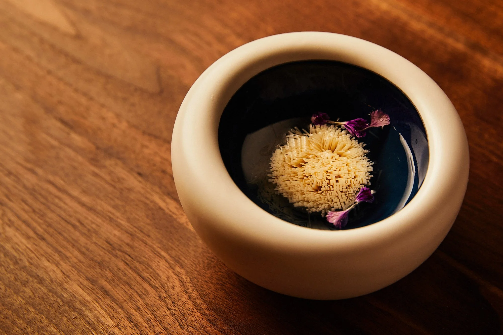
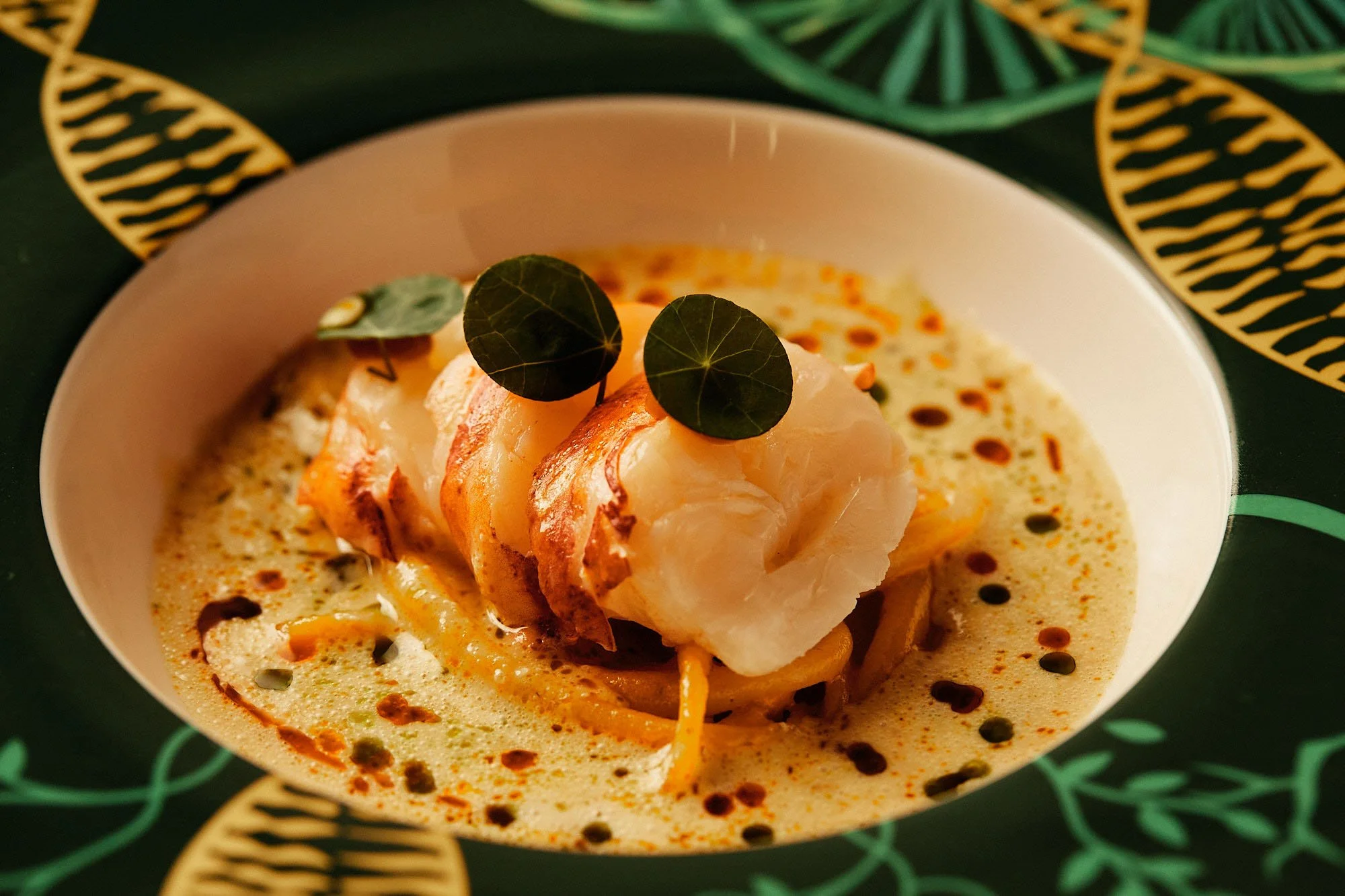
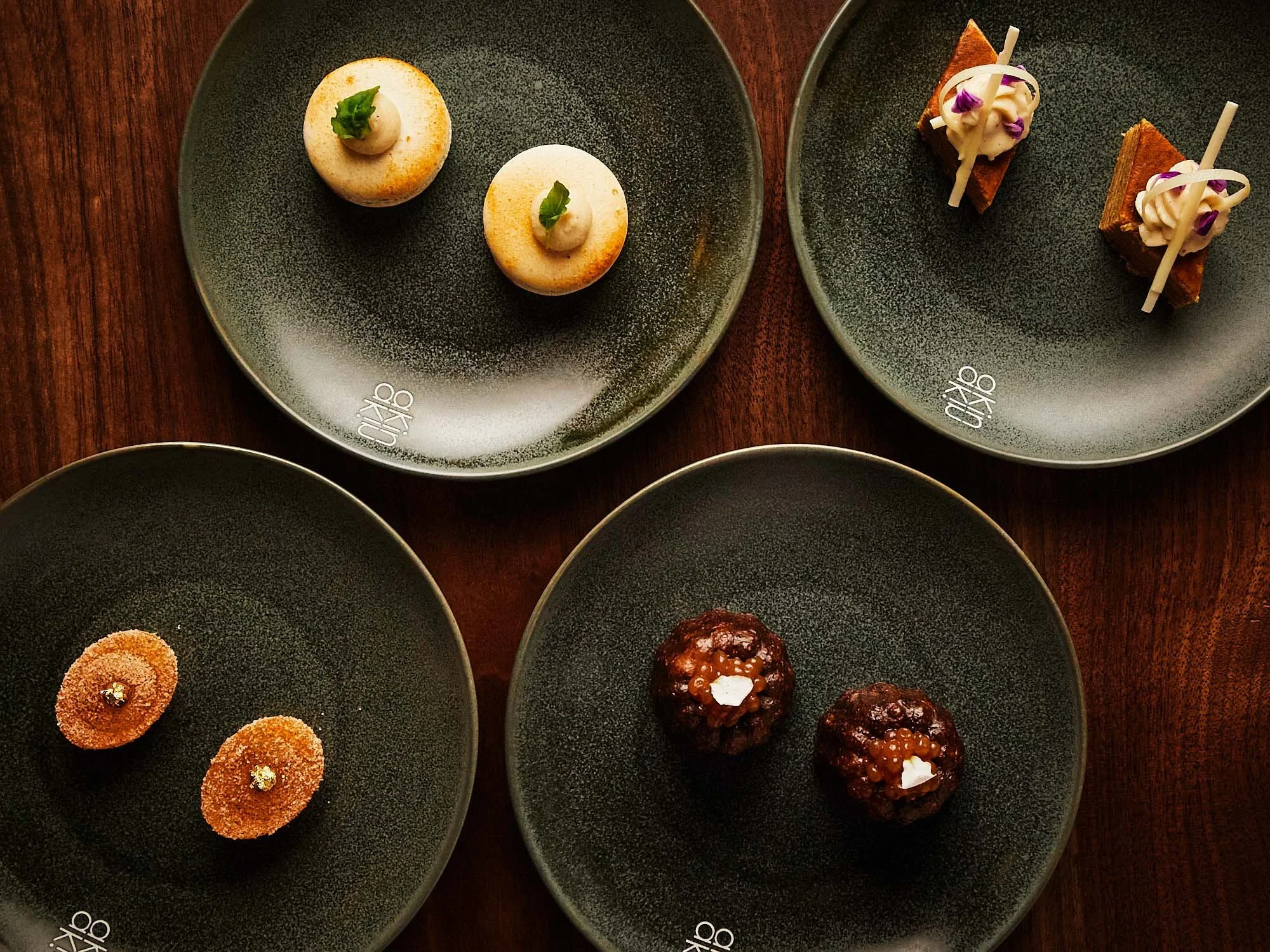
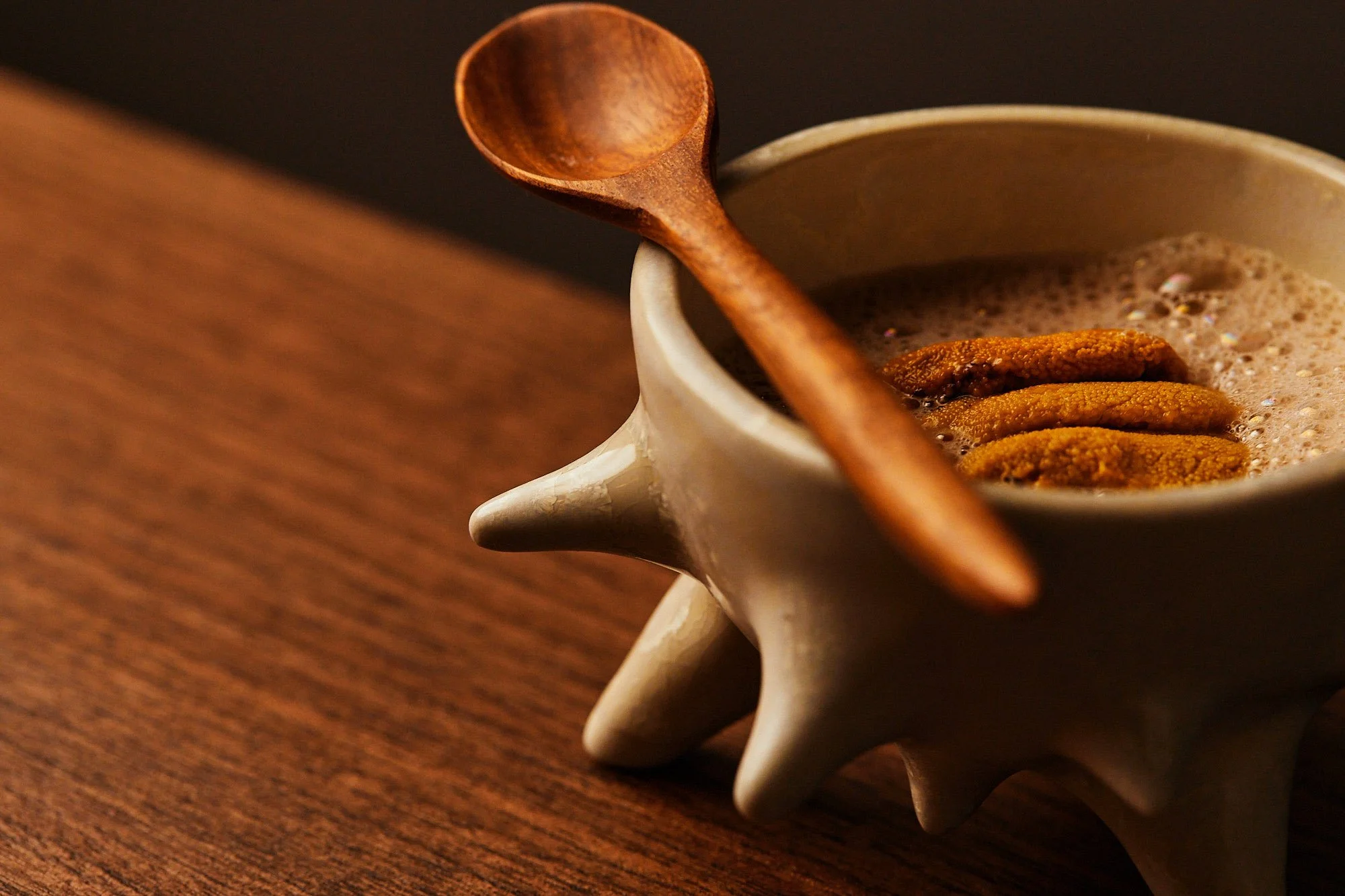
Brand photography courtesy of aKin
Consult with our Experts
Amazing brands start with an understanding of your goals and vision.
Our team understands the challenges of launching a brand online, and we’re here to answer all your questions and simplify the process for you. Let’s go!
Our Success Stories
Get inspired by real stories of how our designs have made a difference for brands like yours.


