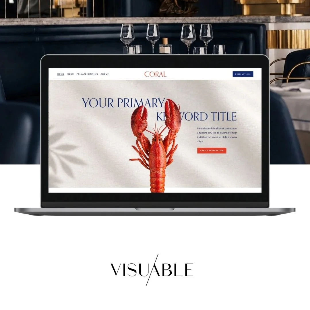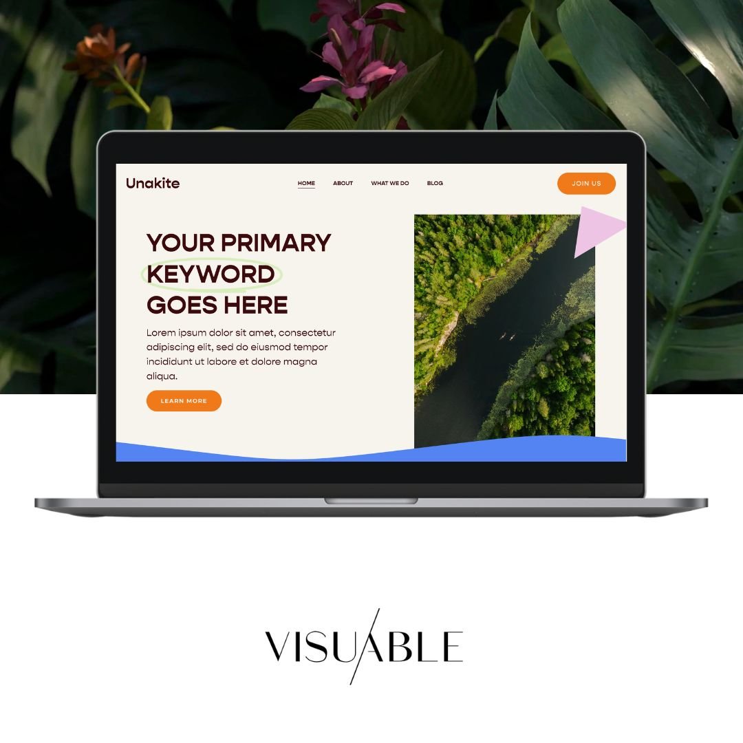

There is something incredibly powerful about a website that feels effortless to explore. The moment you land on the page, everything makes sense. The message is clear, the visuals feel intentional, and you instinctively know where to go next. Nothing competes for your attention, yet everything feels considered.
That is the beauty of minimalist web design.
For businesses looking to create a stronger online presence, minimalism offers much more than a beautiful aesthetic. When approached strategically, it can improve the user experience, communicate your value more effectively, and encourage visitors to take meaningful action.
However, there is a common misconception that minimalist websites need to feel sparse, overly simple, or stripped of personality. In reality, the most effective minimalist websites are often rich in character, storytelling, and thoughtful details.
The secret lies in understanding what deserves attention and giving it the space to shine.
Let's explore why minimalist web design can improve conversions and how to embrace simplicity without sacrificing the personality that makes your brand unique.
What Is Minimalist Web Design?
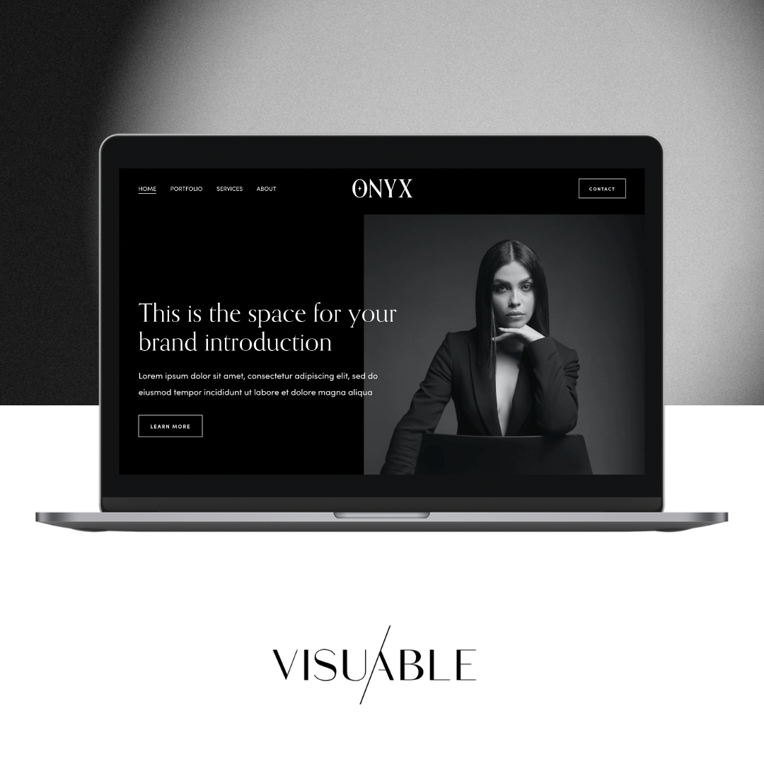
Minimalist web design is an approach that prioritises clarity, simplicity, and intentional visual choices. Rather than filling every available space with content, graphics, and features, it focuses on presenting the most valuable information in a way that feels intuitive and engaging.
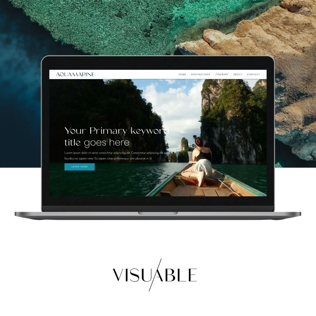
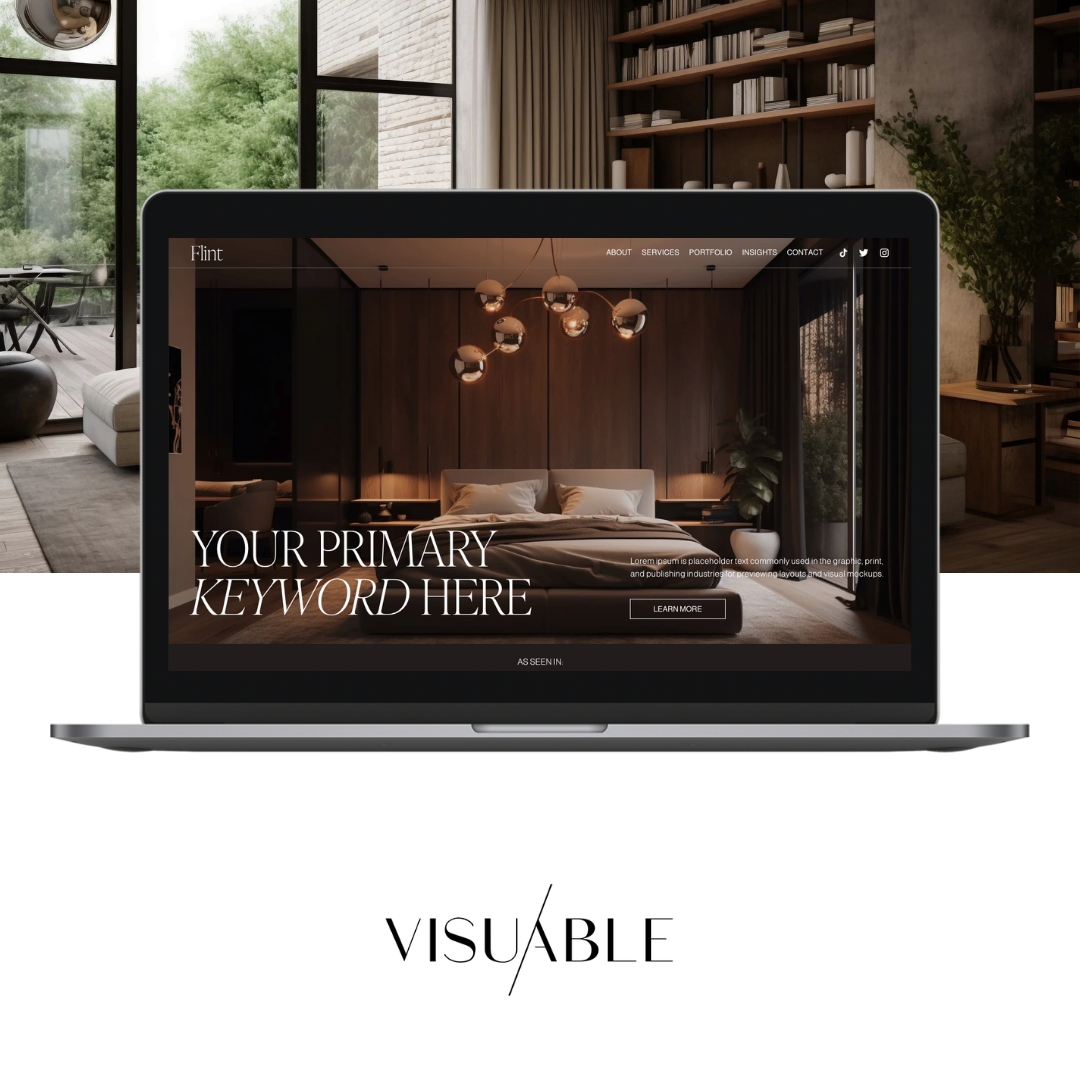
Think clean layouts, considered typography, purposeful imagery, and generous spacing. Every element has a reason to exist, and every design decision supports the overall experience.
However, minimalism is about much more than removing unnecessary details. It is about creating a thoughtful balance between aesthetics, functionality, and communication.
A minimalist website can still feature bold colours, expressive typography, beautiful photography, and creative interactions. The difference is that these elements work together rather than compete for attention.
For businesses, this creates an opportunity to communicate their message with greater confidence. Instead of overwhelming visitors with everything at once, a minimalist website introduces information at the right moment, guiding people naturally towards the next step.
Why Minimalist Web Design Can Improve Website Conversions
A beautiful website creates a strong first impression. A strategically designed website takes that impression further, helping visitors understand your offering, build trust in your brand, and feel confident taking action.
This is where minimalist web design can make a meaningful difference.
1. Less Visual Clutter Creates More Clarity
Imagine walking into a beautifully curated boutique. The products are thoughtfully displayed, the atmosphere feels welcoming, and you can immediately appreciate what makes each item special.
Now imagine entering a shop where every surface is overflowing with products, signs, and competing messages. Finding what you need becomes a much more demanding experience.
Websites work in a similar way.
When a page contains too many competing elements, visitors need to work harder to identify what matters. Multiple calls to action, lengthy introductions, excessive graphics, and crowded navigation menus can make even a valuable offering feel confusing.
Minimalist website design reduces this visual competition. By establishing a clear hierarchy, visitors can quickly understand what your business offers, why it matters, and what they should do next.
Clarity makes decisions easier, and easier decisions can lead to more conversions.
2. A More Intuitive Experience Keeps Visitors Engaged
Your website should feel like a natural conversation with your audience. Each section introduces something relevant, answers a question, or provides reassurance before guiding visitors towards the next stage.
Minimalist web design supports this experience by creating a logical flow between content, imagery, and interactive elements.
Clear navigation, readable typography, and thoughtfully positioned buttons help people explore your website without unnecessary effort. Visitors can focus on discovering your services or products rather than figuring out how the website works.
This becomes particularly valuable for service businesses, where potential clients often need time to understand the offering before making an enquiry.
A well structured website can guide someone from initial curiosity to genuine interest, creating a smoother journey towards booking a consultation or getting in touch.
3. Minimalist Design Can Strengthen Brand Credibility
First impressions matter, especially when someone is discovering your business for the first time.
A polished, cohesive website communicates professionalism and attention to detail. When typography, colours, imagery, and spacing feel consistent, visitors are more likely to perceive the brand as considered and trustworthy.
Minimalist design can amplify this impression by allowing your strongest brand elements to take centre stage.
Rather than relying on excessive decoration to create impact, a carefully crafted layout communicates confidence through restraint.
Of course, simplicity alone does not establish credibility. Clear messaging, authentic photography, testimonials, and relevant examples of your work are equally important.
The most effective websites combine these trust signals with a clean visual experience, helping visitors feel reassured about the business behind the design.
4. A Focused Layout Makes Calls to Action More Effective
Every business website should have a purpose. Perhaps you want visitors to book a discovery call, purchase a product, explore your services, or subscribe to your newsletter.
Whatever your goal, your website should make the next step feel obvious.
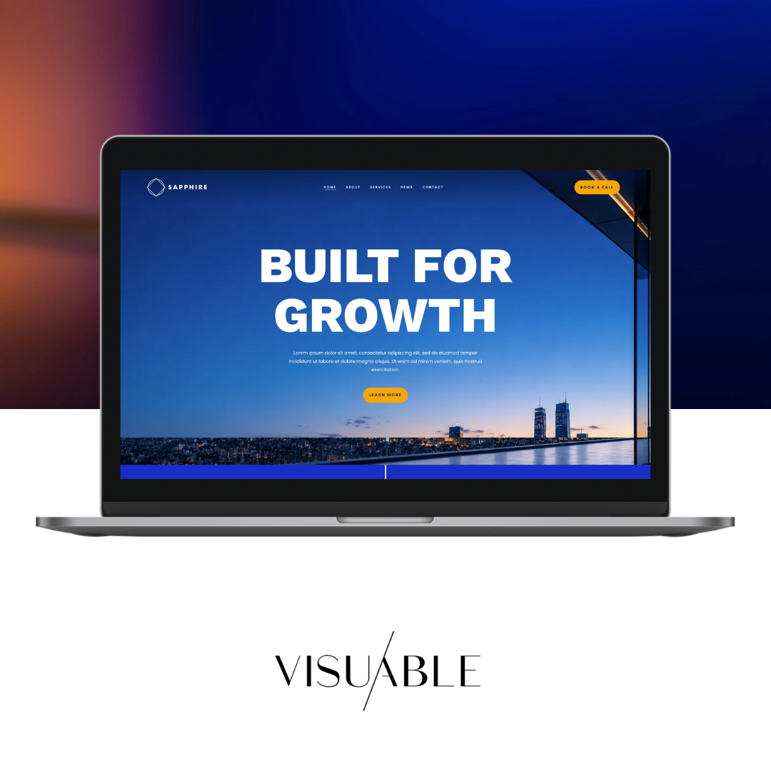
When several buttons, banners, and promotional messages compete for attention, visitors may struggle to decide where to click. A minimalist layout creates a stronger visual hierarchy, allowing your primary call to action to stand out naturally.
For example, a service page might introduce your offering, explain the transformation it provides, share relevant testimonials, and conclude with a clear invitation to enquire.
Each section supports the same goal without overwhelming the visitor with competing requests.
This is the foundation of conversion focused web design: creating an experience where beautiful design and business objectives work together.
The Difference Between Minimalist and Empty Website Design
One of the biggest concerns business owners have about minimalist web design is that their website might end up looking too plain.
It is an understandable concern. After all, your website should communicate the personality, value, and individuality of your brand.
However, there is an important distinction between a website that feels minimal and one that feels unfinished.
An empty website lacks the content, visual interest, or emotional connection needed to engage visitors. A minimalist website uses these elements selectively, creating a more intentional experience.
The difference comes down to strategy.
A beautifully designed minimalist website still needs compelling messaging, meaningful imagery, a recognisable brand identity, and enough information to support confident decisions.
Minimalism should simplify the experience, not diminish the story.
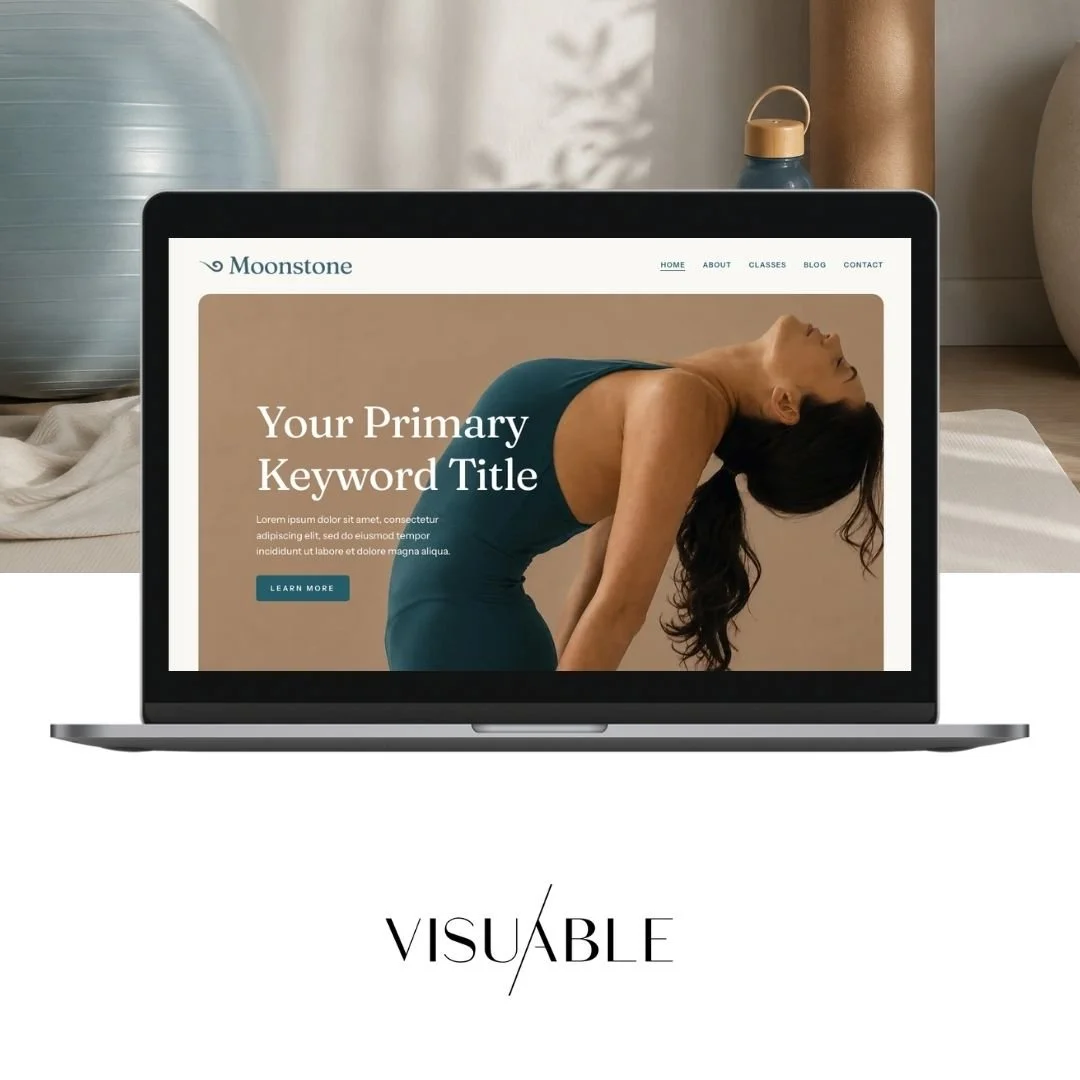
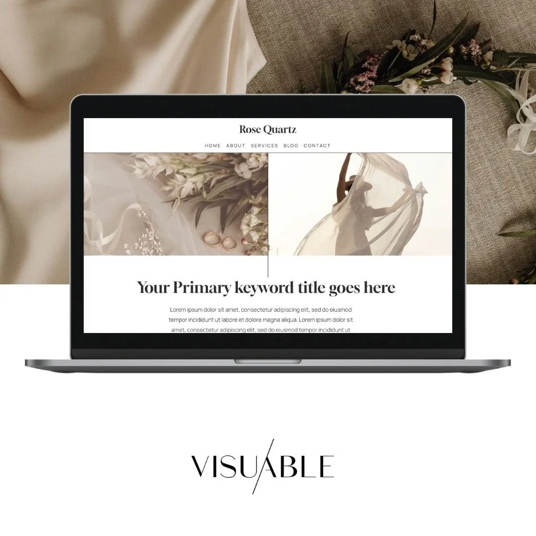
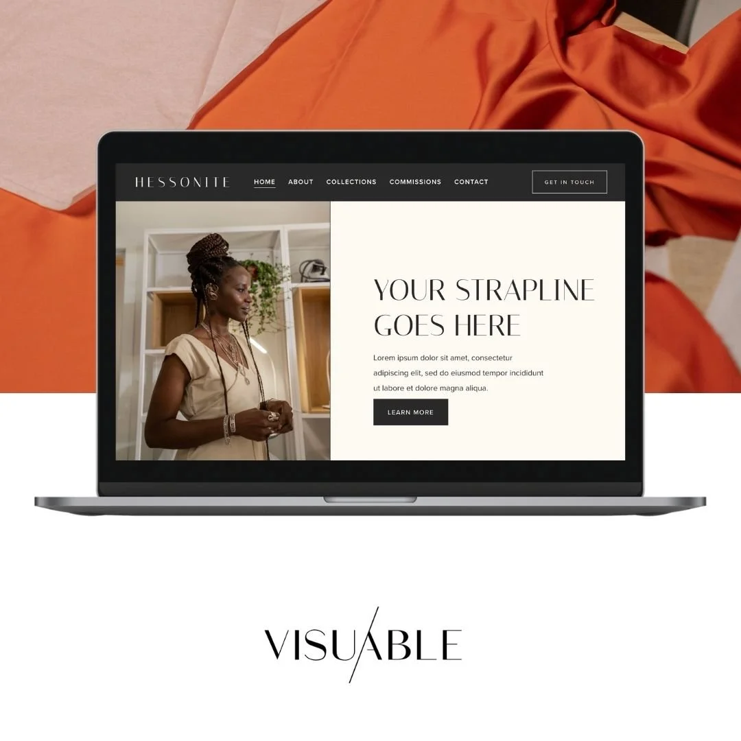
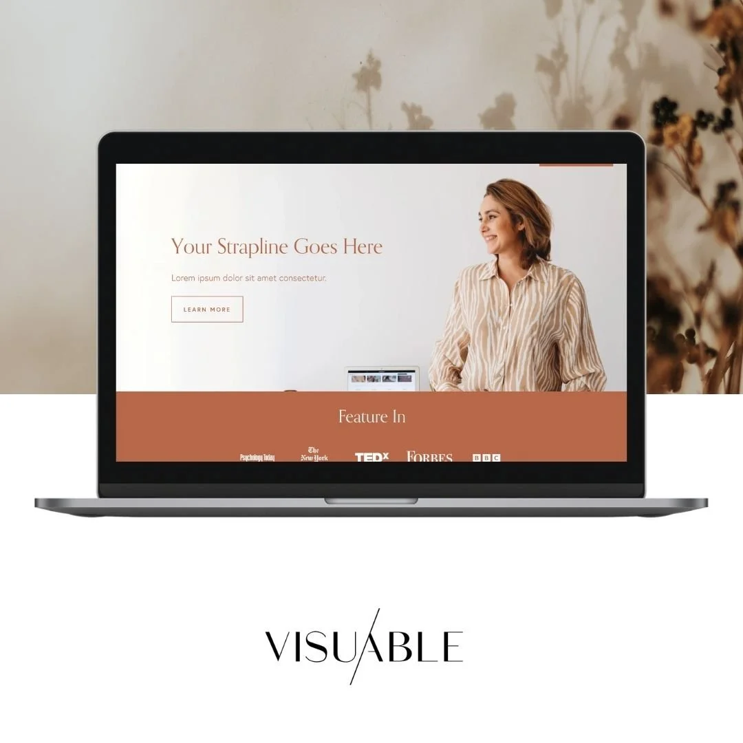
For example, a creative studio might use oversized editorial typography, carefully selected photography, and subtle movement to communicate its personality. A wellness brand might choose soft colours, natural imagery, and spacious layouts to create a calming atmosphere.
Both approaches embrace simplicity while expressing completely different identities.
The goal is to create a website that feels unmistakably yours.
How to Create a Minimalist Website That Still Feels Engaging
Creating a successful minimalist website requires more than choosing a neutral colour palette and removing decorative elements. It starts with understanding your audience, defining your priorities, and making thoughtful design decisions.
Here are six principles worth considering.
1. Start With a Clear Website Strategy
Before exploring layouts, fonts, or colour combinations, define what your website needs to achieve.
Who are you trying to attract? What information matters most to them? What questions might they have before making a decision? And what action would you like them to take?
These answers should shape your website structure and content.
For example, a consultant may need to establish expertise and build personal trust, while an ecommerce business may prioritise product discovery and a seamless checkout experience.
Both can benefit from minimalist web design, although the final layouts will look very different.
A strong strategy ensures simplicity serves a purpose rather than becoming purely an aesthetic preference.
2. Use White Space to Create Balance and Focus
White space, sometimes called negative space, refers to the areas between design elements. Despite its name, it can be any colour.
It is one of the most valuable tools in clean website design because it gives content room to breathe.
Generous spacing around headings can make them more impactful. Space between sections helps visitors recognise changes in topic. Thoughtful margins around images can make photography feel more refined and intentional.
However, effective spacing is about balance rather than simply making everything further apart.
Too much space between connected elements can interrupt the reading experience, especially on mobile devices.
The aim is to create a comfortable visual rhythm that guides attention while keeping the website engaging and easy to navigate.
3. Let Typography Express Your Brand Personality
Typography is one of the most effective ways to bring character into minimalist website design.
When layouts contain fewer decorative elements, the choice of typeface becomes even more important.
An elegant serif font can communicate sophistication and creativity, while a contemporary sans serif might feel modern, approachable, and confident.
Combining complementary typefaces can introduce contrast and visual interest without creating clutter.
Consider how your headings, body text, and smaller supporting details work together. A clear typographic hierarchy makes information easier to digest while reinforcing your brand identity.
Remember that readability should always come first. Beautiful typography should make your message more engaging, not harder to understand.
4. Choose Imagery That Adds Meaning
Minimalist websites often rely on fewer images, making the quality and relevance of each visual especially important.
Rather than filling every section with generic photography, choose imagery that communicates something meaningful about your business.
This might include authentic portraits, thoughtfully styled product photography, behind the scenes moments, or visual examples of your work.
Strong imagery can create an emotional connection, communicate your values, and help visitors imagine what working with your brand might feel like.
For service businesses, showing the people and process behind the offering can be particularly valuable.
Every image should contribute to the story you want to tell.
5. Write Clear, Compelling Website Copy
Minimalist design places greater emphasis on the words you choose.
When your website features fewer visual distractions, your headings and supporting copy become central to the experience.
This makes strategic website copywriting essential.
Your homepage headline should communicate the value of your offering. Your service descriptions should explain how you help your clients. Your calls to action should make the next step feel natural and inviting.
The goal is to communicate more effectively, rather than simply writing less.
A minimalist website still needs enough information to answer important questions, address potential concerns, and build confidence.
Combining thoughtful design with strategic website copywriting helps ensure your website feels beautiful while communicating a clear and persuasive message.
6. Design for Mobile and Prioritise Performance
A minimalist website should feel just as intuitive on a smartphone as it does on a desktop.
This means considering how typography scales, how sections stack, and how easily visitors can navigate and interact with your content on smaller screens.
Large gaps that look elegant on desktop may create unnecessary scrolling on mobile. Oversized headings may need adjustments, while navigation should remain simple and accessible.
Performance also deserves attention.
A more restrained design can reduce the need for heavy visual assets, although minimalism alone does not guarantee faster loading times. Image optimisation, efficient code, and thoughtful use of animations remain essential.
A smooth, responsive experience helps visitors stay focused on your content and move comfortably towards conversion.
Common Minimalist Web Design Mistakes to Avoid
While simplicity can improve website usability, taking minimalism too far can create new challenges.
The most common mistakes include:
Removing too much information. Visitors still need clear service details, relevant benefits, and answers to their questions before making a decision.
Using unclear navigation. Creative layouts should remain intuitive, with familiar navigation patterns and descriptive labels.
Prioritising aesthetics over accessibility. Low contrast text, tiny fonts, and subtle buttons can make a beautiful website difficult to use.
Creating a generic visual identity. Minimalism should enhance your brand personality rather than make your website look interchangeable with competitors.
Hiding important calls to action. A clean layout should make the next step easier to find, not harder.
The strongest minimalist websites balance visual simplicity with meaningful content and effortless functionality.
Is Minimalist Web Design Right for Your Business?
Minimalist web design can work beautifully across many industries, from creative studios and consultants to lifestyle brands, wellness businesses, and ecommerce shops.
However, the right approach depends on your audience, offering, and business goals.
A luxury brand might benefit from spacious layouts and immersive imagery, while a business offering complex services may need more detailed explanations and supporting content.
The important consideration is how effectively your website communicates.
Minimalism is especially valuable when you want to create a refined brand experience, improve content clarity, or simplify the journey towards an enquiry or purchase.
For businesses with extensive information, the solution may involve better content organisation rather than reducing the amount of content available.
Ultimately, successful website design is about creating the right experience for the people you want to reach.
Create a Website That Feels Effortless and Converts With Purpose
Minimalist web design proves that creating a memorable online presence does not require filling every corner of your website.
Sometimes, the most impactful design decisions involve giving your message more room to shine.
When thoughtful layouts, compelling copy, distinctive branding, and intuitive navigation come together, simplicity becomes a powerful business advantage.
Ready for a Website That Looks Beautiful and Works Harder for Your Business?
Whether you are building your first website or refreshing an existing one, our approach brings strategy and creativity together so your brand can make a lasting impression.
Explore our website design portfolio for inspiration, or get in touch with our team to discuss creating a website that feels unmistakably yours.
FAQs
-
Minimalist web design can improve conversions by reducing visual distractions, simplifying navigation, and making calls to action easier to identify. However, results depend on the quality of the content, audience expectations, and overall website experience. The most effective approach combines visual simplicity with clear messaging and a thoughtful conversion strategy.
-
The main benefits include improved readability, clearer navigation, stronger visual hierarchy, and a more focused user experience. Minimalist layouts can also highlight important brand elements and support faster loading times when combined with good technical optimisation.
-
Focus on distinctive typography, meaningful imagery, intentional colour choices, and engaging website copy. Use white space to create balance while ensuring every section contributes to your brand story. A minimalist website should feel thoughtfully curated rather than unfinished.
-
Minimalist web design can support SEO by improving usability, creating clearer content structures, and reducing unnecessary page elements. However, strong search performance also requires relevant content, strategic keywords, accessible navigation, technical optimisation, and a well organised website structure. Removing valuable content purely for aesthetic reasons can limit your SEO opportunities.
-
Absolutely. Squarespace is well suited to creating elegant, minimalist websites with responsive layouts, beautiful typography, and flexible design options. At Visuable, we create custom Squarespace websites built around each brand's goals, using tailored layouts and design details to achieve a distinctive result.
-
Yes. Minimalist ecommerce design can help products stand out, simplify browsing, and make the purchasing journey easier to follow. The key is to maintain essential product information, clear pricing, accessible navigation, and a straightforward checkout experience while creating a visually cohesive brand environment.
Related Blogs