5 Tips to Improve Your Website Conversion Rate
Did you know that the average website conversion rate is around 2-5%? This means that 95-98% of your website visitors are not enquiring with you. In this blog, we will share conversion optimisation techniques that you can implement to turn more visitors into enquiries and bookings.
Your website is the first impression that your potential customer will have, and just making it look pretty isn’t enough anymore. Our team has reviewed and designed more than 1000 websites since 2015, and we are excited to share key components that you can implement to maximise your website's lead generation potential.
If you’re unsure whether your current website is doing the job, take a look at our blog on 5 signs your website isn’t working for you. It’ll help you identify whether a few quick updates could make all the difference—or if it’s time for a more strategic overhaul.
This blog will discuss purposeful design, the importance of establishing a strategic direction for your website design, establishing trust, focusing on customer journeys, the role of images and mobile view optimisation. These 5 tips are here to help you maximise your chances of your web visitors turning into customers.
Make your BRAND POSITIONING clear
Your unique value proposition needs to be nailed down and clearly communicated to your website visitors. A purposeful and well thought through strategic direction is key to fully understanding who the website is for and what to consider when designing a website. Start by asking these questions:
What is the value you are offering to your clients?
Who are the people that your offer is aimed at?
How does doing business with you benefit them?
All these questions need to be answered using one simple, strong brand introduction statement. This should hold a prominent position at the very opening of your website. You can use the formula below to write your brand introduction:
“[Your brand name] is a [brand category] based in [location] helping [target audience] achieve [their goal] so that they can [the ultimate benefit].”
Once you nail down all the strategic brand fundamentals and your USP, everything else that follows (i.e. the website design and creative direction) will become a lot easier.
Turn fear into trust
In today’s competitive landscape, you need to have more than just a good product or service, you need a brand with personality. How are your customers supposed to trust and buy from you if they don’t know who you are?
For building trust, we recommend adding these elements to your website:
Providing social proof – several customer reviews, showcasing satisfaction rates, case studies, and active social media presence.
Adding credibility indicators – qualifications, number of years experience, showcasing business partners and known clients that have trusted you in the past.
Great About page – communicate your brand story, your mission, and why you do what you do. Showcase your team members and who is behind the business.
Behind-the-scenes content – customers love seeing the people behind the brand, how you work with clients, or how you produce your products.
Create purposeful customer journeys
Your customers need to be led down a purposeful customer journey with all roads leading to your Call-To-Action (CTA), which could be to get in contact with you or to buy your product/service. This is done by strategic and expert website design.
If the journey is confusing, complicated, or badly organised – your customers will most likely click away and decide to find an alternative service provider.
Have a logical flow - Your website isn’t a bunch of pages chucked together. It should be meticulously mapped out to give you a birds-eye view of how the website experience will look for your visitors.
Include clear signposting - Make it easy to navigate and put key information on obvious pages. Don’t assume that they know where it is because you do.
Have clear call-to-action’s - What is your objective? Where do you want them to go? What do you want them to do? Make all CTA’s clear and stand out!
Incorporate images of people
Including great quality photos of people on your website can increase empathy and, as a result, increase conversion, and images can give your brand personality. For example, by including customers, visitors will have a good idea of what it’s like to work with you. People want to see you in action in an environment that is reflective of your business.
Focus on these three elements when choosing your images:
Highlight the authenticity of your business and the distinctiveness of your brand
Remember to showcase the quality of your work
Follow your brand identity guidelines for a consistent outlook. If don’t have guidelines, seek designer help to create a unique brand identity that sets you apart.
Optimise your mobile view
In 2022, there were over 5 billion mobile internet users worldwide, and it is around 60% of the total users. This number has also been estimated to keep growing, so it is crucial factor in successful website design.
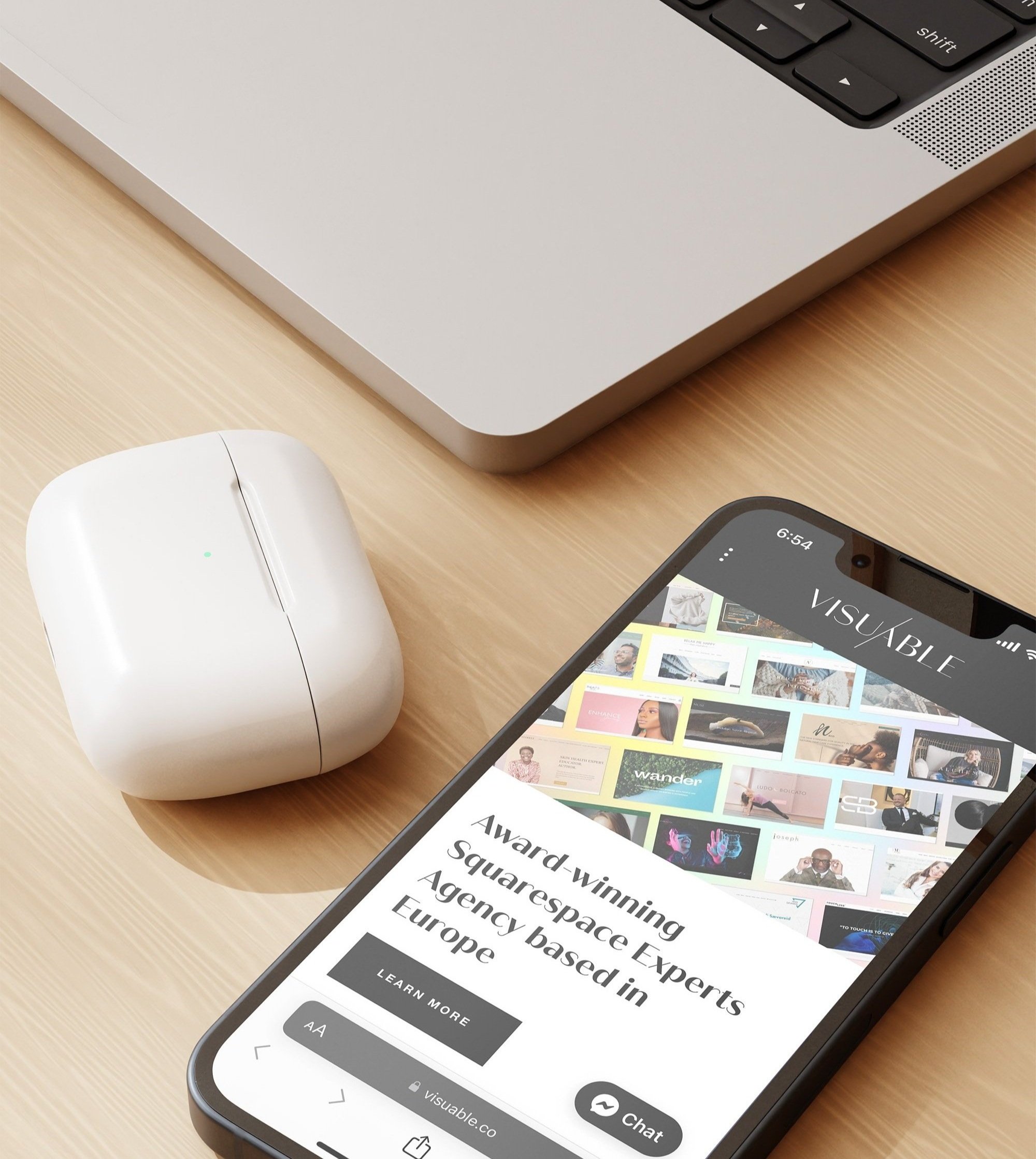
Pretty much everyone is on mobile, and your website needs to provide a seamless and easy experience for your visitors. If your website is difficult to navigate via mobile or takes too long to load, users won’t hesitate to leave your site to look at one of your competitors.
Don’t hesitate to reach out to professionals, if you are not able to get your website to look brilliant on mobile and other devices. It’s worth the investment.
You might have a beautiful website that you are visually extremely happy with, but those days just a pretty website is not enough. By establishing your strategic direction, how you are building trust within your audience, offering purposeful customer journeys, including beautiful images, and optimising your mobile view, you’ll increase your chances of increasing your website conversion rate and generating quality leads through your website.


