JJ Apothecary Life | USA
JJ Apothecary Life
Essential Brand Identity & 8h Design Review & Restyle Case Study
Learn how we helped JJ Apothecary Life refresh their brand identity and elevate their online presence by delivering a custom Essential Brand Identity and an 8-hour Design Review & Restyle.

Enhanced homepage layout
SIMPLE navigation structure
Refreshed Brand Identity
Stronger call-to-actions
Project Overview
The Client
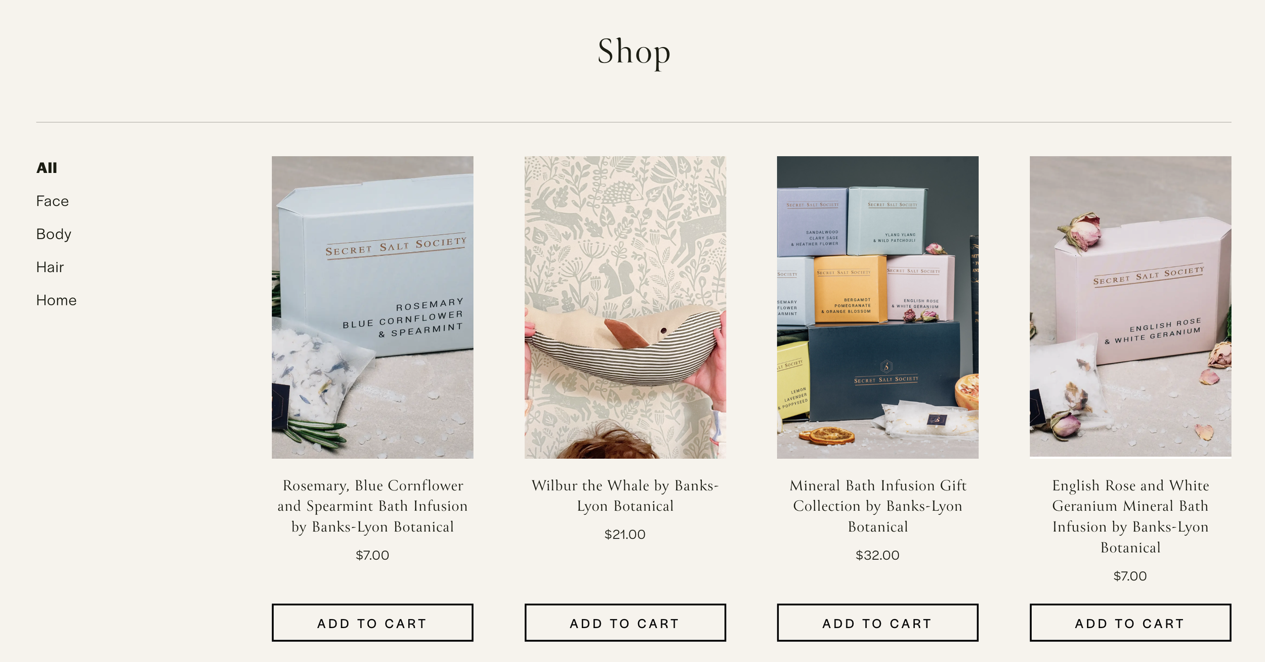
JJ Apothecary Life is a wellness-focused brand offering holistic remedies, healing products, and lifestyle inspiration. Their online space serves as both a digital storefront and a source of empowerment for customers seeking natural wellbeing.
The Challenge
The client needed a complete brand refresh, alongside a refined website design. Their goals were to create a visually striking brand identity, enhance the site structure, and optimise for stronger conversions.
Our Approach
Visuable Packages
To meet these needs, we delivered:
What We Delivered
Refined logo and visual identity: We created a clear, minimalist logo system and colour palette that embodies JJ Apothecary Life’s calming, natural essence.
Tailored typography system: Selected typefaces added clarity and warmth across all touchpoints.
New branded elements: Designed on-brand graphics and banners to bring consistency across the website.
Enhanced homepage design: Visually guided visitors with intuitive sectioning and bold visuals.
Website layout restyle: Redesigned key page structures to be more engaging and easier to navigate.
Conversion-led structure: Introduced clear call-to-actions and repositioned content to encourage engagement.
The Results
UX & UI Design Outcomes
Enhanced homepage layout: improved user journey and first impression
Streamlined navigation structure: created an intuitive flow to guide visitors
Refreshed colour palette and typography: unified the look and feel of the brand
Stronger call-to-actions: boosted engagement and conversion points
Creative Execution


Impact and Creativity
At the heart of JJ Apothecary Life’s transformation was the desire to reflect the soul of the brand—rooted in natural wellbeing, intentional living, and emotional healing. Our creative direction focused on expressing this ethos visually and emotionally. We crafted a soothing, earth-inspired aesthetic that uses soft tones, organic shapes, and clean spacing to evoke feelings of calm, trust, and clarity. This wasn’t just about aesthetics—it was about creating a safe, welcoming digital sanctuary that mirrors the real-world experience of the brand’s products and mission.
We consciously avoided overly clinical or trendy design choices. Instead, we leaned into timeless minimalism, allowing the brand’s essence to shine through. Subtle design elements, like hand-drawn accents and calming visuals, serve as visual metaphors for the care and intentionality behind every product JJ Apothecary Life offers.
Functionality and User Experience
From a UX perspective, our goal was to design a site that doesn’t just look beautiful but also feels effortless to use. We mapped the user journey to ensure every page encourages discovery, connection, and conversion. The homepage is now structured like a gentle conversation—inviting users in, guiding them naturally through the brand’s story, and leading them toward key calls-to-action.
Design decisions such as simplified navigation, logical content flow, and responsive mobile experiences were all part of creating a friction-free interaction. The layout is intentionally calm and uncluttered, mirroring the brand’s wellness values and allowing content to breathe. Every design choice—from typography to image ratios—was made to ensure ease of use without sacrificing aesthetic harmony.
Branding and Storytelling
This brand identity tells a story—not just of the products offered but of a lifestyle and philosophy. Every colour, font, and design element was chosen with purpose. The soft greens and neutrals reflect the natural ingredients and holistic approach. The typography blends gentle elegance with clarity, reinforcing both professionalism and accessibility. And the custom visual elements, like illustrations and banners, offer continuity and recognition.
Rather than imposing a new narrative, we unearthed and amplified what was already true about JJ Apothecary Life. The founder’s story, her intention behind the products, and the brand’s impact on its community all informed the visual direction. It’s not just a brand refresh—it’s a visual affirmation of the values they already live by.

Execution and Design Excellence
Design excellence is about precision and purpose. In this project, we merged form with function—every element was intentional, from the margin spacing to the layering of text over images. We used modern design principles but filtered them through the lens of the client’s unique brand character. This allowed us to strike a balance between timeless elegance and current usability standards.
The final outcome is a cohesive visual identity and website that doesn’t just look good—it feels good. It supports the user emotionally, builds trust through consistency, and gently encourages them to take action. It’s a perfect representation of what happens when strategy and creativity meet—beautiful, aligned, and effective.


Summary
JJ Apothecary Life's refreshed visual identity and redesigned website bring their holistic mission to life. With an elevated brand presence and intuitive online experience, they’re now better positioned to inspire, connect with, and convert their ideal audience. This transformation highlights the power of aligning design with brand strategy—creating a space that truly reflects the soul of their business.


Brand photography courtesy of JJ Apothecary Life
Consult with our Experts
Amazing brands start with an understanding of your goals and vision.
Our team understands the challenges of launching a brand online, and we’re here to answer all your questions and simplify the process for you. Let’s go!
Our Success Stories
Get inspired by real stories of how our designs have made a difference for brands like yours.


