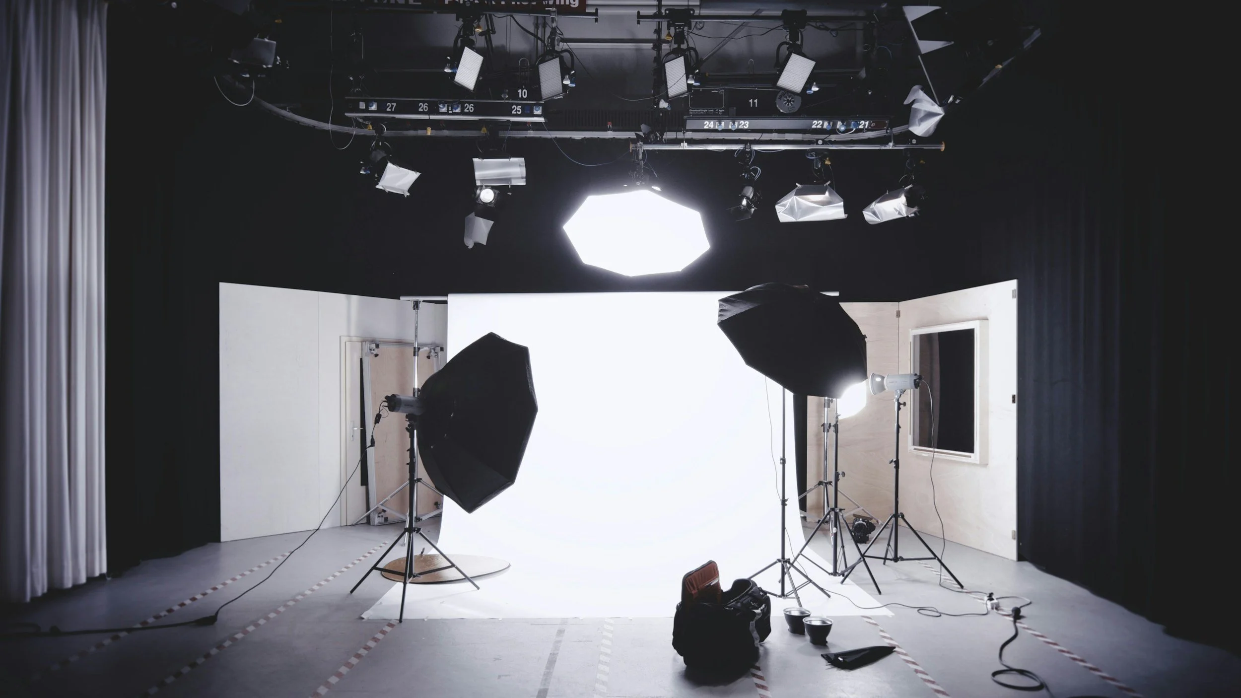
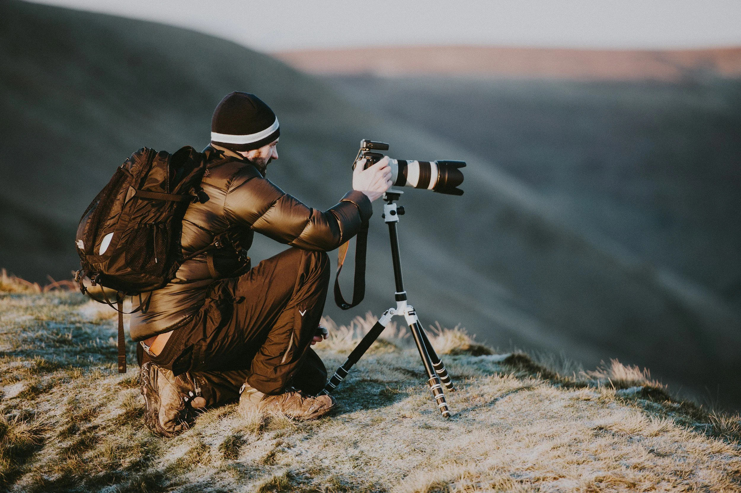
Photography Website Design: What Makes a Photographer's Website Actually Convert

For photographers and studios, your website is more than a digital portfolio. It’s your hardest-working sales tool. It speaks for you when you’re on a shoot. It builds trust before a single email is sent. And when it’s designed with intention, it quietly guides the right clients to enquire, book, and invest.
Yet we see this all the time: incredibly talented photographers with beautiful work, but websites that don’t convert. The images are strong, but the enquiries are inconsistent. The site looks good, but it doesn’t work.
So what’s missing?
Photography website design that converts is never about trends or flashy effects. It’s about clarity, strategy, and experience. In this article, we’ll walk through what actually makes a photographer website convert, and how to design yours so it supports your business goals, not just your visuals.
Your website’s real job (and why portfolios alone don’t convert)
Most photographers think their website’s main job is to showcase their work. That’s only half the picture.
Your website needs to:
Attract the right clients
Build trust quickly
Answer unspoken questions
Communicate your value
Guide visitors towards one clear next step
A strong portfolio proves you can do the work. A conversion-focused website explains why someone should choose you.
When someone lands on your site, they’re subconsciously asking:
“Is this photographer right for me?”
“Do they understand what I need?”
“Can I trust them with this investment?”
If your website doesn’t answer those questions within the first few seconds, they’ll scroll… then leave.
First impressions: why above-the-fold design matters so much
Above the fold is the first screen your visitor sees before they scroll. It’s the most valuable real estate on your entire site.
For photographers, this area often gets wasted on vague statements like:
“Capturing moments you’ll treasure forever.”
It sounds nice, but it doesn’t say anything meaningful.
A high-converting photography website uses the top of the page to clearly communicate:
Who you serve
What you do
What makes you different
What action to take next
This doesn’t mean sacrificing beauty. It means pairing your strongest image with intentional messaging.
Instead of a generic headline, speak directly to your ideal client. For example, a wedding photographer might focus on experience and peace of mind, while a commercial studio might highlight results, professionalism, and brand alignment.
Clarity builds confidence. Confidence drives action.
Designing for your ideal client, not every client
One of the biggest conversion blockers we see is trying to appeal to everyone.
When your website speaks to everyone, it resonates with no one.
Your photography website design should be built around a clear niche and audience. Whether that’s couples planning intimate weddings, brands needing editorial content, families wanting a relaxed experience, or creatives seeking personal branding imagery, your site should reflect their world.
This affects everything:
The language you use
The images you lead with
The way you structure your pages
The tone of your calls to action
When visitors feel seen and understood, they’re far more likely to enquire. Conversion happens when someone thinks, “This feels like it was made for me.”
Visual hierarchy: guiding the eye (and the click)
Photography websites are naturally visual, but too many visuals without structure can overwhelm visitors.
High-converting photography website design uses visual hierarchy to guide attention intentionally.
This means:
Clear heading structure that breaks content into digestible sections
Enough white space so images and text can breathe
Strategic image placement that supports the story, not distracts from it
Your visitor should never wonder where to look next. The design should gently guide them down the page, from curiosity to trust to action.
This is especially important on mobile, where most photography websites are viewed. A beautiful desktop site that feels cluttered or confusing on mobile will quietly lose enquiries.
The role of copywriting in photography website design
Images attract attention. Words convert.
This is where many photography websites fall short. They rely almost entirely on visuals and treat copy as an afterthought. But strong copy is what turns admiration into action.
Effective photography website copy does three things:
It positions you clearly
It communicates value, not just services
It reduces friction and hesitation
Your copy should explain your process, your approach, and what it feels like to work with you. It should answer practical questions without overwhelming. And it should reinforce why your work is an investment, not a commodity.
This isn’t about being salesy. It’s about being clear, confident, and helpful.
Building trust before the enquiry form
People don’t enquire unless they trust you. Trust isn’t built with one element; it’s layered throughout your website.
High-converting photographer websites include:
Social proof, such as testimonials or client feedback
Clear explanations of what working together looks like
Consistent branding that feels professional and intentional
Thoughtful details that show experience and care
Even subtle things matter. Broken links, outdated galleries, or unclear pricing signals create doubt. A polished website signals that you’re established, organised, and serious about your work.
Trust reduces hesitation. Reduced hesitation leads to more enquiries.
Calls to action that feel natural, not pushy
A call to action doesn’t have to shout “Book now!” to be effective.
For photographers, softer, confidence-led calls to action often convert better. Think of invitations rather than demands.
For example:
“Enquire about your date”
“Let’s talk about your project”
“Start your photography journey”
What matters most is consistency. Every page should gently guide visitors towards the same primary action, whether that’s an enquiry form, a consultation booking, or a contact page.
If your website has multiple competing actions, visitors often choose none.
Contact and enquiry forms: where conversions are won or lost
This might sound obvious, but it’s worth saying clearly. If your enquiry process feels complicated, people won’t complete it.
A high-converting photography website makes it easy to get in touch.
That means making it effortless for someone to reach out the moment they feel ready. Clear contact buttons should be visible throughout your site, gently reminding visitors that starting a conversation is simple and welcome. Your enquiry form should feel intuitive and easy to complete, not like a task or a test. Every field should have a clear purpose, asking only for information that helps you respond thoughtfully, without feeling intrusive. When the process feels respectful and straightforward, people are far more likely to take that final step and get in touch with confidence.
Your form is not a questionnaire. It’s the start of a conversation. Keep it focused on what you genuinely need to respond confidently.
SEO and structure: getting the right people to your site
Conversion doesn’t matter if the right people never find you.
Search-engine-friendly photography website design ensures your site is structured in a way that search engines can understand and rank.
This includes structuring your website in a way that feels intuitive for both visitors and search engines. A clear page hierarchy and well-considered heading structure help guide readers through your content without confusion, while also signalling relevance and clarity behind the scenes. Images should be carefully optimised so they load quickly without losing quality, with descriptive alt text that supports accessibility and discoverability. Thoughtful page naming and clean URLs make it easier for users to understand where they are and what each page offers. Combined with strong mobile responsiveness and fast load times, these elements ensure your website feels smooth, professional, and easy to engage with—no matter how or where someone finds you.
SEO for photographers isn’t about chasing volume. It’s about attracting aligned traffic. Visitors who arrive already looking for what you offer are far more likely to convert.
Why platform choice matters (and why simplicity often wins)
Your platform should support your business, not slow it down.
We often recommend Squarespace for photographers because it balances beautiful design with ease of use. When built properly, it allows for custom, high-end design while remaining simple to manage long-term.
A platform that feels intuitive empowers you to update galleries, post blogs, and evolve your site without stress. That confidence translates into a website that stays current, relevant, and conversion-ready.
The difference between a pretty website and a profitable one
A beautiful photography website is nice to have. A strategic one is a business asset.
When photography website design is done with intention, it saves you time, attracts better-fit clients, and supports sustainable growth. You spend less energy convincing and more time creating.
If your current website isn’t bringing in the enquiries you want, it’s rarely about your talent. More often, it’s about clarity, structure, and strategy.
Designing a photography website that grows with you
Your website shouldn’t just work for where you are now. It should support where you’re going.
Whether you’re refining your niche, raising your prices, or transitioning from passion projects to full-time studio work, your website should evolve alongside your business.
That’s where thoughtful design, strategic copywriting, and SEO come together. Not as separate pieces, but as one cohesive experience designed around your goals.
Ready to turn your photography website into a conversion tool?
If you’re ready for a website that feels aligned, professional, and designed to convert, we’d love to support you. Let’s create a photography website that works as hard as you do.