How to create visual content which isn’t boring

Let’s be honest.
Most visual content online looks the same.
The same stock photos. The same beige graphics. The same overused quotes in generic fonts.
It is polished, but forgettable.
In a digital landscape where attention spans are short and competition is high, creating visual content that actually captures interest is not optional. It is essential.
But how do you create visual content that isn’t boring?
The answer is not about adding more colours or louder graphics. It is about intention. It is about strategy. And most importantly, it is about alignment between your brand and your visuals.
Let’s explore how to create visual content that feels engaging, purposeful, and distinctly yours.
Why Visual Content Matters More Than Ever
Before we talk about how to create visual content, it is important to understand why it matters.
We process visuals significantly faster than text. Within seconds of landing on a website or scrolling through social media, your audience forms an impression. They decide whether your brand feels trustworthy, modern, premium, creative, structured, or chaotic.
That impression is often based almost entirely on visual cues.
Your typography, layout, spacing, imagery, colour palette, and graphic style communicate far more than you may realise. They shape perception before a single paragraph is read.
If your visual content lacks clarity or personality, your brand can feel generic — even if your service is exceptional.
Strong visual content does not just decorate your brand. It reinforces it.
What Makes Visual Content “Boring”?
Boring visual content is rarely offensive. It is simply forgettable.
It blends in instead of standing out. It looks safe. It follows trends without adding personality. It prioritises aesthetics over meaning.
One of the most common mistakes businesses make when creating visual content is copying what competitors are doing. While inspiration is valuable, imitation leads to sameness. When everyone uses identical layouts, muted tones, and identical stock photography, distinction disappears.
Another reason visual content feels boring is the lack of hierarchy. When everything is given equal visual weight, nothing feels important. The viewer’s eye has no clear path to follow.
Overcomplication can also drain impact. Too many fonts, too many colours, too many graphic elements competing for attention create visual noise instead of clarity.
Ultimately, boring visual content lacks intention. It is created to fill space rather than communicate meaning.
“People buy from people they know, like and trust and from brands whose values and beliefs they share”
The Foundation of Engaging Visual Content
If you want to create visual content that holds attention, you must begin with a strategy.
Before choosing imagery or designing graphics, ask: What is this content meant to communicate? What feeling should it evoke? What action should it encourage?
Visual content should always support your positioning.
If your brand is positioned as premium and refined, your visuals should feel spacious, elevated, and intentional. If your brand is bold and innovative, your design may incorporate stronger contrasts and dynamic layouts. If your brand is calm and nurturing, softer tones and gentle typography may feel more aligned.
Without alignment between strategy and visuals, content feels disconnected.
Engaging visual content is not about creativity alone. It is about cohesion.
The Role of Brand Identity in Visual Content
Your brand identity acts as the framework for all visual content.
Typography choices influence tone. A modern sans-serif communicates something very different from a classic serif. Colour palettes shape emotional response. Deep, rich tones feel more grounded and premium, while bright palettes feel energetic and youthful.
Consistency across platforms builds recognition. When someone sees your content, they should recognise it without needing to see your logo.
That level of consistency comes from having a defined visual identity rather than improvising each time you create a post, graphic, or page layout.
Visual content becomes stronger when it is not reinvented daily but guided by a clear system.
How to Create Visual Content That Captures Attention
To create visual content that truly engages, focus on clarity before decoration.
Start with a strong focal point. Every visual should have one clear priority. Whether it is a headline, an image, or a key message, the viewer’s eye should know where to land first.
Use whitespace intentionally. Space is not empty — it creates breathing room. It allows important elements to stand out rather than compete.
Think about contrast. Contrast in colour, scale, and weight creates visual interest. Large headlines paired with smaller supporting text create hierarchy. Light backgrounds paired with bold typography create focus.
Imagery should feel purposeful, not random. Instead of relying solely on generic stock photos, consider photography that reflects your brand’s personality and environment. Even subtle shifts in imagery style can elevate perception significantly.
Above all, avoid overcrowding. Simplicity communicates confidence.
Visual Storytelling: The Missing Layer
One of the most powerful ways to make visual content more engaging is to treat it as storytelling rather than decoration.
Every piece of content should contribute to a broader narrative.
On a website, visuals should guide visitors through a journey. Hero images create emotional context. Section layouts create rhythm. Case studies demonstrate transformation visually as well as verbally.
On social platforms, visual content can highlight behind-the-scenes moments, client results, or insights in a way that reinforces your expertise.
When visual content supports storytelling, it becomes memorable.
Without narrative, it becomes filler.
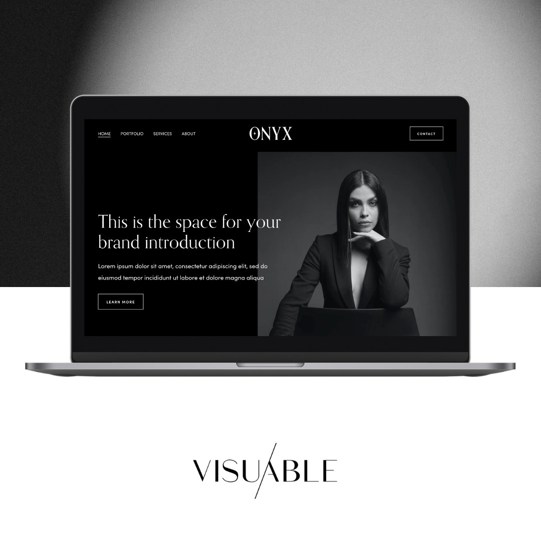
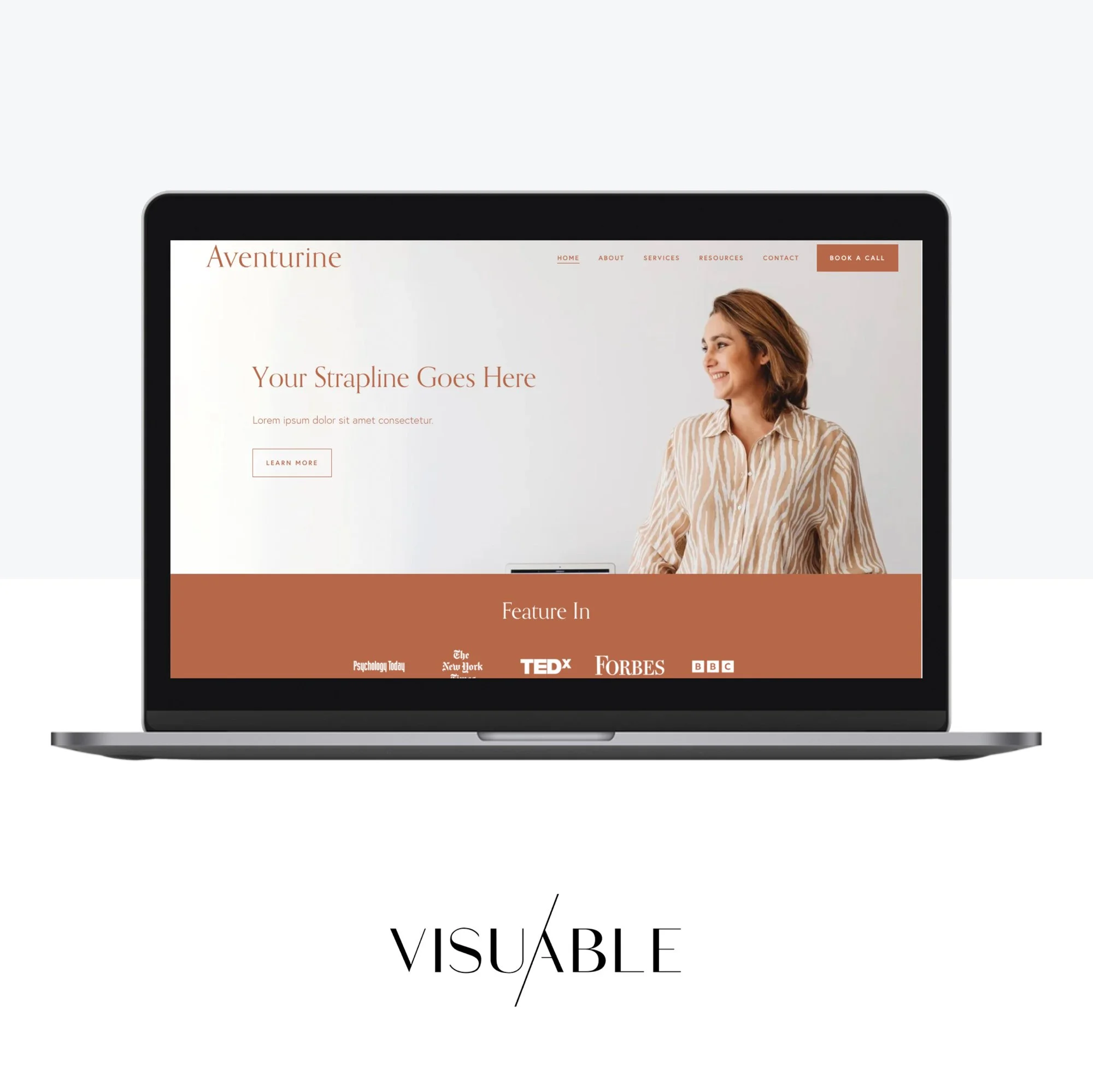
Website Design and Visual Engagement
Your website is often the most important platform for visual content.
Unlike social media, it is fully yours. It allows you to control layout, movement, pacing, and hierarchy.
High-performing websites use visual structure strategically. They balance text and imagery. They use typography to create rhythm. They ensure mobile responsiveness so visuals translate seamlessly across devices.
Animations and subtle interactive elements can enhance engagement when used thoughtfully. However, they should never distract from clarity.
Strong website design demonstrates how visual content and messaging work together. When aligned, they create an experience rather than a collection of sections.
The Impact of SEO on Visual Content
While visual content is inherently visual, it still plays a role in search engine optimisation.
Image optimisation, alt text descriptions, and structured layouts help search engines understand your content. Clean visual hierarchy improves readability, which supports user experience metrics that influence rankings.
Creating engaging visual content is not separate from strategy — it integrates with it.
When visual appeal and SEO best practices work together, your content becomes both discoverable and impactful.
Evolving Beyond Trends
Trends move quickly. Minimalist palettes, bold typography, retro fonts — each season brings something new.
While trends can inspire, building visual content solely around them creates short-term relevance.
Instead, focus on timeless clarity rooted in your brand strategy. Refine rather than chase. Adapt without losing cohesion.
The most memorable brands are not trend-driven. They are identity-driven.
Final Thoughts: Visual Content With Purpose
Creating visual content that is not boring requires more than creative tools.
It requires intention.
It requires clarity around who you are as a brand. It requires consistency in typography, colour, and layout. It requires thoughtful hierarchy, contrast, and whitespace. And it requires alignment between visual design and strategic positioning.
When these elements come together, your visual content does more than look good.
It communicates.
It builds trust.
It captures attention without shouting.
And in a crowded digital landscape, that quiet confidence is often what makes the strongest impression.
If your current visual content feels inconsistent, flat, or disconnected from your strategy, the solution is not more graphics. It is more clarity.
Because when your brand direction is clear, creating visual content becomes not just easier — but far more powerful.
Related blogs